
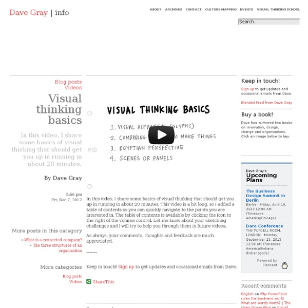
Visual thinking school Visual thinking is a way to organize your thoughts and improve your ability to think and communicate. It’s a way to expand your range and capacity by going beyond the linear world of the written word, list and spreadsheet, and entering the non-linear world of complex spacial relationships, networks, maps and diagrams. It’s also about using tools — like pen and paper, index cards and software tools — to externalize your internal thinking processes, making them more clear, explicit and actionable. Why is visual thinking important? There’s more information at your fingertips than ever before, and yet people are overwhelmed by it. When faced with too much information we shut down. We think in pictures. Think you can’t draw? Squiggle birds (I learned squiggle birds from my friend Chris Glynn). So why is visual thinking important? The whirl. Visualization is increasingly used in business and science to simplify complexity: a picture is worth a thousand words. This is a fallacy. How to draw a car.
Relation Browser / Visualisations showing relations | valderama.net Relation Browser - Moritz Stefaner Different types of relations, different type of entities. Number of relations should not get bigger then ~25. Nice animations. "Flat" - every relation is equal. Ask Ken - Michael Aufreiter (Linz) In contrast to the "relation browser" (by moritz s.) here a whole graph opens. Image swirl - G. The start is a Grid View. PaperCube - Peter Bergstrom my thoughts are here Publication Map - Moritz Stefaner Publications are clustered according their cross-references of single articles. Relation Circle for Publications - Moritz Stefaner Here just one type of relation and one type of entiy is used. See infoVis Pattern .
Name Every Shade of the Rainbow With This 'Color Thesaurus' Driving along the highway in Didcot, England, you may notice something strange: the road signs point the way to places like Neverland and Middle-earth. The names of these and other fictional locales from literature were seamlessly added to road signs by an artist/prankster using Transport Medium, the official font of British road signs. After some sleuthing, BBC News found the man responsible, who spoke to the outlet on the condition of anonymity. Oxfordshire County Council isn't laughing; it told the BBC that although the signs were "on the surface amusing," they were "vandalism" and potentially dangerous, since it would be hard for a driver who spotted one not to do a double take while their eyes were supposed to be on the road. Jackie Billington, Didcot's mayor, recognizes that the signs have an upside. There are five altered signs in total. See the signs here and in the video below. [h/t BBC News]
Napkin Sketch Workbook by Don Moyer: Education Words are great, but some messages are hard to communicate with words alone. That's why we need visual explanations—charts, figures, diagrams. This workbook inspires all writers to create better visual explanations and shares practical techniques you can apply right away—even if you think you can't draw. The workbook includes many exercises you can use to practice new skills and build confidence. Developed to support Don's workshop for writers, presented at the annual conference of the Society for Technical Communication. About the Author Don Moyer Foglifter Pittsburgh, PA, USA Don Moyer is a writer and designer who enjoys helping businesses communicate important ideas by making messages visible. Publish Date December 29, 2010 Dimensions Pocket 172 pgs Black and White printing (on cream uncoated paper) Category Education Tags visual explanation , napkin sketch … , Society for Technical Communications , Netflix , Shopatron , ThoughtForm , STC , preview , workbook , draw
Brands of the World™ | Download vector logos and logotypes Identify a Lie with 6 Simple Questions post written by: Marc Chernoff Email We all fall victim to at least a few lies during the course of our lifetime. A lie can travel halfway around the world while the truth is putting on its shoes.- Mark Twain How do you know this? If you enjoyed this article, check out our new best-selling book. And get inspiring life tips and quotes in your inbox (it's free)...
ToDo - interaction & media design Color Psychology by David Johnson Like death and taxes, there is no escaping color. It is ubiquitous. Yet what does it all mean? Colors often have different meanings in various cultures. Black Black is the color of authority and power. White Brides wear white to symbolize innocence and purity. Red The most emotionally intense color, red stimulates a faster heartbeat and breathing. The most romantic color, pink, is more tranquilizing. Blue The color of the sky and the ocean, blue is one of the most popular colors. Green Currently the most popular decorating color, green symbolizes nature. Yellow Cheerful sunny yellow is an attention getter. Purple The color of royalty, purple connotes luxury, wealth, and sophistication. Brown Solid, reliable brown is the color of earth and is abundant in nature. Colors of the Flag In the U.S. flag, white stands for purity and innocence. Food for Thought While blue is one of the most popular colors it is one of the least appetizing.
Sketchnotes 101: The Basics of Visual Note-taking Welcome to the second article in the the new Core77 "Sketchnotes Channel" (www.core77.com/sketchnotes) where we'll be exploring the application of visual thinking tools in the worlds of design and creative thinking. So you say you're ready to start sketchnoting. Maybe you're not much of a sketcher but you take a lot of notes, and are interested in making them more meaningful and interesting, but you're afraid your drawings are too crude. For you, it's important to stress that sketchnotes—although they are inherently a visual medium—do not require drawing ability of any kind. Essentially they're about transforming ideas into visual communication; structuring thoughts and giving hierarchy to concepts can be completed with strictly text and a few lines. Maybe you're perpetually drawing and want to try and make your notes more useful and engaging but you are afraid of imposing structure to your normally freeform way of sketching. In the end, it's up to you. So let's get tactical.
Today Is Your Day To Win 7 Basic Rules for Making Charts and Graphs Charts and graphs have found their way into news, presentations, and comics, with users from art to design to statistics. The design principles for these data graphics will vary depending on what you're using it for. Making something for a presentation? You'll want to keep it extremely simple and avoid using a lot of text. Designing a graphic for a newspaper? You'll have to deal with size constraints and try to explain the important parts of your graphic. However, whatever you're making your charts and graphs for, whether it be for a report, an infographic online, or a piece of data art, there are a few basic rules that you should follow. There's wiggle room with all of them, and you should think of what follows as more of a framework than a hard set of rules, but this is a good place to start for those just getting into data graphics. Check the data This should be obvious. Explain encodings Maybe you use a color scale to indicate magnitude or the size of a square to represent values.
Collection: Visual thinking sketchnote-lessons Archives Color is a great way to add visual interest and guide people’s eyes to what you want them to focus on. Here’s Kevin Dulle’s sketchnote lesson on adding emphasis with shadows and color: Reposted with permission – check out his blog for more tips! If you’re starting out with sketchnotes, you don’t have to use color right away. You can always add color afterwards. You can also add color on the computer. Okay, so that takes care of the mechanics. Develop your personal style by looking for inspiration and experimenting with ideas. Here’s a sampler of different coloring styles I’ve played with in my sketchnotes: Sketchnote Army has a wide variety of sketchnoting styles. Like this?