
Data Art. How can anyone start a career in data visualization and what is the required skill set for it? Presentation Tools Online. Welcome. Data visualisation and Infographics tools. Visually stunning math concepts which are easy to explain. User:LucasVB/Gallery. Below is a mostly comprehensive gallery of all images — illustrations, diagrams and animations — that I have created for Wikipedia over the years, some of which have been selected as featured pictures, or even picture of the day.

As you'll probably notice, they're mostly related to physics and mathematics, which are my main areas of interest. If you have any comments, requests, suggestions or corrections, feel free to drop me a message on my talk page. But please, before making a suggestion, first take a look and see what sort of stuff I can do. Due to time, knowledge and complexity constraints, I cannot guarantee I'll be able to make a good illustration of any topic. You can also follow me on tumblr for WIPs, current and failed projects and other creations.
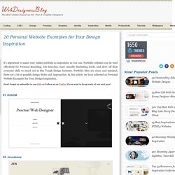
If you appreciate my work, consider making a donation. Animations[edit] Waves[edit] Wave-related animations. Pendulums[edit] A series of images illustrating the oscillation of a pendulum. Blue Solids[edit] Static[edit] 2D[edit] 3D[edit] 20 Personal Website Examples for Your Design Inspiration. It’s important to make your online portfolio as impressive as you can.

Portfolio websites can be used effectively for Personal Branding, Job Searches, most valuable Marketing Tools, and show off their awesome skills to stand out in this Tough Design Industry. Portfolio Sites are clean and minimal, there are a lot of possible design Styles and Approaches. In this article, we have collected 20 Personal Website Examples for Your Design Inspiration.
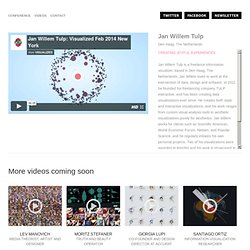
Don’t forget to subscribe to our RSS or Follow us on Twitter if you want to keep track of our next post. 01. 02. 03. 04. 05. 06. 07. 08. Goddard Scientific Visualization Studio. Watch: Visual journalism and what makes a good infographic. Data Innovation Day. Data & Visualisation. Visualized. Den Haag, The Netherlands Jan Willem Tulp is a freelance information visualizer, based in Den Haag, The Netherlands.

Jan Willem loves to work at the intersection of data, design and software. In 2011 he founded his freelancing company TULP interactive, and has been creating data visualizations ever since. He creates both static and interactive visualizations, and his work ranges from custom visual analysis tools to aesthetic visualizations purely for aesthetics. Jan Willem works for clients such as Scientific American, World Economic Forum, Nielsen, and Popular Science, and he regularly initiates his own personal projects.
Infographics and how-tos. Graphics and Fonts. Infographic. Information graphics or infographics are graphic visual representations of information, data or knowledge intended to present complex information quickly and clearly.[1][2] They can improve cognition by utilizing graphics to enhance the human visual system’s ability to see patterns and trends.[3][4] The process of creating infographics can be referred to as data visualization, information design, or information architecture.[2] Overview[edit] Infographics have been around for many years and recently the proliferation of a number of easy-to-use, free tools have made the creation of infographics available to a large segment of the population.

Social media sites such as Facebook and Twitter have also allowed for individual infographics to be spread among many people around the world. Egyéb. Free Data Visualization Software. 20+ Tools to Create Your Own Infographics. A picture is worth a thousand words – based on this, infographics would carry hundreds of thousands of words, yet if you let a reader choose between a full-length 1000-word article and an infographic that needs a few scroll-downs, they’d probably prefer absorbing information straight from the infographic. What’s not to like? Colored charts and illustrations deliver connections better than tables and figures and as users spend time looking back and forth the full infographic, they stay on the site longer. Plus, readers who like what they see are more likely to share visual guides more than articles. While not everyone can make infographics from scratch, there are tools available on the Web that will help you create your very own infographics.
In this article, we’re listing more than 20 such options to help you get your messages across to your readers, visually. Read Also: The Infographic Revolution: Where Do We Go From Here? What About Me? “What About Me?” Vizualize.me Piktochart. Logo Design Tool. Free and Online.