

Infographic: the grammar of cause and effect. Teaching academic vocabulary: a guide for beginners. While this is intended as an all-you-need-to-know guide for teachers contemplating teaching academic vocabulary for the first time, I also hope there’s a little bit for everyone in today’s post.

For teachers just starting out as EAP educators, this whole post might serve as a useful guide in how to go about teaching vocabulary in the language classroom, while the experienced among us may wish to fast forward to the third section and explore the tools I suggest. Whoever you are, please drop me a line in the comments section and let me know if you found this post useful! Learning vocabulary is as important a step in developing future academic reading, listening, writing and speaking skills as any other aspect of language learning.
Consequently, in this post I’ll reflect on what we teachers need to do in terms of dealing with what learners need to know about the words we want to teach, and how we can effectively teach them. Ok, ready? Part 1: Effective ways of presenting vocabulary 1.6 Mime. Infographic: the grammar of describing a process. The ability to describe scientific and historic processes is one of the six tenets of EAP.
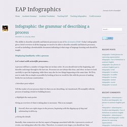
Today’s infographic gives a brief overview of all the language we need to be able to describe scientific and historic processes, as well as including a downloadable document indicating at what stage of language learning each should be taught. Displaying familiarity with a process Let’s start with scientific processes… A process will have a number of stages that are in time order. So you should start at the beginning, and describe each stage through to the last one. 1 Introduce your subject Tell the reader of your process what it is that you are describing. 2 Highlight the main points.
A lesson framework for getting learners to prepare and present infographics. One of the key aims of EAP infographics, along with examining what it means to teach academic English and presenting useful infographics for classroom teaching, is to enhance learning through learners developing their own visuals.
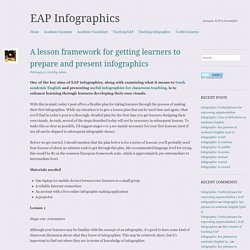
With this in mind, today’s post offers a flexible plan for taking learners through the process of making their first infographics. While my intention is to give a lesson plan that can be used time and again, what you’ll find in today’s post is a thorough, detailed plan for the first time you get learners designing their own visuals.
As such, several of the steps described today will not be necessary in subsequent lessons. To make this as clear as possible, I’d suggest stages 1 to 5 are mainly necessary for your first lessons; most if not all can be skipped in subsequent infographic classes. Infographic: key phrases in academic English (part 1) The ability to use an appropriate academic style is one of the six tenets of EAP.

Today’s infographic is the first in a new series that will show you some of the key phrases that are most commonly used in spoken and written academic English. Wherever you find yourself teaching academic English, and under whatever circumstances this may occur in, the chances are that you will be working to a tight schedule and have a great deal of expectation placed on you. Basically, you’ll have to deliver. It’s important, therefore, that your learners should pick up some language that is used a lot in speaking or writing, that they need to understand, and that they can take out that day and use and actually simulate some fluency in doing so. Infographic: Uses of definitions in academic English. The ability to display familiarity with a concept is one of the six tenets of EAP.
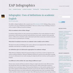
Defining a thing, a person, or an idea is a key part of displaying such familiarity. There are a variety of ways of defining a concept, as well as a number of different reasons for doing so. Why do academic writers define things? In academic writing students are often expected to give definitions of key words and phrases in order to demonstrate to their instructors that they understand these terms clearly. Academic writers generally, however, define terms so that their readers understand exactly what is meant when certain key terms are used in context of a particular piece of writing.
Infographic: Useful phrases for expressing argumentation. Infographic: Past perfect tense. Following on from my triumphant award for the British Council TeachingEnglish ‘Featured blog of the month’, I’m once again in the mood for making another infographic for you all!
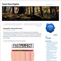
Today’s infographic shows us how to use the past perfect tense. In addition to highlighting the forms of this verb tense, the main functions are clearly explained, with many examples. As usual, I used Piktochart to design the infographic. You can download the original, full size image here (800×2180). Additionally, there are a number of share and embed options available from Flickr here. Finally, you can share the image using the QR code on the right. Infographic: Present continuous tense. British Council Teaching English featured blog of the month for July, 2014.
Infographic: comparative and superlative adjectives. My recent award for the British Council TeachingEnglish ‘Featured blog of the month’ has put me in the mood for making another infographic for you all!
Today’s infographic shows us the various ways of comparing things in English. There are examples to help you clearly understand how we use comparative and superlative adjectives. Also, we see examples of irregular comparative and superlative adjectives. As usual, I used Piktochart to design the infographic. You can download the original, full size image here (800×2277). Additionally, there are a number of share and embed options available from Flickr here. Finally, you can share the image using the QR code on the right. EAP vocabulary: available. EAP vocabulary: area. EAP vocabulary: to analyze. EAP vocabulary: to approach. EAP functional categories: The 6 tenets of EAP. Today’s infographic should be considered an overview of the functional categories that I believe are at the heart of EAP.
Each of the functions shown in today’s infographic, as well as the grammar that flows through them, will be dealt with in much greater detail in future visual representations.