

Pictor.
Graphisme - textures. Graphisme logos. Graphisme blogs. Graphisme icons picto. Typography. Behance. I have NOT read and agree to the terms of use. Generative.app: turn your images into unique illustrations. PDF to CMYK. Information is beautiful. Been getting a ton of requests for ‘how to’s and guides for creating decent visualizations and information designs.
Information is beautiful - Is Beautiful Ideas, issues, knowledge, data - visualized! – agnesdelmotte
Made me think: maybe I could do some workshops in this area.
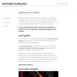
I like developing ideas and working with people. Could be fun! So if you think you’d like to attend a workshop on visualization or organize one for your organisation, please fill in this quick form (30 seconds). In the meantime, you might be interested in a section I’ve been building in a far-flung corner of the site. The most recent one explores the stages we went through creating an infographic for Wired magazine about planets in other solar systems – or “exoplanets”. (Microscopic, dark and unimaginably far away, these tiny celestial objects should be impossible to spot. Here’s how we created it. Timelines: TimeTravel in TV and Film Yup, we went through 36 drafts of this. Pixar vous offre son logiciel pour réaliser vos propres films d'animation. The Innovation of Loneliness. Akiyoshi's illusion pages.
Akiyoshi's illusion pages Akiyoshi KITAOKA, Professor, Psychology, Ritsumeikan University, Osaka, Japan studying visual perception, visual illusion, optical illusion, trompe l'oeil, 3D, etc.
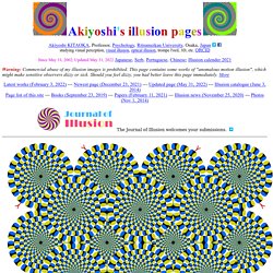
ORCID Since May 18, 2002; Updated August 19, 2021 Japanese, Serb, Portuguese, Chinese; Illusion calender 2021. Danny Haas Crafts Magnificent 'Star Wars' and Superhero Prints [Art. Until the day comes when Shepard Fairey starts making Star Wars posters, Danny Haas' Darth Vader and Boba Fett prints will have to tide you over.
He's got some pretty rad designs, though, and his Yoda, Luke and Han prints would all be transferable to t-shirts in a perfect world.Haas takes a handful of different approaches to his work, which he shares on his own website and sells through his Society6 page. A few of his other pieces are available on shirts and iPhone covers there, including a Fairey-ish series of secret identity hero works featuring Superman, Batman and Iron Man. All this set seems to be missing is a Composite Superman iPhone skin and a Lando Calrissian print (and it should go without saying that a Lando T-shirt done in Haas' style would blow up multiple Death Stars with its awesomeness). Crazy4Cult Art Immortalizes Cult Movies.
InShare0 Billy Perkins' mushroom-cloud-layin' M.F. pays tribute to Pulp Fiction and makes an eye-grabbing cover for the Crazy4Cult: Cult Movie Art book.
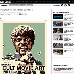
Shepard Fairey's Obey Billboard echoes sci-fi flick They Live's theme. Kenneth Jansson Portfolio. Images by Circos in Publications: Newspapers, Magazines, Books and Journals. Images created with Circos in published literature, except in cases of citations to other software that implements a Circos-like display. One Plain, One Fancy Submission Series by Mat Dolphin.
One Plain, One Fancy is an on-going Mat Dolphin project, inspired by and dedicated to Duffie Thompson. Creative submissions are welcome from everyone. All you have to do is interpret the phrase ‘One Plain, One Fancy’. – agnesdelmotte
Gurafiku: Japanese Graphic Design. Japanese Poster: Hiroshima Appeals.
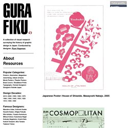
Kenya Hara, Yoshitaka Mizutani. 2017 Started in 1983, Hiroshima Appeals is a yearly poster project in observation of the atomic bombing of Japan in 1945 with the goal of promoting peace at home and abroad. Designer Kenya Hara writes: Ccnerdfactory.wordpress. - home : HELMO. Art of the Menu. About Art of the Menu, is a division of UnderConsideration, cataloguing the underrated creativity of menus from around the world.
**Art of the Menu, is a division of UnderConsideration, cataloguing the underrated creativity of menus from around the world. – agnesdelmotte
Art of the Menu uses Typekit to render Proxima Nova by Mark Simonson and Adelle by Type Together.
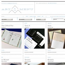
Art of the Menu is run with Six Apart’s MovableType 6.3.2. GEX - The work of Genis Carreras - Philosophy Posters. Clever Negative Space Artworks. Avant Tinder il y avait les cartes de rencontres. Dans la société prude de l’Amérique du 19ème siècle il était difficile de d’aborder des gens du sexe opposé sans se faire mal voir par sa famille et les gens présents.
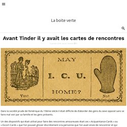
Un des dispositifs qui était utilisé pour faire des rencontres amoureuses était ces « Acquaintance Cards » ou « Escort Cards » que l’on pouvait glisser discrètement à la personne que l’on avait envie de rencontrer et qui portaient des messages qui pouvaient aller de la simple présentation à la proposition la plus explicite. Cartoonist Hergé beyond Tintin - Creative Review. Some 230m copies of Georges Remi’s – aka Hergé’s – Tintin comic book albums have been published worldwide, translated into over 100 languages.
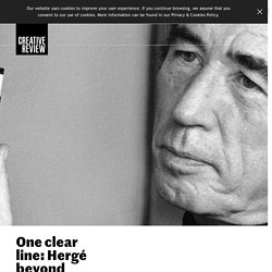
But Hergé also put his name to a considerable amount of commercial work, from illustrations for magazines to poster designs, much of which is now on show in the largest ever exhibition of his original artwork at the Grand Palais in Paris. Remi was 11 years old in 1918 when the First World War ended and he recalled his childhood in Brussels, with the German occupation of Belgium, as “sad and grey”. His home wasn’t particularly happy, either. The young Georges escaped into a world of his own, writing and illustrating stories. But two seemingly unrelated post-war discoveries were to change the course of his life dramatically – the Boy Scouts and the cinema. Georges and his little brother Paul were taken to see the films of Charlie Chaplin, Buster Keaton, Harry Lloyd or Max Linder every week. It wasn’t easy. New York City Transit Authority Graphics Standards Manual. NASA Graphics Standards Manual.
"A driving force and the use of innovative techniques and ideas have brought NASA the image of a get-it-done agency, and the record backs up the reputation.
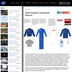
As we move ahead to an even more exciting era in aeronautical research and space exploration, we have added a new tool to enhance and symbolize the progressive path we have always followed. Le guide de style graphique de la Nasa des années 70. Depuis quelques semaines un guide graphique de la Nasa de l’époque où elle avait son logo affectueusement comparé à un ver a refait surface sur Flickr.
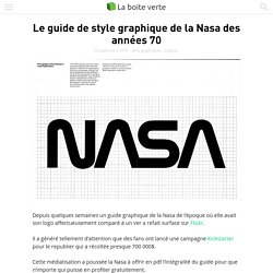
Il a généré tellement d’attention que des fans ont lancé une campagne Kickstarter pour le republier qui a récoltée presque 700 000$. Cette médiatisation a poussée la Nasa à offrir en pdf l’intégralité du guide pour que n’importe qui puisse en profiter gratuitement. Vous pouvez le télécharger ici. C’est le studio Danne & Blackburn qui avait imaginé cette identité visuelle distinctive en 1974 et le guide explique par l’exemple comment l’appliquer de manière consistante à toutes les facettes de l’agence spatiale, des voitures aux en-têtes du papier à lettre en passant par les avions, les voitures et les panneaux d’affichages.
Il est resté utilisé jusqu’en 1992.