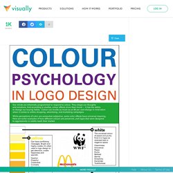

Color Psychology in Logo Design. COLOUR PSYCHOLOGY IN LOGO DESIGN Our minds are inherently programmed to respond to colour.

They shape our thoughts and emotions. And according to studies, colour affects more than mood — it has the ability to change our buying habits. Colour can invoke as much as an 80 per cent change in motivation when it comes to online shopping, advertising, and marketing campaigns. While perceptions of color are somewhat subjective, some color effects have universal meaning. Here are some examples of how different colours are perceived, and logos that were designed to aggressively or subtly reach their market. ->white The universal colour of peace and purity. Cleanliness Innocence Peace Purity Refined Sterile Simplicity Surrender Truthfulness ->yellow Can have conflicting messages Bright and highly visible, it’s often used in logo design to get attention, create happiness and warmth.
Caution Cheerful Cowardice Curiosity Happiness Joy Playful Positivity Sunshine Warmth McDonald’s -> red. Color Theory for Designer, Part 3: Creating Your Own Color Palettes. Advertisement In the previous two parts of this series on color theory, we talked mostly about the meanings behind colors1 and color terminology2.

While this information is important, I’m sure a lot of people were wondering when we were going to get into the nitty-gritty of actually creating some color schemes. Well, that’s where Part 3 comes in. Here we’ll be talking about methods for creating your own color schemes, from scratch. We’ll cover the traditional color scheme patterns (monochrome, analogous, complementary, etc.) as well as how to create custom schemes that aren’t based strictly on any one pattern. A Quick Review Let’s start with a quick review of what was covered in parts 1 and 2. An Introduction to Color Theory for Web Designers. 50 Beautiful Color Palettes for Your Next Web Project. Choosing the right color scheme is essential to your website’s success.
Your layout and other design choices — including font — should be developed in concert with your color scheme, which can ensure readability, cohesiveness, and beauty in the final product. Unfortunately, making that choice or creating a color palette from scratch can be quite the challenge. That’s why for today’s post I’ve put together a collection of 50 beautiful color palettes that are ready to use for your next web project. If you like these, check out another 24 palettes I’ve recently rounded up. Getting the Most Out of This Post Before diving into the color palettes I’ve collected, I want to mention a few tools that can help you get the most out of this post. Editor’s Note: Want to make your own palettes even better?
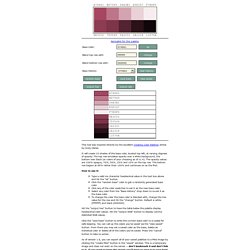
Remember that Photoshop will display certain colors far more vibrantly than they will look on the web when you use hex codes. That’s all. Pick Your Palette Bonus Resources! Color Palette Generator. Color palette creator v1.6.1. This tool was inspired directly by the excellent Creating Color Palettes article by Andy Clarke.

It will create 10 shades of the base color, located top-left, at varying degrees of opacity. The top row emulates opacity over a white background, the bottom over black (or colors of your choosing as of v1.4). The opacity values are 100% opaque, 75%, 50%, 25% and 10% on the top row. The bottom row begins at 85% rather than 100% and continues on as the first.
How to use it: Type a valid six character hexidecimal value in the text box above and hit the "ok" button. Hit the "output hex" button to have the table below the palette display hexidecimal color values. Click the "save base" button to write the current base color to a cookie for safe keeping. As of version 1.6, you can export all of your saved palettes to a PNG image by clicking the "create PNG" button in the "saved" window. COLORTHEORY_A.jpg (1054×1600) Ct_1440.jpg (Imagem JPEG, 1440x900 pixéis) Color Scheme Designer 3. Color Advice and Insights from the Experts - Sensational Color.