

Lightning fast wireframing in Sketch. Simplified Mobile Authentication with OAuth2, SAML, LDAP, and More. FAQs How does this work?
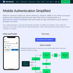
This template is integrated with Kinvey, one of our sister products at Progress. Kinvey is a top ranked Backend as a Service product with many other features besides identity connectivity. La-voix-un-outil-de-travail. Ford-veut-permettre-aux-passagers-malvoyants-de-toucher-le-paysage. Google is Designing An Advanced Hand Gesture Recognition Sensor. CA Technologies France Webcast Channel. Les entreprises adoptent les dernières technologies et méthodologies en matière de développement afin de livrer des applications et fonctionnalités innovantes qui répondent aux attentes de leurs clients et exigences du marché.
Heatmaps, Visitor Recordings, Conversion Funnels, Form Analytics, Feedback Polls and Surveys in One Platform. Why You Should Never Center or Right Align Your Logo. Many designers assume that center or right aligning their website logo will make their brand more memorable.
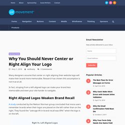
Research has shown this assumption is not true at all. In fact, straying from a left aligned logo can make your brand less memorable and even your site harder to navigate. Right Aligned Logos Weaken Brand Recall A study conducted by the Nielson Norman group concluded that more users remember brands when their logos are placed on the left rather than on the right. They found the “average lift in brand recall was 89%” when the logo is on the left. When users scan sites, their visual gaze leans toward the left. Centered Logos Impede Navigation to Homepage The Nielson Norman group also did a study on center aligned logos. Not only that, but they also impede the user’s ability to navigate to the homepage. Users have a conditioned habit of clicking the leftmost element to get to the homepage. Mouvement Wallon pour la Qualité - Portail MWQ. Le groupe AFNOR propose un outil pour mesurer la qualité de l'expérience client, notion intangible, subjective et liée à l'émotion ressentie avant, pendant et après un achat.
Indiko Expérience client s'appuie sur les travaux du Cercle Performance des Organisations de la Fondation Paris-Dauphine. Connu pour les normes volontaires qu'il publie, ses activités de formation et certification, le groupe AFNOR propose également des études sur la mesure de la qualité de l'expérience client, selon un modèle novateur. Les directives AnySurfer - AnySurfer. Tutorial: The Art of UX Sketching. If you’ve done any sort of serious creative work, you are all too familiar with creative block.

It feels like hitting a brick wall: None of the ideas you’re able to visualize are good enough, or can’t work in real life. For designers, the feeling is all too familiar. However, like any complicated problem with no clear solution, a smart process can make all the differences. This is where UX sketching comes in. UX sketching is a crucial, yet often overlooked, aspect of user-experience design. Sketch Studios for Better Interface Design. I’m a collaborator.
I like to get multiple heads on a project to see what insight and perspectives they bring that can build on mine. So naturally, one of my go-to activities to get a project off the ground is running a sketch studio. Sketch studios are a collaborative exercise where the project team designs and iterates an interface together in a structured format. Applying human-centered design to emerging technologies. When you dream of the future, what do you see?
Do you dream about concurrent odometry or horizontal plane detection? Do you fantasize about hot words and utterance capture? Probably not. Most likely, when you dream of the future, you imagine the places you can go, the things you can do, and the people you can be… just like you did when you were a kid. Earlier this year, Google Play approached IDEO to find out what emerging technologies like Virtual Reality, Augmented Reality, digital assistant, and ephemeral apps (apps that you don’t have to download and install) may actually be good for. Since humans are at the center of IDEO’s design work, we started by talking to people and asking questions about their hopes for the future of these technologies.
We spoke to creators and stakeholders of these four technologies (experts, artists, and developers), as well as people ranging from elementary school kids to early adopters and technophobes. Here are highlights of what we heard: Behance. Le « nudge » influe sur nos comportements. Prototypes d'applications mobiles : l'outil ultime! Our Symbols guidelines in Sketch: Move fast and don't break things. Okay, maybe this is a bit dramatic.
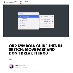
A meeting with the previous designer usually sorts most things out, but let’s be honest: it’s not a bullet-proof system. Especially when your team designs multiple design systems a year, it’s important to have every designer on the same page on how to organise things, regardless of the project they’re working on. “What are the components used in this design? How do they behave?” “Where can I find this symbol?” The goal Our goal was to define an approach on how to set up and organise symbols. With the guidelines we eventually defined, any of our designers is able to hit the ground running when they’re assigned to, for example, design the UI of a new feature for an existing product. Framer - The Complete Guide to Wireframing. Though wireframes and prototypes are often used interchangeably, they actually perform two distinct functions at opposite ends of the design cycle.
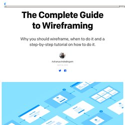
In this guide, we’ll share everything you need to know about: Wireframing vs. Prototyping Wireframing Tools and Tips 4 Steps to Create Your First Wireframe Wireframing Resources Wireframing vs. Prototyping Wireframes are the backbone of any project and generally created during the early stage ideation phase.