

Tirages format Polaroid gratuits depuis iPhone. SVG PORN. Download Free Vectors, Photos, Icons, PSDs and more - 1001FreeDownloads.com. HEMA Paasactie. UX REACTIONS. Creative Cards. House Of Borel. Secret 2 Timeless Fashion changesbut style endures.

House of Borel designs are inspired by classic shapes and given an unexpected modern touch that makes them so distinctive. secret 3 Attention todetail andcraftsmanship are the essence of our design. Secret 4 From usingorganic leathersto investingin small family-owned businesses, House of Borel wishes to contribute to making the world a better place by carefully choosing how our products are made and selecting where the components come from. secret 5 travel every city is aHouse of Boreldestination Our brand travels seamlessly across the globe.
Secret 6 From conceptionto creation. 26 nouveaux PSD gratuits pour l'arrivée du printemps. 20 Cool Resume & CV Designs. Resumes are the gateway to most jobs, they provide employers with information about you and what you have achieved.

As you’ll know, it’s imperative your resume is pitch perfect to improve your chances of getting that dream job. Here we have a selection of some awesome resume designs that are targeted at the design and creative industries. Author Oliur Rahman Founder & CEO of UltraLinx oliur.com. Chrome Experiment #1000. CSS3 perspective-origin property. Playful Trampoline Effect. A little playful content navigation effect that uses the draggable Elastic Stack and Snap.svg for animating a background shape like a trampoline.
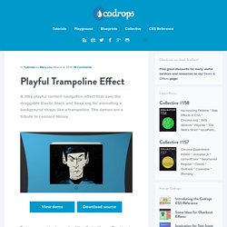
The demos are a tribute to Leonard Nimoy. View demo Download source Today we want to share a fun little effect with you. The idea is to simulate the bounciness of a trampoline when navigating the image stack. For the draggable image stack we are using the Elastic Stack. The demos and the Dribbble shots used in them are a little tribute to Leonard Nimoy who passed away last week. Have a look at the tutorial on the Elastic Stack to understand how it works. The first element in the body will be the SVG shape that we’ll morph from a rectangle to a squeezed rectangle whenever we navigate. The initial rectangular shape is the one defined in the path of the SVG, and the squeezed shape we morph to is saved in the data-morph-next. The markup for the stack is the following: The morph shape needs to be stretched over all the page: And that’s it! Ink in the watter. Reimagines the In-Car Cluster.
It’s been a few months since our five-part blog and ebook was released and we’re delighted with all the responses and feedback generated.
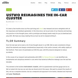
In the time since, we’ve put some of our theories and learning into practice in this thought-piece, with a prototype and design assets ready for you to download and play with. We hope you enjoy reading this as much as we’ve enjoyed writing it. TL;DR Summary Over the last year we’ve seen a lot of new thought about in-car HMI. We’ve seen considered critique about the elements and design considerations (especially in the centre console), with safety rightly at the forefront. In the course of our research and partnership with CDR (Car Design Research), we identified one fundamental and ubiquitous element in cars which has lacked an effective redesign over the last few decades. This element is the humble instrument cluster, with its speedometer and fuel gauge and so on.
Our Hypothesis Video Demo. An Interactive Visualization of NYC Street Trees. About We were curious to see what were some of the common and not so common trees planted in the five boroughs of New York City.
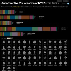
While this visualizes trees which we personally love as an essential element of any urban city, we see this as an experiment or model to visualize other datasets in an additive/subtractive format. This visualization allows one to quickly see distribution. Trees in the Bronx and Manhattan seem to be distributed more uniformly compared to the other three boroughs. With such high concentrations of certain trees, there is a risk of a pathogen, insect or environmental stress wiping out a large amount of trees. Trees have been grouped by genus. Concept & Design: Cloudred | Programming: Cristian Zapata. Zero element loading animations · MadebyMike. 05 Jan 2015 With a "zero element" loading animation, a loading state can be applied to any element with just the addition of a class name.
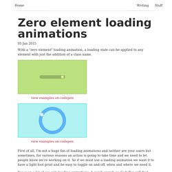
First of all, I'm not a huge fan of loading animations and neither are your users but sometimes, for various reasons an action is going to take time and we need to let people know we're working on it. So if we must use a loading animation we want it to have a light foot print and be easy to toggle on and off, when and where we need it. I've seen a lot of css only loading animations. A quick search on CodePen will find thousands of examples. There are definite benefits to css only solutions such as improving the number of network requests, page weight and animation performance. Perhaps slightly more practical are the "single element" examples.
After all loading is a "describing word", it indicates the state of something and is not an object itself. I eventually settled on a solution that works almost everywhere. How it works. Lapka x Project Ara.