
Rainscreens. Despite the growing popularity of rainscreen systems, we find that most people don’t know much about them and don’t understand why they are important to architecture.

Like most innovative building systems it was the Europeans that first introduced the concept. One of the first examples we remember seeing is the IRCAM music school completed in Paris in the late 70’s by Renzo Piano. In the last decade we’ve noticed a growing interest and use of raincreens on buildings and houses here in the northwest. The concept of a rainscreen is to create an air gap between the siding material and the water-proof surface. This allows the structure to breathe a bit. 1. Okay, let’s get to some examples around the Seattle area: Seattle Orthopedic Center at 2409 N 45th St The project seems to use the Fincolorply system, or something very close to it. [Photos by BUILD llc] The William H. [Photos by Swiss Pearl] Camano Cabin on Camano Island The residence uses steel cor-ten panels as its rainscreen. Dr. Beach Walk House / SPG Architects.
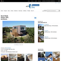
Architects: SPG Architects Location: Fire Island, New York, USA Project Year: 2011 Photographs: Jimi Billingsley & Daniel Levin Project Area: 4637.5 sq ft Participant Designers: Caroline Sidnam, Eric Gartner General Contractor: Kenneth E.

Larson Construction Landscape Architect: Robin Key Landscape Architecture This Fire Island house is located directly behind beach-front dunes. The strict requirements of both FEMA and local codes regarding height, lot line, setbacks, and site coverage; the proximity of neighbors; and very specific view corridors all presented a host of challenges. Our response was to create a dynamic composition of three intersecting rectilinear forms, which is rotated on the site off the prevailing grid. The center volume, clad in horizontal wood siding, houses bedrooms & baths and provides roof decks for the living level.
William Reue Architecture. A House in the Woods was selected for the 2013 High Honors Design Award by AIA Westchester Hudson Valley.

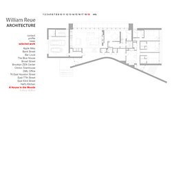
The project is a single-family home located on a densely forested 8.5 acre lot at the base of the Shawangunk Mountains. The 4800 SQFT residence is the result of the studied relationship between two opposing geometries – a long sculptural wall clad in Cor-Ten weathering steel and a mass of stratified bluestone that appears to have emerged from the boulder-strewn earth. Locally-sourced materials and strategic siting stitch the house into the natural world while contributing to its sustainability for the modern one.
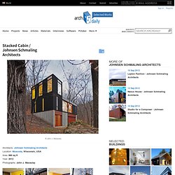
The design for A House in the Woods was grounded in the owner’s desire to build an artful home that responded to her values of order, beauty, and environmental stewardship. The structure’s uncomplicated geometry is enriched by the boldness of its materials, resulting in a balanced composition that is both sensuous and refined. Modern windows. Stacked Cabin / Johnsen Schmaling Architects. Architects: Johnsen Schmaling Architects Location: Muscoda, Wisconsin, USA Area: 880 sq ft Year: 2012 Photographs: John J.

Macaulay This modest, 880 square-foot cabin for a young family sits at the end of an old logging road, its compact volume hugging the edge of a small clearing in a remote Wisconsin forest. The tight budget required a rigorously simple structure. In order to minimize the building’s footprint and take advantage of the sloped site, the horizontally organized components of a traditional cabin compound – typically an open-plan longhouse with communal living space, an outhouse, and a freestanding toolshed – were reconfigured and stacked vertically.
Nexus House / Johnsen Schmaling Architects. Architects: Johnsen Schmaling Architects Location: Madison, Wisconsin, United States Project Year: 2012 Project Area: 2,000 sq ft Photographs: John J.

Macaulay The Nexus House, a compact home for a young family of four, occupies a small site in University Heights, a historic residential district in Madison with iconic homes by Louis Sullivan, Frank Lloyd Wright, Keck & Keck, and many others. Successfully contesting the local preservation ordinance whose strict guidelines advocated stylistic mimicry while failing to recognize the neighborhood’s rich architectural diversity, we designed a quiet but unapologetically contemporary building, its formally restrained volume discreetly placed in the back of the trapezoidal site, where it avoids direct visual competition with its two dignified neighbors, a hundred-year old Spanish Colonial home and the Ely House from 1896, a cherished landmark on the National Register of Historic Places.