

Font Men - SXSW 2014 Official Documentary Short Selection on Vimeo. The Good, The Bad And The Great Examples Of Web Typography. Advertisement Choosing typefaces is an integral part of every web design project.
With thousands of typefaces available from hosting services such as Typekit, as well an ever-improving collection of free fonts1 available, there has never been a better time to be a typography-obsessed web designer. One could easily argue that nothing affects a design more than typography. And good typography starts with choosing an appropriate typeface. But can having too much choice be a bad thing? In this article, we’ll review a collection of beautiful websites and analyze the impact that their designers’ typeface choices have had on the overall designs. Vesper Hotel Domaine Display2, a curvy and ornate display typeface from New Zealand-based type designer Kris Sowersby143, makes for a beautiful combination with Proxima Nova344 on Vesper Hotel5’s website. I also love when a brand is able to use a web font for its logo. Dragone Sometimes when text is set on top of images like this, legibility suffers.
TEFF Lexicon – The World’s Most Expensive Typeface → Typewolf. August 12, 2014 I first encountered TEFF Lexicon when type designer Kris Sowersby chose it as one of his top three favorites typefaces.
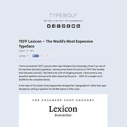
Having never heard of Lexicon or TEFF (the foundry that released Lexicon), I decided to do a bit of Googling around. I discovered a very beautiful typeface, but was a bit taken aback by the price — $391 for a single cut or $4,996 for the complete family. In the days of Ten Dollar Fonts (apparently designed by “typographers” rather than type designers), selling a typeface for $4,996 seems a little crazy… Lexicon sample sheet. How Much Should a Typeface Cost? The easy answer is a typeface should cost however much someone is willing to pay for it. Ten Dollar Fonts price their fonts cheaply with the hopes of making their products more accessible to the masses (and hopefully getting more sales). Game about Squares. Gotham Fonts. Gotham.
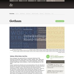
What letters look like. Every designer has admired the no-nonsense lettering of the American vernacular, those letters of paint, plaster, neon, glass and steel that figure so prominently in the urban landscape. From these humble beginnings comes Gotham, a hard-working typeface for the ages. Gotham celebrates the attractive and unassuming lettering of the city. New York is teeming with such letters, handmade sans serifs that share a common underlying structure, an engineer’s idea of “basic lettering” that transcends both the characteristics of their materials and the mannerisms of their makers. Gotham is that rarest of designs, the new typeface that feels somehow familiar. Now in Four Widths Designers asked if Gotham could take on new typographic roles, and we listened.
Gotham ScreenSmart: High Performance Webfonts. A Dao of Web Design. What Zen was to the 70’s (most famously with motorcycle maintenance), the Tao Te Ching was to the 90’s.
From Piglet and Pooh to Physics and back, many have sought sense in applying the Tao Te Ching to something (the Tao of Physics), or something to the Tao Te Ching (the Tao of Pooh). It can be a cheap trick, but lately it has struck me that there is more than a little to be understood about web design by looking through the prism of the Tao. Article Continues Below Daoism is a philosophy, like Buddhism, a way of living, of being in the world, which stems from a text of great antiquity, the Tao Te Ching, whose 81 “chapters” enigmatically sweep across human experience, but with a strong common theme, that of harmony.
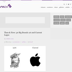
For the last couple of years, for better or worse, my life has revolved more than a little around style sheets. What I sense is a real tension between the web as we know it, and the web as it would be. Same old new medium? Controlling web pages#section3. Shape. Then & Now: 30 Big Brands 1st and Current Logos. 31 Mar 2014 | 3 comments | 15 likes | in found The history of the logos was collected from Logopedia Found is our way of sharing the best articles, resources and tutorials that find their way to the eyeballs of the CSSDA crew.
Junction.