

Grande2.jpg 2,040×1,042 pixels. 40 maps that explain the world. By Max Fisher By Max Fisher August 12, 2013 Maps can be a remarkably powerful tool for understanding the world and how it works, but they show only what you ask them to.
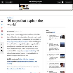
So when we saw a post sweeping the Web titled "40 maps they didn't teach you in school," one of which happens to be a WorldViews original, I thought we might be able to contribute our own collection. Some of these are pretty nerdy, but I think they're no less fascinating and easily understandable. A majority are original to this blog, with others from a variety of sources. I've included a link for further reading on close to every one. [Additional read: How Ukraine became Ukraine and 40 more maps that explain the world] Click to enlarge. 15 famous logos that have hidden meanings. The key to a good logo is making it "distinctive, memorable, and recognizable", according to designer Lo Min Ming, who's worked for the likes of Google, DropBox and Microsoft.
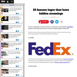
But some of the most famous logos in the world, and others a little less well known, have hidden meanings which make them that little bit extra special. Che significa la freccia gialla di Amazon? 10 messaggi nascosti nei loghi più famosi al mondo. Watch This Video & You’ll Never Eat McDonald’s French Fries Again. Via Collective Evolution Michael Pollan is an author, activist, journalist and professor of journalism at the UC Berkeley Graduate School of Journalism.
He mainly focuses on the industrial food chain with regards to his research. He emphasizes how cooking is one of the simplest and most important steps people can take to improve their family’s health, build communities, help fix our broken food system and perhaps most importantly, break our growing dependence on corporations. Michael Pollan is a food activist and you can find out more about him and his work by clicking here. In the video below he illustrates how McDonald’s insists on using Russet Burbank Potatoes, a potato in America that is unusually long and difficult to grow. They further insist that their potatoes have no blemishes at all, which is hard because these potatoes commonly suffer from what is referred to as Net Necrosis, which causes unwanted spots and lines on the potatoes.
Globalisierung_dimensionen.gif 598×342 pixels. 4fef42cce4d776.65921275.undefined 803×510 pixels. Globalisation_negative.jpg 800×400 pixels. Fig18.jpg 539×368 pixels. 10 Shocking Facts about McDonald’s. Whether you love it or hate it, there’s no denying the success of McDonald’s. 74 years after the fast-food company first started serving customers in California, McDonald’s now has over 34,000 restaurants operating in 119 countries around the world.
Worth almost $40 billion, it is the sixth most valuable brand in the world. Over the years, the chain has been criticised for contributing to the obesity epidemic, damaging the environment, exploiting child labour, failing to pay fair wages to its employees, targeting children in its advertising campaigns and indirectly causing animal cruelty. Documentaries like “Super Size Me” and books such as “Fast Food Nation” have exposed the negative side of the company. We Have Been Misled By An Erroneous Map Of The World For 500 Years. 40 Maps That Will Help You Make Sense of the World - Combination of Science and Networking. If you’re a visual learner like myself, then you know maps, charts and infographics can really help bring data and information to life.
Maps can make a point resonate with readers and this collection aims to do just that. Hopefully some of these maps will surprise you and you’ll learn something new. A few are important to know, some interpret and display data in a beautiful or creative way, and a few may even make you chuckle or shake your head.See Also 10 Maps That You were not Taught in High Schools 1. Where Google Street View is Available 2. 3. 4. Pangea was a supercontinent that existed during the late Paleozoic and early Mesozoic eras, forming about 300 million years ago. 5. 6. 7. 8. 9. 10. 11. 12. 13. 14. 15. 16. 17. 18. 19. 20. The world's most controversial logos - Business News - Business - The Independent. London 2012 The logo for London 2012, which was designed by Wolff Olins to the tune of £400,000, was lambasted for its quirky and jagged design from the moment of its first unveiling.
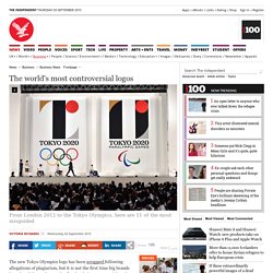
Ubiquitous, going on to be used for the first time for both the Olympic and the Paralympic Games, it nonetheless fell flat – with 80 per cent of people in a BBC poll giving it the lowest score in terms of popularity. Indeed, when it was first revealed in 2007, Lord Coe admitted it wouldn't "be to everybody's taste immediately", but insisted that it was "not a logo, it's a brand that will take us forward for the next five years". He also said it represented the 2012 commitment to "reach out and engage with young people".