

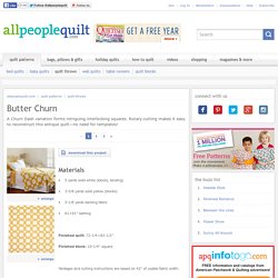
Butter Churn. Download this Project Materials • 5 yards solid white (blocks, binding) • 3-5⁄8 yards solid yellow (blocks)
The ultimate color combinations cheat sheet. Finding a correct color combination is one of the most important steps in designing a stylish and holistic look.

This is why we’re offering you this cheat sheet, so you’ll always hit the bullseye when choosing clothes and interior decor. Scheme № 1: A complementary combination Complementary (also known as supplementary or contrasting) colors are colors that sit opposite of each other on the Itten color circle. The combination of such colors creates a vivid and energizing effect, especially at maximum saturation. Scheme № 2: The triad — a combination of three colors. Exuberant Color.
SPLASH OF COLOR by Jackie Kunkel. Hello all you wonderful blog hoppers.
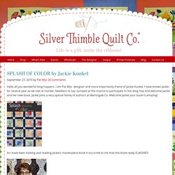
I am Pat Wys designer and more importantly friend of Jackie Kunkel. I have known Jackie for several year as we met at market. Needless to say I jumped at the chance to participate in this blog hop and welcome Jackie and her new book. Jackie joins a very special family of authors at Martingale Co. Welcome Jackie your book is amazing! Quilting Club - Use B&W to Improve Designs. Christinebarnes.com. This Pink Ribbon Quilt Is A Great Way To Show Support! Learn To Make It Here. How to Pick Quilt Color Combinations That Are Right for You - The Craftsy Blog. Do you have a hard time picking out quilt color combinations?

Do you enjoy seeing the pretty work of others, but have a hard time choosing your own quilting color schemes? Try these four tried and true methods for putting together color selections, often called “color stories,” to help you find that perfect color combo! Find the quilt color combination that’s right for you with these simple tips! 1. Start with a focus fabric. This is perhaps the easiest way to pull together a color scheme that works. For example, look at the first fabric shown in the bundle below. Moda Honeysweet by Fig Tree & Co. 2. Choosing Between Black and White Quilt Backgrounds. Color Play: Our Top Rust-Inspired Quilt Kit Picks.
Looking to infuse more color into your quilting projects, but not sure where to start?

We’ve done the heavy lifting for you! In our Color Play series, we show you how to masterfully mix color in unexpected ways and achieve beautiful results when considering fabric selection. Read below for this month’s most inspired color trends! With the holidays long gone, and your vacation days stored up for May, you might be looking for ways to indulge that don’t involve breaking the resolutions you’ve worked so hard for last month. Now is the time to make yourself something luxurious: Enter rich jewel tones and opulent textures. Not quite orange, and not quite brown, rust is a shade of red that happens in nature when iron is exposed to oxygen and moisture for long periods of time.
Diamond Life Table Runner Dine in stylishly this season with a lush, stunning table runner. Buy the Diamond Life Table Runner Quilt Kit here. Quilting Ideas: Quilting Color Principles Part 2. How do you choose colors for your quilts?
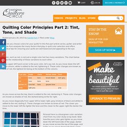
In this five-part article series, quilter and writer Carole Fure analyzes the many factors that play in quilt color selection and offers practical tips for ensuring your quilts are well-balanced and appealing to the eye. A color, such as red, is not just a single color but has many variations. The chart below shows the relationship of these variations to each other. In the upper left hand corner is the pure color, let’s say red. As you move down the left hand column, white is added to the red, lightening it. As you move across the top, black is added to the red, darkening it.
As you move diagonally from upper left to lower right, gray (mixture of black and white) is added to the red, dulling it. Pictured here is a blue/green color variation chart from my color study scrap book. Now let’s go back to the dinner party analogy we discussed in Part 1. Quilting Ideas: Quilting Color Principles Part 1. How do you choose colors for your quilts?
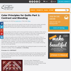
In this five-part article series, quilter and writer Carole Fure analyzes the many factors that play in quilt color selection and offers practical tips for ensuring your quilts are well-balanced and appealing to the eye. Color is the calling card of the quilt. It is the spark that catches our attention. If the color is appealing we will move in to take a closer look. However, if the color is unattractive, we walk on by, not noticing the creativity, design, and workmanship of the quilt. Quilting Ideas: Quilting Color Principles Part 3. How do you choose colors for your quilts?
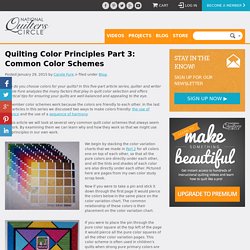
In this five-part article series, quilter and writer Carole Fure analyzes the many factors that play in quilt color selection and offers practical tips for ensuring your quilts are well-balanced and appealing to the eye. Remember color schemes work because the colors are friendly to each other. In the last two articles in this series we discussed two ways to make colors friendly: the use of balance and the use of a sequence of harmony. AQ - Karen Comb's Quilt Illusions. Essential Guide to Modern Quilt Making Series: Principles of Color. Susanne Woods, publisher with Lucky Spool Media, compiled the Essential Guide to Modern Quilt Making as an all-inclusive guide.
Through the guide’s 10 workshop chapters, expert quilters teach you modern quilt making design principles, providing support as you practice a variety of piecing techniques, play with negative space and enjoy 16 new patterns. Instructors like Denyse Schmidt, Jacquie Gering and Angela Walters share the pages with over 250 beautiful photographs and more than 100 additional illustrations, guiding you through the elements of modern quilt design and construction.
Choosing Quilt Colors, and the Art of the Color Wheel. View All Articles » Color is one of the most important aspects of quilt design.

While there are infinite variations possible, it's important that quilters think about how to effectively use the right colors to create visual appeal within their quilts. While sometimes colors work well together - bringing balance and contrast to the quilt design; other times they don't, resulting in a project that's not quite as beautiful as desired. Focus On Neutrals! Often times I will refer to “NEUTRALS” as a background, and I know it leaves some confused….especially those who know English as a second language. Or those who are so used to “Light/Medium/Dark” in their thinking- When using the term “NEUTRAL” I am referring to the “GROUND COLOR” that my background fabric is printed on. Neutral backgrounds mean I want the main fabric to read as white, cream, beige or tan.
Blue Nickel Studios » Blog Archive » Day One #12DaysofColor. Admin December 11th, 2013 Finally the big day is here! The first of 12 Days of Color!