

Music Hall in Algueña / Cor & Partners. Architects: Cor & Partners / Miguel Rodenas + Jesús Olivares Location: Algueña, Valencia, Spain Client: Algueña Town Council Project Year: 2011 Photographs: David Frutos Algueña is a small village in the interior of Alicante County, with a population of two thousand and an economy based in agriculture and marble industries.
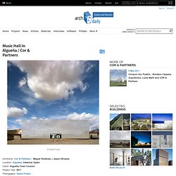
We were asked for a building able to bring together all the activities related to music and culture that took place in the village, and also promoting its cultural future. We were commissioned to search for an opportunity, articulate it and carry it out. Under these circumstances, that also comprised the definition of an extensive musical schedule of activities and a maximum budget of 562.800 €, we proposed in a first phase the rehabilitation of old Guardia Civil’s quarter that was in disuse since the 80s.
Library and auditorium for the University of Amiens / Serero Architects. Serero Architects’ winning design for a library and auditorium for the University of Amiens incorporates a wooden “smart skin” that controls the internal space ambiance and frames views.
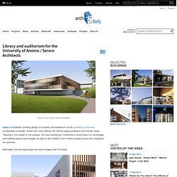
Resting in the middle of the campus, the new building will “constitute a central place for exchanges and meeting around technologies as well as the catalyst of an intense campus social life” explained the architect. More about the winning design and more images after the break. Both the library and auditorium are at the same level as the central garden, and the auditorium’s sloped floor follows the natural landscape of the site. A reception hall ties these two volumes together and acts a transition space from the lower level of the site to the garden. The architectural and technical devices (lighting system, ventilation, furniture, façade) are placed on a regular grid of 1.80m x 7.20m, helping the library offer a more opened and flexible interior space. Competition First Prize Winner Floor Area : 1424 m²
M+ / HAHN Design. Architect: HAHN Design / Hahn Joh Location: Gangnam-gu, Seoul, Korea Client: Jeonghun Oh Design Team: HAHN Design (Hahn Joh/Deokjae Kim/Jinhyung Cho/Wonseok Kim/Sehee Lee) + NC Partners (Jongwon Seo) Consultant: NC Partners(Struct.), Doul Int.
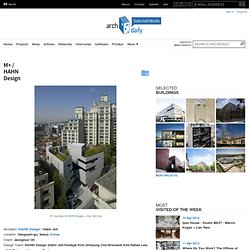
Eng. (MEP) General Contractor: Youngchun Construction Site Area: 611.5 sqm Building Area: 345.97 sqm Total Foor Area: 1,269.63 sqm Project Year: 2007-2009 Photographs: Courtesy of HAHN Design + Soo Ok Chai M+ is a building located at the resonating border/liminal space where heterogeneous urban elements such as super-luxury residential skyscrapers, dilapidated low-rise housing, houses converted into offices, and offices that double as residences all collide and interact. M+ is a process of discovering the ever renewing relational possibility within this liminality. Library + Restaurant + Multifunctional Space / BOB361 Architects. Architects: BOB361 Architects Location: Dendermonde, Belgium Project Team: Goedele Desmet, Ivo Vanhamme, Jean-Michel Culas Collaborators: Gunther Slagmeulder, Ward Verbakel, Annelies Augustijns, Annelies Staessen, Nathan Ooms, Griet Moors Interior Architect: Venlet interior architecture – danny venlet Structural Engineer: BAS – dirk jaspaert- kathleen mertens Environmental Engineer: Daidalos – filip descamps Acoustic Engineer: Daidalos – paul mees Hydraulic & Mechanical Engineer: BBT – guido neuhard Project Area: 6,300 sqm Budget: 8,500,00.00 Euro Project Year: 2003-2010 Photographs: André Nullens The building site is situated between the main road of the city of Dendermonde and the green bank of the river Dender.
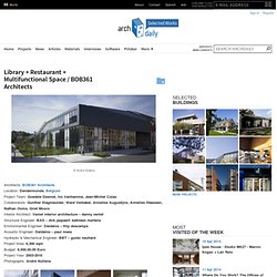
Three urban strategies lead to the creation of a new connection of these two contrasting atmospheres. The historical fortifications are transformed into a greenbelt around the centre of the city. The passage gives the building four active façades. Sustainability. Mixed Use Center in Zhangjiagang / ATKINS - Mixed Use Center in Zhangjiagang / ATKINS (144700) - ArchDaily. Mixed Use Center in Zhangjiagang / ATKINS. Vallecas 48 / Auriens Arquitectura. Vallecas 48 was the winner of a contest organized by the EMVS of Madrid.
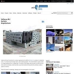
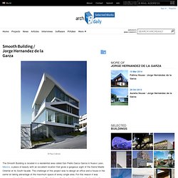
It contains 41 residential units, 41 commercial and storage space, and 42 parking spaces. The study decided to group homes in a single building with an L-shaped plan. The result is two bodies that are joined, one flies over the other and the road below, while the other volume falls behind forming what the architects called a “game of volumes.” Follow the break for renderings, drawings and more photographs of this project. The separated volumes converge to create access to an interior courtyard . Smooth Building / Jorge Hernandez de la Garza. The Smooth Building is located in a residential area called San Pedro Garza Garcia in Nuevo Leon, Mexico, a place of beauty with an excellent location that gives a gorgeous sight of the Sierra Madre Oriental at its South facade.
Mixed Use Tower / Moho Architects. Spanish firm Moho Architects are currently in the schematic design phase of a mixed use tower for San Jose, Costa Rica.
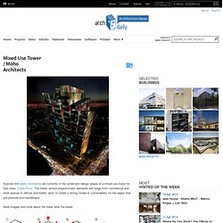
The tower, whose programmatic elements will range from commercial and retail spaces to offices and hotels, aims to create a strong model of sustainability for the region that will promote eco-friendliness. More images and more about the tower after the break. The building’s form is conceived of as independent strips that begin to peel away from each other as the tower rises. Voids are punched through the form to create viewing platforms and a space to add greenery. Lincoln Mixed Use / Meridian 105 Architecture. Chad Mitchell, president of Denver based Meridian 105 Architecture, has shared with us his proposal for a planned mixed use complex in downtown Denver Colorado.
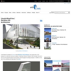
After the break, be sure to look over the proposed passive wall systems used throughout the design proposal in addition to the rest of the renderings and description from M1A. Lincoln Mixed Use is a design proposal for an urban mixed-use complex planned for Denver, Colorado, consisting of a hotel, retail, parking structure, restaurant, and movie theater. The building is sited on a transition lot between high-rise residential and a primary commercial corridor running through the city. Faced with the challenge of bridging these two zones, the design makes use of internal circulation, crossing the site and easing visitors through the various program elements. Deep retail spaces take advantage of natural light with repetitive skylights and atriums, minimizing electrical lighting loads by taking advantage of daylighting. AD Round Up: Mixed Use Part VI.
For our sixth selection of previously featured mix-used projects we have some great designs from last year.
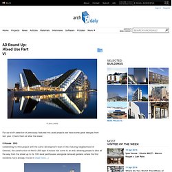
Check them all after the break! 8 House / BIG Celebrating its third project with the same development team in the maturing neighborhood of Orestad, the construction of the 61,000 sqm 8 House has come to an end, allowing people to bike all the way from the street up to its 10th level penthouses alongside terraced gardens where the first residents have already moved in (read more…) M+ / HAHN Design M+ is a building located at the resonating border/liminal space where heterogeneous urban elements such as super-luxury residential skyscrapers, dilapidated low-rise housing, houses converted into offices, and offices that double as residences all collide and interact. M+ is a process of discovering the ever renewing relational possibility within this liminality (read more…) Crystal Towers / Vivid Architects South Africa-based Vivid Architects shared with us their project “Crystal Towers”.
AD Round Up: Mixed Use Part VII. All projects from December 2010 for our seventh selection of previously featured mixed use buildings.
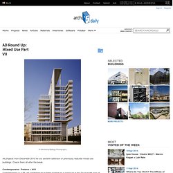
Check them all after the break. Contemporaine / Perkins + Will Contemporaine is a 28-unit condominium building located on a corner lot in the River North area of urban Chicago. In Progress: Ocean Front Mixed-Use / Kanner Architects. These two 3-story mixed-use buildings, side-by-side reflecting each other, sit on a narrow thirty-foot lot along Ocean Front walk on world famous Venice Beach. This culturally diverse urban community is a busy commercial pedestrian area, popular with tourists and locals alike. Architect: Kanner Architects Location: Venice Beach, California, USA Project Area: 13,000 sqf Each of the buildings houses a retail space on the ground level and two 3-bedroom apartments on the floors above.
Features include: a roof deck with unobstructed ocean views; a setback for privacy from the busy street; double height ceilings; private patios and balconies. Mainz Markthäuser 11-13 / Massimiliano & Doriana Fuksas. Ex Arsenal at Maddalena Conversion / Stefano Boeri Architetti. © Paolo Rosselli. AD Round Up: Mixed Use Architecture Part III. From China, Italy, Germany, Egypt, and Croatia. Here are some great mixed use previously featured projects you may have missed. Check them all after the break. New Academy of Art in Hangzhou / Wang Shu, Amateur Architecture Studio. Lucien Rose Complex / Atelier du Pont.