
TAO TAJIMA. Dinner for Five. - l'atelier interactif. Digital Art Director based in Amsterdam, France. Bruno Arizio — Interactive Designer. Top 10 Site Web Minimaliste dont s'inspirer (web design) Mentoring for creatives. Blog – ASPHALTE. ASPHALTE - Des bonnes fringues. Point. Inspiration : 10 sites one-page tendances. Front-end Design and Development. - Introducing Workout Apparel. Front-end Design and Development. Owl Carousel. Elastic Circle Slideshow. Macadamia Skin Oil $39 Macadamia Skin Oil Hydration for very dry skin Grapeseed Skin Oil $19 Grapeseed Skin Oil Moisture control for all skin types Jojoba Skin Oil $35 Jojoba Skin Oil Protection for sensitive skin Amaranth Skin Oil $29 Amaranth Skin Oil.
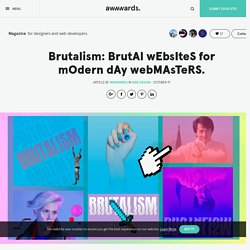
Isotope · Filter & sort magical layouts. Unite Gallery - Tiles - Columns - Default. Item Revealer. Line Maker. Inspiration for Letter Effects with anime.js. Little Fragments. Stack Motion Hover Effects. This is a hover effect. Best viewed on desktop. Images made with designs by Freepik.com If you enjoyed this demo you might also like: Segment Effect. Block Reveal Effects. Animated Fragment Slideshow. Glitch Slideshow. Diagonal Slideshow. CSS Grid Layout Slideshow. CSS Grid Layout Slideshow. Expanding Grid Item Animation. Grid Loading Animations. Custom Cursors. Crossroads Slideshow. Animated Image Columns. Grid to Fullscreen Animations. Brutalism: BrutAl wEbsIteS for mOdern dAy webMAsTeRS. Warning designers, we are facing an invasion.

A “Brutal” invasion of gigantic cursors, crazy hovers and unusable galleries! Brutalism in web design laughs in the face of rationalism and functionality, in the world of design it can be defined as Freestyle UGLY irreverent RAW and superficially decorative etc. Check out some articles and examples of brutalist websites that will blow your mind with interesting digressions like THIS ONE or THAT ONE. Coming from the universe of UX & Interaction Designers, (previously known as web designers or even further back webmasters) We can find an excessive abundance of Hover effects, System Fonts, Web Safe Colors, Hero Typography, Micro-Interactions, Pop Culture Icons and Images in the weirdest and most uncomfortable of places.
Photos that appear and disappear as if they came with no opacity transition and a long series of user UNfriendly practices, presented here in this article or found in our collection “Brutalism in Web design” DISQUES - Mowno. The UI and UX of Persona 5 – Ridwan Khan. There’s one interesting localization point from another menu — the persona subscreen, which lists information about the game’s hundreds of persona monsters.

Along the top, the screen lists the attacks and magic elements each persona is strong and weak against. In the Japanese version of the game those icons can switch between kanji for each element (above) and icons (below). The English version removed the ability to switch to the kanji icons. While more or less useless for most people playing the game in English, for a game set in Tokyo, it does seem a chance for more verisimilitude was lost. Big Bang Burger March: Shopping in Persona 5 Charlie discussed the shopping experience in Breath of the Wild; that game allows your character to move from item to item in (the game’s) physical space, something I was initially confused by, because most RPGs, including Persona 5, handle shopping differently.
Despite how bold and stylish the shopping menu is, many elements make it easier to use. Siroppe – Agencia creativa digital independiente. The-Artery. Doggo For Hire. Reflet. La profusion d'informations Nous savons qu’aujourd’hui l’audience des marques n'est plus uniquement en boutique ou sur un site internet dédié.

C'est pourquoi Reflet accompagne les marques dans leur présence sur les réseaux sociaux, les installations physiques et un référencement efficace notamment grâce à des campagnes adwords gérées par notre équipe dédiée. Grâce aux nouveaux médias et diverses plateformes sociales, la communication n'a jamais été aussi importante. Ce phénomène ouvre le champs des possibles pour la créativité et invite les internautes à interagir directement avec les marques. Les contenus proposés doivent donc toujours, malgré leur profusion, être qualitatifs, spécifiques et pertinents.
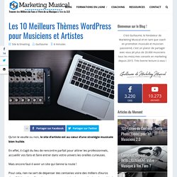
Les 10 Meilleurs Thèmes Wordpress pour Musiciens et Artistes en 2019. Qu’on le veuille ou non, le site d’artiste est au cœur d’une stratégie musicale bien huilée.

En effet, il s’agit du lieu de rencontre parfait pour attirer les professionnels, accueillir vos fans et faire entrer dans votre univers les oreilles curieuses. Mais encore faut-il avoir un site qui tienne la route ! Alacran Group.