

Choking adults. Choking is when your airway gets blocked and you can’t breathe properly.

When someone chokes, the airway can either be partly or fully blocked. Visual thinking for the business world. Progressive Reduction: Evolving the Experience for Your Most Frequent Users. I’m a big fan of minimalist design, so whenever I have the opportunity to reduce the information presented on a screen to just the bare essentials, I’m happy.
With that in mind, I realize that certain patterns that we (designers) want users to execute require learned behaviors. For this, we often use labels, tooltips, etc. so that users know where to go and what to do. However, this can often lead to visual clutter, especially when we start looking at mobile screens or applications with a shit ton of icons. According to the Nielsen Norman Group (NN/g), the best approach to solving this problem is to get the basic design right in the first place, then implement changes slowly and incrementally. The Work of Edward Tufte and Graphics Press.
Edward Tufte is a statistician and artist, and Professor Emeritus of Political Science, Statistics, and Computer Science at Yale University.
He wrote, designed, and self-published 4 classic books on data visualization. The New York Times described ET as the "Leonardo da Vinci of data," and Business Week as the "Galileo of graphics. " He is now writing a book/film The Thinking Eye and constructing a 234-acre tree farm and sculpture park in northwest Connecticut, which will show his artworks and remain open space in perpetuity. He founded Graphics Press, ET Modern gallery/studio, and Hogpen Hill Farms LLC. Visual Display of Quantitative Information 200 pages Envisioning Information 128 pages Visual Explanations 160 pages Beautiful Evidence 214 pages Same paper and printing as in original clothbound editions. The Grid System. Top 5 Recommended Google Font Combinations. It’s no secret that the days of custom web fonts have been around for a while.
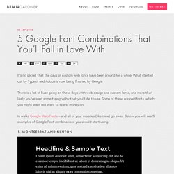
What started out by Typekit and Adobe is now being finished by Google. There is a lot of buzz going on these days with web design and custom fonts, and more than likely you’ve seen some typography that you’d die to use. Some of these are paid fonts, which you might want not want to spend money on. In walks Google Web Fonts – and all of your miseries (like mine) go away.
Below you will see 5 examples of Google Font combinations you should start using. 1. 2. 3. Three Things You Must Know When Working With Graphics. Sharebar One barrier to successful visual design work is a lack of technical knowledge.

In this excerpt from my book, Visual Design Solutions, I try to close this knowledge gap. Here are some foundation concepts you need to grasp to feel comfortable working with graphics. As a designer, your job will be easier and you will make smarter choices when you understand the technical side of graphic creation and graphic file formats. Progressive Reduction: Evolving the Experience for Your Most Frequent Users. Color Theory Tutorial, Concepts, Essays and Color Basics. Why study color theory?
If you are involved in the creation or design of visual documents, an understanding of color will help when incorporating it into your own designs. Choices regarding color often seem rather mystical, as many seem to base decisions on nothing other than "it looks right. " Although often told I had an eye for color, the reason why some colors worked together while others did not always intrigued me and I found the study of color theory fascinating. While attending the University of Minnesota I enrolled in almost every course I could from different departments: graphic design, interior design, and fine arts. During my studies, I learned that there were 2 main reasons why scholars investigated color—the first involved the communication of colors; the other involved the application of color. Communicating Color. GoodUI. How To Write A Visual Style Guide for eLearning.
Sharebar The most efficient way to achieve consistency in visual design for an eLearning course or presentation is to write a visual style guide.

It’s nearly a necessity when working on a team and it’s also valuable when working solo (though a shorter guide may suffice). In either situation, here are some benefits of writing an eLearning visual style guide. See below. What font is the best? Mind Maps for Visual Analysis - Downloads. Elearning: Design Mapping: How to design the right look and feel (visual voice) for your e-learning course. Related: The Educational Benefit of Ugly Fonts. A few months ago, I wrote a speculative blog post about e-readers.
Although I love my Kindle, I worried that these new gadgets made the act of reading a little bit too easy, and that this visual ease might lead, one day, to a shallower engagement with our texts. It was a rather tortured argument, an awkward mash-up of McLuhan and fMRI research. I’m happy to report that a brand-new paper in Cognition by a team of Princeton psychologists (Connor Diemand-Yauman, Daniel M. Oppenheimer and Erikka B.
RGB-to-Hex Color Converter. RGB-to-Hex Conversion Question: How do I convert RGB values of a color to a hexadecimal string?
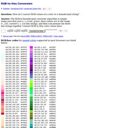
Answer: The RGB-to-hexadecimal converter algorithm is simple: make sure that your values are in the range 0...255, convert R, G, B to hex strings, and then concatenate the three hex strings together. Convert RGB to Hex color values here: function rgbToHex(R,G,B) {return toHex(R)+toHex(G)+toHex(B)} function toHex(n) { n = parseInt(n,10); if (isNaN(n)) return "00"; n = Math.max(0,Math.min(n,255)); return "0123456789ABCDEF".charAt((n-n%16)/16) + "0123456789ABCDEF".charAt(n%16); } ElrngEsstls.pdf. 60 Minute Masters v05 clive no audio 2. RGB Color Codes Chart. RGB color picker | RGB color codes chart | RGB color space | RGB color format and calculation | RGB color table RGB color picker RGB color codes chart Hover with cursor on color to get the hex and decimal color codes below: RGB color space RGB color space or RGB color system, constructs all the colors from the combination of the Red, Green and Blue colors.
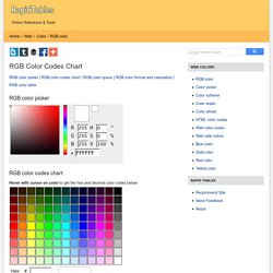
The red, green and blue use 8 bits each, which have integer values from 0 to 255. RGB ≡ Red, Green, Blue Each pixel in the LCD monitor displays colors this way, by combination of red, green and blue LEDs (light emitting diodes). When the red pixel is set to 0, the LED is turned off. Any value between them sets the LED to partial light emission. RGB color format & calculation RGB code has 24 bits format (bits 0..23): A Few Rounds About Bullet Lists.
By Mark Nichol Before reading this post you might wanna check one we published a while ago titled 7 Rules For Formatting Lists. Here’s a quotation from it: “The items in unnumbered lists are often preceded by dots or other symbols known collectively as bullets, though such markers are technically not necessary, especially in a recipe or a materials list. (In those cases, it’s implicit that the ingredients or components are added or constructed in the order listed — it’s actually a numbered list that needs no numbers.)” A bullet list lets you display a set of terms, phrases, or statements clearly. prevent reader fatigue or confusion in the form of a long run-in list in a sentence.avoid repetition by following an introductory phrase with “fill-in-the-blank” list items. Create numbered multi-level heading styles - Word 2010. How To Use Styles In Microsoft Word To Save A Lot Of Work. Most of the discussion on styles these days is about web pages and CSS, but everyone seems to have forgotten how styles can help in Word.
I’m going to show you how to use styles in Word 2007, but if you have an older version you’ll be fine. This stuff is largely unchanged since Word for DOS, and that was too long ago to discuss. Most other word processors have similar capabilities, so don’t despair if you’re not a Word user. An analogy is the simplest way to approach this, so come outside with me, and take a look at the fence. Color schemes - Adobe Color CC.