

How-create-collapsible-menu-container-tableau-48610?domain=Gerrard. Note: This is a guest post by Tableau Zen Master Robert Rouse.
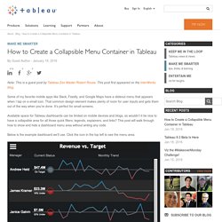
This post first appeared on the InterWorks blog. Some of my favorite mobile apps like Slack, Feedly, and Google Maps have a slideout menu that appears when I tap on a small icon. That common design element makes plenty of room for user inputs and gets them out of the way when you’re done. It’s perfect for small screens. Available space for Tableau dashboards can be limited on mobile devices and blogs, so wouldn’t it be nice to have a collapsible area for all those quick filters, legends, explainers, and links? Below is the example dashboard we’ll use. Tableau Software. Table Calculations - Why apply them 'By Cell' A question I was recently asked by an in training Tableau User was ‘Why would I apply a table calculation by cell?’.
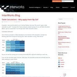
To answer this I have produced a simple example of a by cell Table Calculation. Before I get to it I would like to run through some Table Calculation basics. Calculation Direction One of the key principles in Table Calculations is the direction of the calculation. Consider the following table which shows the ‘Running Sum’ table calculation running ‘Table Across’: As you can see this running sum is running horizontally left to right and restarting on each row. If you ran the calculation again, this time ‘Table Down’ the calculation would work vertically down the table restarting for each column. Tableau Support Community. Tableau Tips,Tricks,Best Practices - Sort/Filter - Jenny (Xiao) Zhang. Cascading Quick Filters in Tableau. Overview This blog post is going to cover both the basics of quick filters as well as trying to push the boundaries, so if you know the basics, feel free to skip down to the later examples!

Quick Filters refresh Before I get into the ins-and-outs of cascading quick filters, I should probably put a quick explanation of what a “Quick Filter” is. Tableau Support Community. Custom Number Formatting ($K,$M) Creating a Sheet Selector for a Dashboard. Article Note: This article is no longer actively maintained by Tableau.
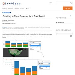
We continue to make it available because the information is still valuable, but some steps may vary due to product changes. When creating a dashboard view, sometimes you may want the ability to display only individual worksheets on the dashboard without having to create multiple dashboards or actions. In cases like this, you can create a “sheet selector” that gives you the ability to select an individual sheet from the dashboard and replace all sheets with just the sheet you selected. Step 1 Right-click the Data window, and select Create Parameter. Step 2 Create a string parameter by doing the following tasks in the Create Parameter dialog box: In the Name text box, type a name for the sheet selector. Step 3 Right-click the Data window, and select Create Calculated Field. Step 4. Sheet Swap and Pop in Tableau. Transition Matrix. I'm with Noah.
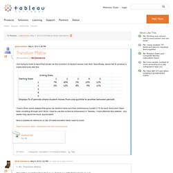
Doing the work outside of Tableau to give yourself a Row ID that you could join on or even to set up some slightly-complicated SQL to do the same using a date will make life so much easier in Tableau that I believe it's worth the effort. I'll explain how the LOOKUP() is doing what it does in your Table Calc view, then explain why a working table calc solution is more difficult to put together. Tableau makes working at different levels of granularity really easy, right up until the point that we need to pay attention to them and then it's not much help. In the Table Calc view, there are two levels of granularity that are important, the granularity of the raw data (where Date & Name are the dimensions that determine what makes a unique record) and the granularity of the view (the distinct combinations of values of the dimension(s) are on Rows, Columns, Pages, and the Marks Card).
The Table Calc view has only Current Bucket as a dimension. Jonathan. Create button to reset parameter controls? Viewdata option missing in tooltip. How to Have Sets with Your Secondary (Data Sources) Tableau Sets can turn incredibly complicated interactions into a few mouse clicks that can reveal patterns in your data.
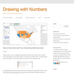
However, if you’ve ever created a Set in a secondary data source and tried to use it across a blend in a primary, this is what you see: Lots of grayed out items that can’t be touched. It’s like you’re at a party and have just met the hot-babe-of-appropriate-gender-of-your-dreams and they are totally into you, but only at the party, and not back at your place. Using a filter on one dashboard takes me to ano. Brilliant!

To encourage you to post this, here are instructions based on what you'd posted: 1) Create the original worksheet(s) that will end up on dashboard #1. 2) Create target worksheet(s) that will end up on dashboard #2.
InterWorks - Business Intelligence & Tableau Consulting. Older But Still Useful – Conditional Formatting. Back in May of this year before I started this blog, I did a presentation at the Boston Tableau User Group on conditional formatting in Tableau.
Prior to using Tableau, I’d created some dashboards and reports in Excel, and when I tried to re-create them in Tableau I ran into a number of different issues in terms of doing the kinds of formatting, layout, and conditional formatting that are possible in Excel. I created a workbook with every technique I could find and some I figured out. Here are links to: Conditional formatting workbook – I made extensive use of captions for instructions, and unfortunately Tableau Public makes the captions take up the space for display of the view, so it’s better to download the workbook. Tricks + Miscellaneous Techniques. These are either single tips or chunks of techniques that don’t have their own page yet.
Be sure to check out the following sources of material on the Tableau Community: Get last value in dataset Fixing axis size Use an invisible reference line, either based on a constant or a calculated field. Tableau will make sure the axis range is big enough.