

Grid “fallbacks” and overrides - rachelandrew.co.uk. A very good time to understand CSS layout. I’ve been building a set of common UI patterns for my CSS Grid resource site, Grid by Example.

These use CSS Grid Layout but include legacy layout in order that older browsers get some layout - even if not the full design that is implemented with Grid. Accessible, Simple, Responsive Tables. There is no single solution to make any <table> appropriately responsive.
That's what I like about this post by Davide Rizzo: it admits that, then gets on with some solutions. This is a great addition to territory we've been treading for a while. Content and Comparison tables There are many types of tables on websites where content can vary as wildly as the approaches used to make them responsive. The tables I find most frustrating are comparison tables or normal content layout tables, there are really no comprehensive CSS based solutions for making these types of tables responsive. 8 Tips to Write CSS You Won't Hate. Cleaning Up a CSS Codebase. You have just been onboarded to an existing project to replace a departing developer.
BEM 101. Share this: Ship custom analytics today with Keen.io.

What The FlexBox?! - A free 20 video course to learn CSS Flexbox. On :not and Specificity. The negation pseudo-class, :not, can be incredibly useful.
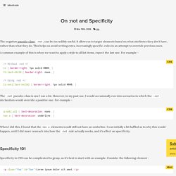
It allows us to target elements based on what attributes they don't have, rather than what they do. This helps us avoid writing extra, increasingly specific, rules in an attempt to override previous ones. A common example of this is when we want to apply a style to all list items, expect the last one. Preview border-corner-shape, before implementations! As an editor of the Backgrounds & Borders Level 4 spec, I am naturally a bit more interested in the cool features it will bring, once implementations start (it’s currently too early for that).
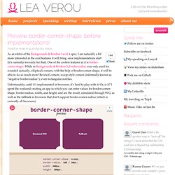
One of the coolest features in it is border-corner-shape. CSS3 PIE: CSS3 decorations for IE. Prefix free: Break free from CSS vendor prefix hell! -prefix-free lets you use only unprefixed CSS properties everywhere.
It works behind the scenes, adding the current browser’s prefix to any CSS code, only when it’s needed. The target browser support is IE9+, Opera 10+, Firefox 3.5+, Safari 4+ and Chrome on desktop and Mobile Safari, Android browser, Chrome and Opera Mobile on mobile. Native CSS feature detection via the @supports rule. By Chris Mills Introduction With browsers of varying degrees of standards support still in use for browsing the Web (from decent modern browsers, to old rustbuckets like IE6), we are pretty comfortable with the idea of sending different code to different browsers to provide different-but-still-acceptable user experiences.
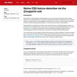
This is done in a variety of ways, but generally it relies on the rather error-prone browser detection, or the cleverer and more robust feature detection. Feature detection is normally done by writing your own JavaScript to test if a fundamental property, method, etc. of the feature you are detecting exists or can be used, or by using a 3rd party feature detection library, such as the excellent Modernizr. Modernizr provides feature tests and mechanisms for selectively applying CSS and JavaScript based on the results of those tests, for a whole host of different HTML5 and CSS3 features. @supports syntax @supports not (display: flex) { } A @supports example Summary. CSS3 Please! The Cross-Browser CSS3 Rule Generator. 6 Smashingly Practical CSS3 Effects You Can Use Right Now. CSS3 is developing fast, and the most exciting part is seeing all of the intriguing and attractive effects that are being invented to solve real design problems.

With the combined creativity of the design community, CSS3 has quickly traveled through the zone of interesting speculation and into the territory of time/resource saving practical everyday use. Today, we’re going to look at 7 impressive, concrete, real-life effects and techniques that you can implement in your next design. This isn’t going to be the usual overview of features – these are all specific techniques that will help your design work to be more advanced and effective. Let’s dig in! Drop-down Menu. CSS Style Guides. As we wrap up our recent poll on ordering CSS properties, it brings up the larger issue of CSS style guides.
Ordering properties is just one choice you have to make that makes up a complete styling strategy. Naming is a part of it. Sectioning is a part of it. Commenting, indentation, overall file structure... it all makes up a complete CSS style guide. Let's round up some existing ones. But first... I love pattern libraries. The List I'll list some excerpts from each that I like below.
GitHub GitHub CSS Style Guide → CSS3 Patterns Gallery. Browser support The patterns themselves should work on Firefox 3.6+, Chrome, Safari 5.1, Opera 11.10+ and IE10+. However, implementation limitations might cause some of them to not be displayed correctly even on those browsers (for example at the time of writing, Gecko is quite buggy with radial gradients).
Also, this gallery won’t work in Firefox 3.6 and IE10, even though they support gradients, due to a JavaScript limitation. Submission guidelines.