

Experts Speak: Tips for Designing for Web Accessibility. Designing for Web accessibility is often an afterthought for many design and development professionals, as they are responsible for many tasks when launching or maintaining a digital property.
This is, however, a mistake as making sure every user (regardless of ability) can interact with a site and accomplish their goals should be a top priority. Website Magazine solicited the help of your peers to gather the best resources and advice for designing for Web accessibility. While many of their responses were featured in the November issue, here are some equally important tips*: Stay in the Know "Keeping up with legislature of the more 'social' countries and economies who can afford such programs is a good tip. ~Lars Hilse, Founder/CEO, www.larshilse.com Don't Cut Corners "Always use the correct markup for the job.
~Fiona Taylor-Gorringe, Developer & Blogger at myaccessible.website. Advice from the Pros: Designing for Web Accessibility. By Amberly Dressler, Managing Editor More people are accessing the Web than ever before and with the influx of new Internet users comes a greater demand to make it usable for everyone regardless of abilities.
While regulation is not uniform across industries (read, "Web Accessibility Rules for 2015" at wsm.co/warules15) experts like Carin van Vuuren, CMO of Usablenet, notes an increase of cases where online businesses are sued on the grounds of discrimination. While some corporations are mandated by the federal government or other agencies to make their website accessible, others, notes van Vuuren, want to be good corporate citizens and support all their customers. There are, of course, revenue implications as well. "Being unable to navigate non-descriptive links such as 'click here' or 'more info' greatly impacts the experience for the user living with disability, and is likely to end in abandonment in the journey," said van Vuuren. Accessibility is not what you think. Accessibility is not just about meeting the needs of the disabled or catering for edge cases.
Accessibility impacts everybody. Subscribe to these quick tips using iTunes or RSS | Download Audio I have posted about the misconceptions of user experience design and information architecture. Now I want to dispel some myths about accessibility. I dislike the term accessibility. The Paciello Group – Your Accessibility Partner (WCAG 2.0/508 audits, VPAT, usability and accessible user experience) Designing for Accessibility. The Paciello Group – Your Accessibility Partner (WCAG 2.0/508 audits, VPAT, usability and accessible user experience) HTML5: Techniques for providing useful text alternatives.
1.
Requirements for providing text to act as an alternative for images Text alternatives,[WCAG] are a primary way of making visual information accessible, because they can be rendered through any sensory modality (for example, visual, auditory or tactile) to match the needs of the user. Providing text alternatives allows the information to be rendered in a variety of ways by a variety of user agents.
For example, a person who cannot see a picture can have the text alternative read aloud using synthesized speech. The alt attribute on images is a very important accessibility attribute. 1.1 Examples of scenarios where users benefit from text alternatives for images They have a very slow connection and are browsing with images disabled. 1.2 General guidelines Except where otherwise specified, the alt attribute must be specified and its value must not be empty; the value must be an appropriate functional replacement for the image.
In this example, a portion of an editor interface is displayed. Label and name inputs properly — Web Fundamentals. I don't care about accessibility. by Jeffrey Veen. These are the speaking notes I used during the Accessibility is for everyone!
Panel discussion at South by SouthWest earlier this week. I came here to be on this panel to tell y'all that I don’t care about accessibility. Don’t care. Not an issue. Hardly ever comes up. Here’s my big secret for you today. John just gave us an amazing glimpse at the heights of creativity that are attainable despite what most would consider overwhelming constraint. We have to let go of typography -- you get a half dozen faces and guess what, they also come in both bold or italic! And so on and so on and so on… Like I said, most designers approaching our medium from another are simply astounded. Now, granted, I live in a sort of Web design fantasy world, and I fully admit that. These days, my work generally goes as far as interaction flows and schematics.
“Uh, yeah, we won’t be able to get that menu to float over there considering the semantics of this list.” Web Accessibility for Designers. The focus of web accessibility is often on web development – the things that happen in HTML, CSS, or JavaScript after a site has been designed visually.
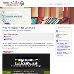
Optimal accessibility should start much earlier, as part of the visual design process. We have created an infographic that highlights a few important principles of accessible design. Text Version Plan Heading Structure Early Ensure all content and design fits into a logical heading structure. Consider Reading Order The reading order should be the same as the visual order. Provide Good Contrast Be especially careful with light shades of gray, orange, and yellow. Use True Text Whenever Possible True text enlarges better, loads faster, and is easier to translate. WAVE Web Accessibility Tool. Blog - 10 Easy Accessibility Tips Anyone Can Use. Today is Global Accessibility Awareness Day (GAAD).
To celebrate and to help promote accessibility, here are 10 simple accessibility tips that most anyone can implement today into their web site’s HTML and CSS to make it more accessible. 1. A transparent and collaborative approach to building the new University of Strathclyde website. Tackling Accessibility on The Web. As browser capabilities continue to grow the websites that we are building are getting ever more complex.
Fancy JavaScript UIs are great for showing off the latest technologies but they can cause a real problem for assistive technologies like screen readers. Things I learned by pretending to be blind for a week. I’m a full visually-able user and I love looking at websites.
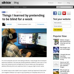
I know though, that not everyone experiences websites in the same way. Browsing websites at different screen sizes is a hot topic at the moment, but lets not forget that it’s not just mobile users that experience websites differently, blind users experience them in a way you might not even realise. So I started using a screen reader to see (I suppose I should say “experience”) how a blind user navigates a website. First I want to say accessibility isn’t completely new to me. I’ve been creating W3C valid websites for years, building to web standards, and always taken care to make sure all my images have alt tags, and any Flash has an appropriate text alternative. How blind people use the web.
Download the Web Accessibility Handbook by HiSoftware; Microsoft. Throughout 2008, Microsoft and HiSoftware partnered to hold a series of European Dialogues on Practical Strategies for an Accessible Web.

The Dialogues focused on understanding the challenges of Web accessibility and sharing best practices to address those challenges. Participants included a wide range of individuals with practical, theoretical and/or personal experience in the Web accessibility space, including members of public sector and private sector organizations, technology vendors and NGOs. HiSoftware Cynthia Says Portal. Quick fix accessibility. Accessibility: The estimated time to read this article is 4 minutes The Pareto principle (also known as the 80/20 rule) states that, for many events, 80% of the effects come from 20% of the causes.
Web-accessibility-quick-guide.pdf (application/pdf Object) Accessibility. A Complete Beginner's Guide to Web Accessibility. Most beginners in development and designing will not look deeply into accessibility, the purpose of this article is to educate beginners as early as possible of the possible pitfalls and how to avoid them. It is like a cookie jar is atop the shelf and a kid is trying to reach it but can’t. What happens next? Frustration enters! An Idiot’s Guide To Accessible Website Design. If you are designing web sites in the UK, you probably already know that the Disability Discrimination Act (DDA) mandates web sites be accessible by visually and physically disabled persons.