

What is a Zentangle®? TanglePatterns.com BEGINNER’S GUIDE to Zentangle® eBook is now available!

Visit the STORE > E-BOOKS tab for more details. “The Zentangle Method is an easy to learn, fun and relaxing way to create beautiful images by drawing structured patterns.” Zentangles are miniature pieces of unplanned, abstract, black and white art created through a very specific Method from an ensemble of simple, structured patterns called tangles on a 3.5-inch (89 mm) square paper tile. Zentangles are not only exquisitely beautiful, they are fun and relaxing to create. The process of creating a Zentangle is a form of “artistic meditation” as one becomes completely engrossed in making each pattern, deliberately focusing on “one stroke at a time”®.
The Zentangle Method “increases focus and creativity, provides artistic satisfaction along with an increased sense of personal well being. As CZT Margaret Bremner has written, “One of the lovely things about Zentangle is that it isn’t supposed to BE anything. Artlandia Glossary of Pattern Design. Balance in Composition. An unbalanced object or scene causes discomfort in a viewer, so, unless this is a desired effect, we should strive to ensure that our images are balanced.
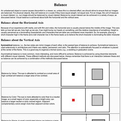
For physical objects, they will balance on a scale if they have equal weight, not equal size. For an image, the unit of measure is visual interest, i.e., our image should be balanced by visual interest. Balance by visual interest can be achieved in a variety of ways, as discussed below. Visual balance is achieved about both the horizontal and the vertical axes. Balance about the Horizontal Axis Because of our experience with reality, and with film and video, the horizontal axis is usually placed below the middle of the image. Balance about the Vertical Axis Symmetrical balance, i.e., the two sides are mirror images of each other, is the easiest type of balance to achieve. Composing a Painting Using Notan. Notan may be an unfamiliar term to you, but you will find that practicing and using it will help you achieve balance, unity, rhythm and movement (principles of design) in your paintings.
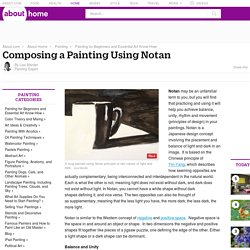
Notan is a Japanese design concept involving the placement and balance of light and dark in an image. It is based on the Chinese principle of Yin-Yang, which describes how seeming opposites are actually complementary, being interconnected and interdependent in the natural world. The Principles of Art and Design. The Elements and Principles of Art and Design are the foundation of the language we use to talk about art.
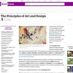
The Elements of Art are the visual tools that the artist uses to create a composition. These are: line, shape, color, value, form, texture, and space. The Principles of Art represent how the artist uses the tools to create an effect and to help convey the artist's intent. Modernism: 30 Movements. In its broadest definition, Modernism is modern thought, character and practise and is used in Art history indicating a period of time- 100 years or so, around the 1850’s to after the first world war.
This can be confused with Modernity. The only difference really is that Modernity is more general- something new/modern that changes your lifestyle. Whereas Modernism is more specific to the art history with distinct characteristics. Modernism was a far reaching ideology applied more or less in all forms of creative expression. The general rule was that function should always dictate form.
Modern art can not easily be identified unless you truly know your art, this is because there are numerous movements within modernism that each has a different approach on art and different conceptual thinking. Below takes you through each movement within the Modernism period providing a short insight to each one. Impressionism: 1870-1890 Post-Impressionism: 1880-1905 Symbolism: 1880- Early 1900’s Like this:
Composition. Before experimenting digitally with how my magazine cover could look, I wanted to do so by sketching designs first.
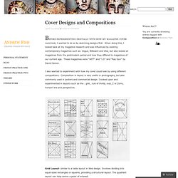
When doing this, I looked back at my magazine research and was influenced by existing contemporary magazines such as: Vogue, Billboard and Vibe, but also looked at magazines from the postmodern period and how they differed to magazines of our current age. These magazines were “WET” and “I.D” and “Ray Gun” by David Carson. I also wanted to experiment with how my cover could look by using different compositions. Attentive Equations. Composition (visual arts) In the visual arts—in particular painting, graphic design, photography, and sculpture—composition is the placement or arrangement of visual elements or ingredients in a work of art, as distinct from the subject of a work.
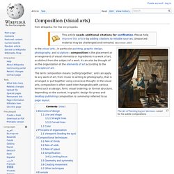
It can also be thought of as the organization of the elements of art according to the principles of art. The term composition means 'putting together,' and can apply to any work of art, from music to writing to photography, that is arranged or put together using conscious thought. In the visual arts, composition is often used interchangeably with various terms such as design, form, visual ordering, or formal structure, depending on the context. In graphic design for press and desktop publishing composition is commonly referred to as page layout. Expressions François Murez.