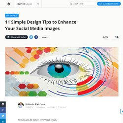

Humans are, by nature, very visual beings.

In the brain itself, there are hundreds of millions of neurons devoted to visual processing, nearly 30 percent of the entire cortex, as compared with 8 percent for touch and just 3 percent for hearing. Each of the two optic nerves, which carry signals from the retina to the brain, consists of a million fibers, compared to the auditory nerve carrying a mere 30,000. That’s all to say that social media images are a vital part of your content reaching the maximum amount of people, people who are very visual beings! Marketers that have dabbled in creating engaging images for social media know just how tough and time-consuming it can be. I’m no expert, but I’ve learned a thing or two about creating social media images after lots of practice (and mistakes!)
Let’s dive in! Social Media Design Tips: 11 Principles & Tactics to Enhance Your Images To create these, we rely on 11 simple design principles to help make the image creation process easy. 1. 2. 3. 4. What Do People Really Think Of Your Profile Picture? Does your LinkedIn photo look competent?

Does your Twitter photo look fun? Does your OkCupid look attractive? I get questions like these all the time from readers. And I get it–it’s scary to put up a picture. You have no idea how it will be judged or what first impression you are giving. I wanted to do some research on how different pictures of the same person can change. According to research published in Psychological Science, slight variations in how an individual face is viewed can lead people to develop significantly different first impressions of that individual. I partnered with a website called PhotoFeeler to do this study. We gave this tool a little spin ourselves. With the current votes, the second photo has scored highest in all 3 areas! What Research Says About the Best Profile Picture. One of the first things I do when I join a new social network is to upload a profile picture.

But which profile picture should I choose? Is there a best one? Profile pictures have always been a bit of a gray area for me inasmuch as I post a picture I think looks good without knowing its actual effect on my audience. Is there such thing as a perfect, best profile picture? Interestingly, there’s been some rather great research about the different elements of profile pictures that have the biggest impact on an audience. I’m happy to share what we’ve found about the perfect profile picture, based on the best science, research, and psychology out there. The 7 Elements of the Best Profile Pictures.
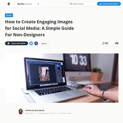
A Non-Designer's Guide to Creating Engaging Images for Social Media. A great social media marketer today and an awesome advertiser in the 1960s have much in common.

David Ogilvy, the father of advertising, was famous for spending an inordinate amount of time on headlines. Why? Because that’s the line that people read the most, so it mattered a lot. Ogilvy was a master at stuff like this — prioritizing what was really important. If he lived through the age of social media, I’m fairly certain Ogilvy would say something like: On the average, many more people engage with images as read the copy in social media posts. Images have never been more important in social. The only issue here is that if, like me, you aren’t über-skilled in graphic design, creating eye-catching engaging images can be difficult. Here are 3 key design principles that will help you create engaging social images every time! Principle #1: Create a Simple and Balanced Layout This is what the table in my Airbnb looked like this morning. How to Keep Your Social Media Images Looking Fresh (Even if You’re Posting Every Day)
Consistently posting high-quality content is the lifeblood of a great social media strategy. But it’s easier said than done. Not only do you have to post consistently to gain traction, the content has be to timely, relevant to your audience, and engaging. Social media is for conversations after all, not megaphones. Whether it’s a plane in the Hudson River or a crying boy hugging a police officer, social images are unique in their ability to communicate so much information in just a snapshot of time. And social networks like Twitter, Facebook, and Pinterest have built-in features to make it incredibly easy for users to share great images and spread them across their entire network.
The Ideal Cover Photo Size for Each of the Major Social Media Platforms. One of the first few things people see when they visit your social media profiles is your cover photo.

Whether it’s your Facebook Page, LinkedIn Company Page, or YouTube channel, your cover photo is the biggest image on the page. And people will see your cover photo even before they see any of your posts. So how do you make your cover photo show up the exact way you want it to be? One of the key factors is the size. Without the correct dimensions (width and height), your cover photo might be cropped to fit the space available and people will miss the important details on your photo. While there isn’t a one-size-fits-all cover photo size for all the social media platforms, the information is out there.