
Stackicons: Doing More with Icon Fonts. The following is a guest post by by Parker Bennett.
While icon fonts are efficient and easy to use and scaleable and all that, one of the classic "strikes" against them is that the icon can only be one color. Parker has a brand new project that solves that issue in a simple and clever way. I'll let him introduce it for you. Even though the future of icons will likely be SVG, here in the present, icon fonts still offer a compelling alternative — with super easy styling of color, size, text-shadows, hover effects and more using just CSS. Icon fonts are still awesome. One big advantage SVG has over icon fonts is full color. I call them Stackicons. For each color, we use a separate pseudo element, then use absolute positioning to stack them on top of each other. Using rgba values, we can even do some color mixing to give us more colors. Yes, it’s a bit on the hacky side: It takes some design forethought, and the ability to generate an icon font. Stackicons Stackicons-Social Try it on CodePen.
Typebase.css: The starting point for good typography on the web.
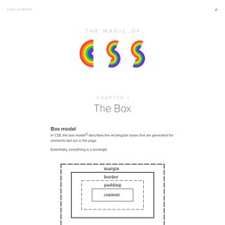
The Box — Chapter 1 — Magic of CSS — Adam Schwartz. The Magic Of Box model In CSS, the box model[1] describes the rectangular boxes that are generated for elements laid out in the page.

Essentially, everything is a rectangle. Some interesting facts: border-radius rounds out the corners of this box. box-shadow adds a shadow to this box. outline and box-shadow aren’t part of the box, and therefore have no effect on the layout. Box sizing The box-sizing property gives you a little control around how boxes are sized within this model. Content-box The default. Border-box When computing the size of a box, padding and border are folded in. For example: Example Both of these boxes have the following CSS, but one has box-sizing content-box and the other border-box. In the border-box case, the width and height of the .box are 5em, exactly what we set. Flexible inputs One of the benefits of using border-box is you can set a padding and width of mixed units without creating strange sizing edge cases. Width: 75% tl;dr Further reading Citations. Frosting Glass with CSS Filters. The following is a guest post by Bear Travis, a Web Standards Engineer at Adobe.

I'm a fan of how Adobe is pushing the web forward with new design capabilities, and doing it in a responsible way. CSS filters is a good example. They knew they were desired because Photoshop paved the way. They brought them to the web with a sensible syntax and they helped with both the spec and browser implementation. Now we're seeing them in stable browsers, and they are advocating use through responsible progressive enhancement.
While filters such as contrast, saturate, and blur have existed in image editors for some time, delivering them on the web has historically required serving images with those filters already applied. Old School: Frosted Glass with Images The frosted glass effect has been kicking around the internet for a while; we even saw it here on CSS-Tricks back in 2008. Demo The HTML The markup is relatively simple. <article class="glass down"><h1>Pelican</h1><p>additional content... Basics of CSS Blend Modes. By Chris Coyier On Bennett Feely has been doing a good job of showing people the glory of CSS blend modes.

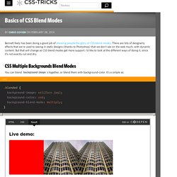
There are lots of designerly effects that we're used to seeing in static designs (thanks to Photoshop) that we don't see on the web much, with dynamic content. But that will change as CSS blend modes get more support. I'd like to look at the different ways of doing it, since it's not exactly cut and dry. #CSS Multiple Backgrounds Blend Modes You can blend background-images together, or blend them with background-color. Multiply is a nice and useful one, but there is also: screen, overlay, darken, lighten, color-dodge, color-burn, hard-light, soft-light, difference, exclusion, hue, saturation, color, and luminosity.
Adobe (who works on the spec for this stuff) created this Pen for playing with the different possiblities here. A single element can have more than one background, stacked up. Those can blend too simply by adding a background-blend-mode. #Arbitrary HTML Elements Blend Modes.