

Elliot H R sur Twitter : "I've not used the Medium app in a while. Like the latest minimal look to their header section. #ui #design. Home - Peppersmith. PlayLAND pavilions by LIKEarchitects, Portugal. LIKE architects‘ playLAND is a set of three bouncy and colorful spatial interventions set for children in the public space of Paredes de Coura, Portugal, using beach floats as construction module.
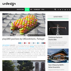
Created for ‘O Mundo ao Contrário’, which means ‘The World Upside-Down’, a week-long event that transformed the quiet village in the north of Portugal into a playground for hundreds of children, featuring street theatre, concerts, circus, and installations, playLAND is a off-the-shelf installation, built with the help of local volunteers and formalized into three different moments: an informal stage, where different shows for children could be seen; a silo-shaped tower, that kids could enter and play in; and a small tunnel pavilion, for children to cross and run around. Being a child object, designed for children to play quietly in the sea or in the pool, the beach float is naturally a colorful and very appealing object. All images © DINIS SOTTOMAYOR PHOTOGRAPHY Comments comments. The Wolffepack: A Backpack Designed to Flip Around to the Front!
Messenger bags make you sore on one side.
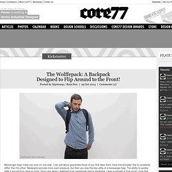
I can just about guarantee those of you that wear them have one shoulder that is constantly stiffer than the other. Backpacks provide more even pressure, but then you lose the key utility of a messenger bag: The ability to quickly slide it around from back-to-front. Orchardtweets : Burger King's in-store wi-fi ... The top 20 design events of summer 2014. Still haven't made any plans for the summer?
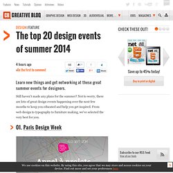
Not to worry, there are lots of great design events happening over the next few months to keep you educated and help you get inspired. From web design to typography to furniture making, we've selected the very best for you. 01. Paris Design Week Whether you're a designer or design lover, this festival showcases the very best in furniture, decoration, fashion, gastronomy, art, and the art of living under the banner of design. Date: 9-14 September Location: Paris Price: Varied Focus: Design 02. Now in its seventh year, Designs of the Year is a summer-long event at London's Design Museum that covers a broad range of design, including fashion, graphic design and architecture. The exhibition showcases all things innovative in the design space. Design Philosophies From the Masters. When creating a presentation, it’s easy to get caught up focusing on the content — after all, it is the meat of any deck.
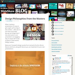
But we can’t forget that if this information is not presented in an engaging way, its impact will not be as great. In other words: Design matters. Below are 13 powerful design quotes from Leonardo Da Vinci, Bruno Munari and more, along with lessons you can implement for your own presentations. Lesson: Follow the rule “less is more” with your slide design. You must avoid every temptation to use too much text or over-complicated charts and graphs. Slide14. Flat And Thin Are In. Advertisement In the last several years, we’ve seen a rapid shift in software and app interface design, from 3-D and skeuomorphic to flat and minimal.
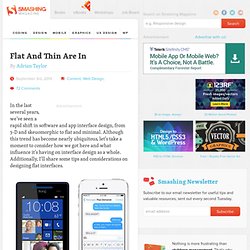
Although this trend has become nearly ubiquitous, let’s take a moment to consider how we got here and what influence it’s having on interface design as a whole. Additionally, I’ll share some tips and considerations on designing flat interfaces. Interfaces on a Windows Phone 8 and Apple’s iOS 7. 50 Design Problems In 50 Days: Real Empathy For Innovation (Part 1)
I recently travelled 2517 miles to try to solve 50 problems in 50 days1 using design — a journey that would challenge me to fundamentally rethink my understanding of the user-experience design process.
I set myself a challenge. I wanted to test the limits of design’s ability to solve problems — big and small. To do this, I left the comfort of my computer chair and set out into the unknown. Each day, I had 24 hours to observe a problem, attempt to solve it and then communicate the solution. Lowdi - Bluetooth speaker. JAM with Chrome. Elliothroberts : #UI #Design I like the dotted... Innovative Technology, Products & Ideas. Symb.ly - Creating the biggest set of mono, glyph, symbol icons. Ikea goes green with a cardboard digital camera. 27 April 2012Last updated at 10:47 ET The camera can be recycled just like any other piece of cardboard Swedish furniture retailer Ikea has revealed an eco-friendly digital camera made almost entirely from cardboard.
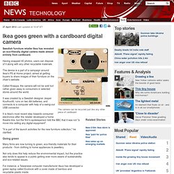
Having snapped 40 photos, users can dispose of it along with any other recyclable materials. The device is a part of a campaign around Ikea's PS at Home project, aimed at getting buyers to share images of their furniture on the chain's website. Called Knappa, the camera will not be sold but rather given away to consumers in selected stores around the world.
It was created by a Swedish designer Jesper Kouthoofd, runs on two AA batteries, and connects to a computer with help of a swing-out USB connector. It is Ikea's most recent step towards consumer electronics after the retailer developed a home theatre line, but the firm's spokesperson told the BBC that it was not "a move into selling any digital equipment". Going green Ikea itself has unveiled green initiatives in the past. Balloona Stool by Natalie Kruch. Digital Web Magazine.