

Best Practices of Combining Typefaces - Smashing Magazine. Advertisement Creating great typeface combinations is an art, not a science.
Indeed, the beauty of typography has no borders. While there are no absolute rules to follow, it is crucial that you understand and apply some best practices when combining fonts in a design. When used with diligence and attention, these principles will always yield suitable results. Today we will take a close look at some the best practices for combining typefaces — as well as some blunders to avoid. Combine a Sans Serif with a Serif By far the most popular principle for creating typeface combinations is to pair a sans serif header typeface with a serif body typeface. In the example below — a typical article layout — we have Trade Gothic Bold No.2 paired with Bell Gothic on the left side.
Putting these two together creates an unwanted conflict in the design. Now let’s look at the example on the right. Avoid Similar Classifications Now notice the example on the right side. Assign Distinct Roles. 25 Fresh Examples of Beautiful Typeface Combinations in Web Design. Typography is a very important part of design and choosing the right type for your design can be very challenging.
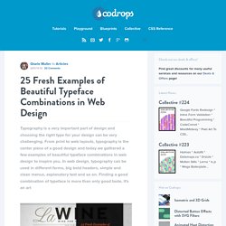
From print to web layouts, typography is the center piece of a good design and today we gathered a few examples of beautiful typeface combinations in web design to inspire you. In web design, typography can be used in different forms, big bold headers, simple and clean menus, explanatory text and so on. Finding a good combination of typeface is more than only good taste, it's an art. Lost Type Co-op.
40 Free High Quality Hand-drawn Fonts. Unlike the serif font family, these hand drawn fonts looked less serious but they tend to give and convey strong human touch wherever they are applied.
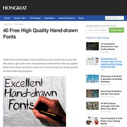
Hand-drawn fonts are hard to stand on it’s own, but they are utmost perfect for these following situations: Hand drawn websitesIf you are inspired to give your new web design a sketchy or hand-drawn look and feel, these fonts are without a doubt the perfect math to the layout. Click here for more examples of Hand-drawn style websites. via bootbGuides and instructions Whether its a storyboard, an online guide & tutorial or merely an attempt to help user understand an illustration better, arrow, pointer and text guide gets the job done seamlessly.
In terms of text, typography that mimics human writing tend to make reading and understanding things easier. Here’s a good example: via woorkComic and dialogues You don’t need Marvel to tell you Helvetica won’t fit for the text in drawing and illustrations. Lost Type Co-op. 25 New Free High-Quality Fonts - Smashing Magazine. Advertisement Every now and then we look around, select fresh free high-quality fonts and present them to you in a brief overview.
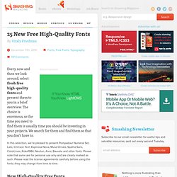
The choice is enormous, so the time you need to find them is usually time you should be investing in your projects. We search for them and find them so that you don’t have to. In this selection, we’re pleased to present Pompadour Numeral Set, Lato, Crimson Text, Espinosa Nova, Musa Ornata, Spatha Sans, ColorLines, Roke1984, Neuton, Avro, Baurete and other fonts. Please note that some are for personal use only and are clearly marked as such. Top 50 Best Free Fonts. 50 Best Free Thin Fonts. 7 Types of Extra Bold Fonts (With Examples) Want to grab the attention of viewers with your next design and slap them in the face with it?
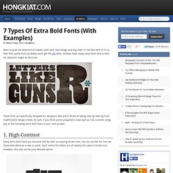
If so, then thin, polite fonts probably won’t get the job done. Instead, thick, heavy duty fonts that scream for attention might do the trick. These fonts are specifically designed for designers who aren’t afraid of taking risks by veering from traditionalist design trends. As such, if you think you’re prepared to take such as risk, consider using any of the following extra bold fonts in your next project. 1. Many extra bold fonts are characterized by their un-varying stroke sizes. If you’re searching for a little more font contrast in an upcoming project, choose one of the following high contrast fonts we’ve indicated below.
Font suggestions: Nouvelle Vague Bodoni XT 2. The downside of extra bold fonts is how much space they typically consume. (Image source: brian) By being extra bold but consuming less space, they offer the best of both worlds. Archery Furore Hursheys Forque 3. Vintage Candy Inc 4. 5. 104 Free Fonts for Web Designers and Logo Artists. It’s very essential for Designers to have an good understanding of typography and selection as the importance of typography in design can’t be neglected.

The proper selection of typography can convert your normal design into very attractive piece of art. Among other things, effective typography manages to achieve three necessary objectives of web designing are Look, Appearance and Outcome which helps you to keep apart from normal wave. As we know that typography can be used as a way of mutual understanding between you and your users. To communicate effectively, typography requires appropriate typefaces as there are a lot of unsung fonts out there that have really inspired us. Handpicked free fonts for graphic designers with commercial-use licenses. 40+ Beautiful and Fresh Free Fonts for Download. Whether you are reading a printed newspaper, magazine, web article or just surfing the Internet, an important element that draws your attention at first is the font.
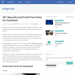
A well-chosen font is fundamental as it has to be distinctive and attractive, to catch the reader’s eye and make him want to read the given information. A well-selected font is an important key to the success of the project you work on, especially if you want your content to be read. TypeDNA : Creative with Fonts. Exljbris Font Foundry.