

The Web’s third frontier. Everyone realizes that the web is entering a new phase in its development.
One indication of this transition is the proliferation of attempts to explain the changes that are occurring. Functional explanations emphasize the real time web, collaborative systems and location-based services. Technical explanations argue that the interconnectivity of data is the most significant current development. They consider the web’s new frontiers to be closely related to the semantic web or the “web of things”. Although these explanations are both pertinent and intriguing, none of them offers an analytical matrix for assessing the developments that are now underway. In contrast, other explanations are far too broad to serve any useful purpose. How can the web’s development be understood? The web represents a compendium of technical resources, functionalities and usage practices, and it cannot be reduced to just one of these dimensions.
The founding principles The two initial phases of growth.
9 lessons about the web and business from Pearltrees, the or. Pearltrees is a French startup that wants to change the way we organise the web.

Describing how it works would lead you to believe that it’s another social bookmarking site, which would do them injustice. Most of the social bookmarks are organized either alphabetically or chronologically, which doesn’t do much good when you try to retrieve stuff later. Also, due to how most social bookmarking sites were designed, they’ve become more like a curated list of the hottest headlines out there right now, and about what Mashable calls “velocity” – the question: how fast is this thing spreading? This idea of velocity is not what Pearltrees is about – on the contrary, it’s a tool that helps you keep an eye on context and history in the endless stream of blogs, tweets and Facebook posts.
It’s a mental map of noteworthy things you’ve read online, organized by subjects and sub-subjects that are endlessly divisible. 1. Press Release V 0.8.1. Pearltrees Beta 0.8.1.
Url?sa=t&rct=j&q=&esrc=s&source=web&cd=1&ved=0CDEQFjAA&url=http%3A%2F%2Fblog.pearltrees.com%2Fwp-content%2F2010%2F05%2Fcp-2-millions-de-perles-Pearltrees.docx&ei=vKKcUoe8BLCf7AbJlYGQDA&usg=AFQjCNGP-ekXjdQdi3U_xSNNNgmlfEKVTA&bvm=bv.57155469,d. Cp-2-millions-de-perles-Pearltrees. Sept mois après le lancement de sa version Beta, Pearltrees sort sa version beta0.7.2 et franchit les deux millions de perles créées Pearltrees, le premier réseau d’intérêts humains, propose une version beta 0.7.2 comportant une série d’améliorations ergonomiques.
Press, Pearltrees OfficialBlog webcache. A New Web Paradigm: Pearltrees. Pearltrees Hits Android, as it Prepares to Become a File Manager. Pearltrees is a content curation startup that we’ve been tracking for some time now, and today it’s launching an app on Android.

However, there’s a twist, as the launch points towards an expansion of exactly what this service is all about. As with the Web and iOS versions of Pearltrees, the Android app allows you to create, share and explore mindmap-style ‘trees’ of content. So, I could create a tree of articles, images and notes related to a particular theme and then if you searched Pearltrees for that theme, you’d find my tree and related ones by other people.
It’s a highly visual, logical way of organizing and sharing ideas and information, and the Android app benefits from the OS’ built-in sharing capabilities. Any Web page can be added to a tree straight from the share menu in your browser. Pearltrees: Visual Collaborative Content Curation for Android. Pearltrees is a powerful application that allows people to browse and organize web content visually.
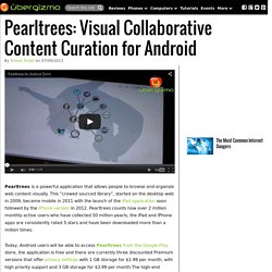
This “crowed sourced library”, started on the desktop web in 2009, became mobile in 2011 with the launch of the iPad application soon followed by the iPhone version in 2012. Pearltrees counts now over 2 million monthly active users who have collected 50 million pearls, the iPad and iPhone apps are consistently rated 5 stars and have been downloaded more than a million times.
Today, Android users will be able to access Pearltrees from the Google Play store, the application is free and there are currently three discounted Premium versions that offer privacy settings with 1 GB storage for $1.99 per month, with high priority support and 3 GB storage for $3.99 per month.The high-end version, currently priced at $9.99, in addition to the privacy control and high priority support, offers 10 GB storage, customization features, backup and encryption. Pearltrees Ha Rediseñado Radicalmente su Servicio de Curaduría en Línea para Llegar a un Público más Amplio. Pearltrees, el servicio de curación en línea con sede en París que puso en marcha a finales de 2009, siempre fue conocido por su interfaz basada en Flash, bastante peculiar que le ha permitido organizar favoritos de Internet, fotos, fragmentos de texto y documentos en una estructura en forma similar a un mapa mental.
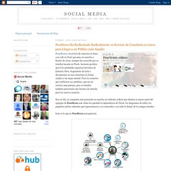
Para los usuarios que recibieron esa metáfora, que era un servicio muy potente, pero su interfaz también presentaba una barrera de entrada para los nuevos usuarios. Hoy en día, la compañía está poniendo en marcha un rediseño radical que elimina la mayor parte del equipaje de Pearltrees 1.0. Atrás ha quedado la dependencia de Flash, los diagramas de árbol, las pequeñas perlas redondas que representaron a su contenido y casi todo lo demás de la antigua interfaz.
Pearltrees passe en version 2.0 et change radicalement d'interface. L’outil de curation web basé à Paris Pearltrees vient de passer en version 2.0.
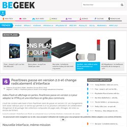
Les changements sont assez radicaux pour ce service qui permet à un ou plusieurs utilisateurs en collaboration d’organiser et de partager des collections composées de pages web, d’images, de notes ou encore de fichiers. Jusqu’à présent, l’interface en Flash se présentait sous la forme d’arbres composés de perles. Pour se plier aux standards actuels et probablement pour rendre le fonctionnement du service plus intuitif, Pearltrees 2.0 passe au HTML5 et abandonne les perles qui ont fait son nom au profit de grilles dynamiques. La possibilité de glisser-déposer un élément (document, page web…etc.) dans sa collection depuis son navigateur ou même le Bureau a été ajoutée.
Si le passage au HTML5 concerne la version web du service, les applications Android et iOS sont aussi revues. Pearltrees releases a new version, without any pearls nor trees. The Paris-based startup founded in 2009 once declared: “We focus on the visual potential of Pearltrees to let people dive deeply into their interests and nearly feel them”.
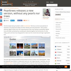
Their product, offering a digital curation tool, was unique because of the visual interface voluntareely original: links and folders symbolized by rounded pearls attached together like the branches of a tree. Today, pearls and trees have disappeared to make room for a brand new and larger organisation tool. Two years ago, everyone wanted to build products around “curation” and “interest graph”. Pearltrees 2.0 Launches with a Brand New User Interface. Today Pearltrees officially separated itself from its unique visual interface made of pearls and pearltrees, finally succumbing to the trend of Pinterest-like user experience.
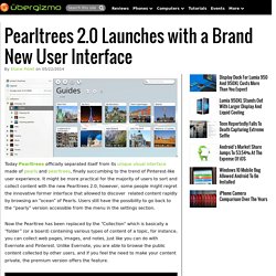
It might be more practical for the majority of users to sort and collect content with the new Pearltrees 2.0, however, some people might regret the innovative former interface that allowed to discover related content rapidly by browsing an “ocean” of Pearls. Users still have the possibility to go back to the “pearly” version accessible from the menu in the settings section. Now the Pearltree has been replaced by the “Collection” which is basically a “folder” (or a board) containing various types of content of a topic, for instance, you can collect web pages, images, and notes, just like you can do with Evernote and Pinterest.
Unlike Evernote, you are able to browse the public content collected by other users, and if you feel the need to make your content private, the premium version offers the feature. Pearltrees veut donner plus de sens à nos collections. Pearltrees Expands Beyond Trees of Pearls with 'Meaning' Content and file curation and sharing platform Pearltrees has been updated today with new features that include ‘Meaning’, a new organization system. ‘Meaning’ is based on a traditional grid and allows users to drag and drop content into collections that can be shared with others and collaborated on with real-time synchronization. Pearltrees tells us that it hopes the new layout will encourage more collaboration between users. The company may have a point – a conventional grid could well take less time for new users to adapt to than Pearltrees’ old ‘tree of pearls‘ look that it moved away from earlier this year, even if it’s not quite as unique to look at.
The France-based company’s video below shows Meaning in action: Pearltrees Staff. Pearltrees. Amazingly popular trees. Logical Pearls. Tech. Cool Pearls. Education Pearls.