

When Do You Need a Long-Form Sales Page? How long does your landing page have to be to get prospects to take the long jump toward conversion?
Image by Hermitianta Prasetya Putra via Flickr. The best landing pages are concise and include just enough copy to make the sale – and not a word more. That’s not to say that, “shorter is better.” Long landing pages definitely have their place. Advanced Music Mailing. Kickstarter, la mayor comunidad creativa dedicada a la realización de proyectos creativos a nivel mundial, desembarca en España de la mano de Sónar+D A partir del día 2 de junio de este año, Kickstarter se lanza en España y pone a disposición de los creadores nacionales la posibilidad de financiar sus proyectos en Euros y recaudar los fondos desde una cuenta bancaria nacional.

De esta manera, los proyectos españoles tendrán una operativa administrativa local y visibilidad internacional. A partir de hoy mismo, día 19 de mayo, todos aquellos creadores que lo deseen pueden empezar a preparar sus campañas en Kickstarter y a partir del día 2 de junio se abrirán al público para que pueda empezar a apoyar los proyectos. Durante los tres días de Sónar+D - 18, 19 y 20 de junio - , el equipo de Kickstarter tomará múltiples espacios del festival para realizar diversas actividades que acercarán el funcionamiento de la plataforma a la comunidad creativa. We are Conversion Rate Optimization Experts. Ask Us Anything. We'll answer your questions on CRO Day, April 9th.
We are Conversion Rate Optimization Experts.
Ask Us Anything. We'll answer your questions on CRO Day, April 9th. For the first time in Conversion Rate Optimization (CRO) history, a global audience will come together online to celebrate a marathon of data-informed marketing—brought to you by the world’s elite conversion experts. Although Conversion Rate Optimization isn’t anything new and is quickly gaining popularity among digital marketers, it’s still not a widely recognized field in the overall digital marketing landscape.
Advertising best practice, evidence and insights. LONDON: Millennials make up one third of the readership of The Economist, but the publisher is more interested in the psychographics of its readers than in their demographics.
In the view of CEO Chris Stibbs the current tendency for many sectors to focus on millennials rather than better understanding their audience as a whole is "a dangerous thing". While that might make sense for some publishers – and here he cited the examples of Vice and Buzzfeed – "at The Economist we understand that our target audience is best defined by its psychographic rather than its demographic". By that he meant people with an interest in international events and the impact of technology on the world, people who are "career-driven, ethical and like a challenge". Economist readers share these characteristics, he declared, not an age. Uso del chat en tiendas online para mejorar la conversion. Los sistemas de chat online, siendo Zopim el más conocido, forman parte de la mayoría de sitios web en los que el usuario puede necesitar soporte o ayuda para, o bien comprender el producto o servicio que se le oferta, disipando dudas, o bien para terminar procesos de contratación o negocio vinculados al objetivo del sitio web.
Cada vez es más habitual verlos presentes en tiendas online y todo tipo de comercios electrónicos, como una herramienta más que facilita la relación con el cliente y permite trabajar la venta en un formato más detallado. El gran “problema” del chat online en una tienda es saber gestionarlo, ¿quién lo atiende? , ¿cómo lo gestionamos? , ¿qué pretendemos conseguir con su uso?
Todos hemos entrado en un comercio electrónico o sitio web en el que, pasado un tiempo, esa ventanita de la esquina inferior derecha, generalmente, cobra vida y te pregunta en que puede ayudarte. ¿Y esto como lo hemos hecho y gestionado? When to Sell with Facts and Figures, and When to Appeal to Emotions. When should salespeople sell with facts and figures, and when should we try to speak to the buyer’s emotional subconscious, instead?

When do you talk to Mr. Intuitive, and when to Mr. Rational? I’d argue that too often, selling to Mr. Rational leads to analysis paralysis, especially for complex products or services. Twitter. 3 Questions You Must Answer to Create Mobile Landing Pages That Convert Like Crazy. Answer me these questions three… to create mobile landing pages that convert.
Image source. Creating a mobile-friendly landing page is no simple feat. For starters, you need to cram all of the essential landing page elements into half the space. 6 Things I Do to My Landing Pages When My Conversion Rates Suck. Irrational Grumpy Cat reactions aside, under-performing campaigns are a major downer – and not just for you.
After all, your visitors have to wade through all that stinky poop too. Think about them for a minute. 10 Conversion Psychology Resources That Will Make You a Smarter Marketer. You don’t have to be Freud to understand how your prospects think.
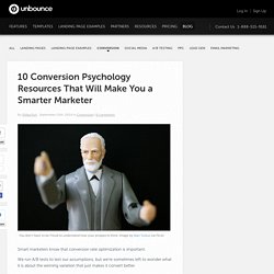
Image by Alan Turkus via Flickr. Smart marketers know that conversion rate optimization is important. We run A/B tests to test our assumptions, but we’re sometimes left to wonder what it is about the winning variation that just makes it convert better. It doesn’t have to be a mystery. How to Use Urgency and Scarcity to Improve Conversions. Conversion optimization is way more than button size, font colors, and sizzling calls to action.
It’s also about the inner psychology of the user, known as customer psychology. A Comparison of Popular Online Fonts: Which Size and Type is Best? By Michael Bernard, Bonnie Lida, Shannon Riley, Telia Hackler, & Karen Janzen In the last edition of Usability News we discussed our findings in regard to the performance and preference of twelve different fonts at the 12-point size. We are now able to compare these fonts at the 10-, 12-, and 14-point sizes. To do this, we examined some of the most commonly used fonts for differences in reading effectiveness, reading time, perceptions of font legibility, font attractiveness, and general preference.
The fonts that were examined are listed below in Table 1. Table 1. Currently, text that is viewed on computer screens consist of an amalgamation of both serif and sans serif fonts that were designed specifically for computer use, as well as those that were originally intended for print (serif fonts cross-strokes that project from the main stroke of a letter, whereas sans serif fonts do not).
Another commonly used serif font is Schoolbook. Dl.boxcloud. Introducción al CRO. 6 Ways to Increase Conversions by Guest Blogging. Guest blogging is time consuming, complex to manage and often requires a sizeable investment. So you need to squeeze more out of every link that you acquire. Today I’ll cover 6 ways to increase conversions from your guest blogging efforts to get more than just ‘SEO value’ out of a link.
If you can show conversions and demonstrate that guest blogging can align with the business goals of your company (rather than just an element of an SEO campaign) it might just open the eyes of your manager or client and help you to secure more budget and a wider scope. 1. Conversion Rate Optimization and SEO (Together at Last) CRO and SEO spooning. Aww, you knew it would happen right? No more hatin’ between the camps. Got it? Good. (Image source) Everyday the Internet gets more complicated. Google is making search optimization and conversion optimization more similar.
Illustrated Guide To Web Experiments. The author's posts are entirely his or her own (excluding the unlikely event of hypnosis) and may not always reflect the views of Moz. Web experimentation is a great tool to increase engagement and conversion rates. The primary strength of experiments is the possibility to isolate variables, and thus examine causality between different metrics such as tagline and conversion rate. Much of the literature on experimental design has its roots in statistics and can be quite intimidating.
To make it more accessible, I introduce the illustrated guide to web experiments (with some help from my brother, Andreas Høgenhaven, who kindly made the illustrations). Before getting started on the experiment, you need to get the basics right: Test metrics that align with your long term business goals. A/B or MVT One of the first things to consider is the experimental design. MVT Face-off: Full Factorial vs Fractional Factorial. Why Your Qualified Leads Refuse to Sign Up: The UX of Plans and Pricing. Every SaaS application has a funnel. Landing page, maybe a demo or pricing page, and then sign up. Qualified leads will stop by your “Plans and Pricing” page to make an informed decision. If you owned a car dealership, would you fill your showroom with stray dogs and blasting loud music?
Well, too many startup founders, product managers, and user experience designers are letting the dogs and loud music run wild.