
Quotes by William Zinsser @ Like Success. A writer is always working. more...

Writers who think THEY are being criticized when only that writing is being criticized are beyond a teacher's reach. Writing can only be learned when a writer coldly separates himself from what he has written and looks at it with the objectivity of a plumber examining a newly piped bathroom to see if he got all the joints tight. more... Writing is not a special language that belongs to a few sensitive souls who have a 'gift for words'. Writing is the logical arrangement of thought. Anyone who thinks clearly should be able to write clearly-about any subject at all. more... Writing is no respecter of blueprints. more... How to Use the "Rule of Three" to Create Engaging Content.
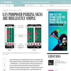
LA's Proposed Parking Signs Are Brilliantly Simple. Ken Husting was circling downtown Los Angeles one day in 2013 trying to find parking when, all of a sudden—Hallelujah!

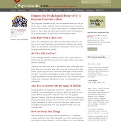
— he found a spot. Then he looked up to see six signs attached to pole telling him that he maybe, possibly could park there. It was hard to know for sure, even for Husting, who is, quite literally, an authority on parking in the city. You undoubtedly know his pain. Such convoluted signage makes parking chancier than throwing dice at the craps table. Nearly two years later, LA is rolling out a pilot program of signs that may do exactly that. You might recognize the design. Click to Open Overlay Gallery Last fall, Krekorian’s team got in touch with Sylianteng to see about presenting her her design to the city council. Krekorian was pushing this plan at the same time Husting’s team was exploring its own parking sign concepts. Welcome to Forbes. Harness the Psychological Power of '3' to Improve Communication - Psychotactics - Big and Small Business Ideas. Two might be company in life, but in communication you can go all the way to three and still have a rollicking party.

If you step over to four however, it’s quite likely that you’ve stepped into the hara-kiri zone. Back up that truck a bit and learn how the power of ‘3’ has the ability to make your communication soar. Let’s Start With a Little Test Here’s a psychological test. Lay out 10 business cards in a row and choose three that catch your attention instantly.
So What Did You Find? Isn’t it strange that there seems to be no real reason why you chose what you did? Some of the cards have lots of information, and some have very little. Aha! Understanding and applying it will throw a light into the dark world of your presentations, brochures, web sites and yes, even email! How the Brain Sees Things The brain finds it relatively easy to grasp threes — elements, colours and fonts. So why does this happen? The Building Blocks of Visual Communication: Elements, Fonts and Colours. Purge These Redundancies and Needless Phrases I commute.

Not every day but a couple of times a week, I walk to the train station and catch the 7:50 (or occasionally the 8:20) and ride into Chicago. At the station I hear this announcement: "Metra commuters, your attention, please. An inbound train to Chicago is now arriving in your station. For your safety, please stand behind the yellow line until the train has come to a complete stop before boarding the train.
" Trapped by tl;dr. TL;DR is internet talk for "too long; didn't read".

It's also a sad, dangerous symptom of the malfunctions caused by the internet tsunami. (Here's a most ironic example of this paradox...) Jony Ive Debuts iOS 7: “Bringing Order To Complexity” Apple debuted the next generation of iOS yesterday at WWDC and now you can watch Jony Ive’s 7 minute iOS 7 introduction video.

“True simplicity is derived from so much more than just the absences of clutter or ornamentation,” Ive explains. “It’s about bringing order to complexity.” As stated on the WWDC stage yesterday, iOS 7 is the biggest change to ever come to the iPhone. So much so that Apple is going to have to extensively sell the update before rolling it out. From what we’ve seen, the new look and feel, gathered by devs testing the beta, is rather polarizing.
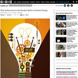
Facebook receives a major backlash when tweaking its look. This video is likely just the start of a major marketing campaign. Why Subtraction Is the Hardest Math in Product Design. Illustration: Tom Whalen Simple doesn’t just sell, it sticks.

Simple made hits of the Nest thermostat, Fitbit, and TiVo. Simple brought Apple back from the dead. It’s why you have Netflix. The Fisher Space Pen, the Swiss Army Knife, and the Rolex Oyster Perpetual are some of our most enduring products. Yet while many mechanical marvels of simplicity remain true to their original form, most electronic ones do not. Travel back in time to use your parents’ first microwave and you’ll likely see a box with three buttons (High, Medium, Low) and a timer dial.