
Introduction to Techniques for WCAG 2.0. This document is part of a series of documents published by the W3C Web Accessibility Initiative (WAI) to support WCAG 2.0 [WCAG20].

It includes a variety of techniques which include specific authoring practices and examples for developing more accessible Web content. As well, it lists failures, which describe common mistakes that are considered failures of WCAG 2.0 Success Criteria. This is not an introductory document. It is a detailed technical description of techniques that can be used to address the requirements in WCAG 2.0. See Web Content Accessibility Guidelines (WCAG) Overview for an introduction to WCAG, supporting technical documents, and educational material.
In order to make the set of techniques maintained by the WCAG WG as comprehensive as possible, the WCAG WG encourages submission of new techniques so they can be considered for inclusion in this document. Sufficient and Advisory Techniques Note that all techniques are informative. Technique Collections. Accessibility: The Missing Ingredient. Assistive Technology for Blind Goes Mobile and User Friendly. BLIND TECH (Chrome Reader - Mobile Webpage Screen Reader) December: Haptic shapes using ultrasound. My Experience Designing for the Blind. My Experience Designing for the Blind Research, Design, and Prototyping At Purdue, there is a program called EPICS in which students can work with real world clients to engineer products to be used in the community at large.

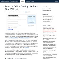
In my Interaction Design class this semester, one of our projects was to work with an EPICS team to provide a IxD perspective to their product. The workflow, from what I have seen in EPICS this semester, is usually get a brief from a client, build a prototype, give it to the client, change the prototype according to their feedback, and repeat until it is good enough. My job was to shake it up by talking the the users before any products are designed in the first place. I was able to pick between a number of projects, but the one that caught my eye was called a “Braille e-Reader.” As a bit of background, a product exists called the Apex Braillenote (seen on the left) that provides one line of 36 cells for a user to read documents one line at a time. Deaf, Blind Sue Over Web Shopping - WSJ. How I use the iPhone as a blind person. Screen Reader Demo. Form Usability: Getting 'Address Line 2' Right. While ‘Address Line 2’ may seem like an insignificant aspect of an e-commerce design or overall form design, we have observed this form field to be the cause of bewilderment and uncertainty for users during both our checkout usability and mobile e-commerce research studies.

Now, it should be noted that ‘Address line 2’ was never observed to be the direct cause of checkout abandonments during any test sessions. Poor ‘Address line 2’ designs did however contribute to a sub-par form filling experience during both studies, as the test subjects spent excessive time filling out forms or typed correct input in a wrong field, resulting in needless validation errors and warnings. Given how easy it is to design a user-friendly and unambiguous ‘Address line 2’ field, it’s worth taking a moment to fix it – it really is one of those low-hanging fruits in checkout and form design.
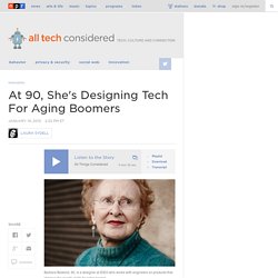
In this article we’ll therefore go over 5 tips to get the ‘Address line 2’ right. At 90, She's Designing Tech For Aging Boomers : All Tech Considered. Barbara Beskind, 90, is a designer at IDEO who works with engineers on products that improve the quality of life for older people.

Nicolas Zurcher/Courtesy of IDEO hide caption itoggle caption Nicolas Zurcher/Courtesy of IDEO Barbara Beskind, 90, is a designer at IDEO who works with engineers on products that improve the quality of life for older people. Nicolas Zurcher/Courtesy of IDEO In Silicon Valley's youth-obsessed culture, 40-year-olds get plastic surgery to fit in. Barbara Beskind says her age is an advantage.
"Everybody who ages is going to be their own problem-solver," she says.