
Typefaces of the occult revival. Man, Myth & Magic #1, January 1970; McCall’s, March 1970.
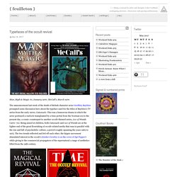
The announcement last week of the death of British character actor Geoffrey Bayldon prompted some discussion here about the typeface used for the titles of Bayldon’s TV series from the early 1970s, Catweazle. This was a humorous drama in which the actor portrayed a warlock transplanted by a time portal from the Norman era to the present day, a comic counterpart to another occult-themed series, Ace of Wands (1970–72). Being aimed at children, both Catweazle and Ace of Wands are at the lighter end of the great flourishing of occult-related media that runs in parallel with the rise and fall of psychedelic culture, a period roughly spanning the years 1965 to 1975. The two trends reflected and fed off each other; the hippie movement stimulated interest in the occult (Aleister Crowley is on the cover of Sgt Pepper) while giving to the commercial propagators of the supernatural a range of aesthetics lifted from the 19th century.
Undated. Atari Font. An assortment of "sixties" typefaces. Albertus and The Prisoner. For those of you not familiar with it, The Prisoner is one of the most iconic TV shows to have come out of the 60s.
It ran on ATV from September 1967 to February 1968. While any TV programme is obviously the work of a huge team of people, this show had one powerful force at its core: it was co-created, directed, and produced by Patrick McGoohan, who also starred in the lead role of No.6. McGoohan had made his name in the black and white spy show Danger Man, and had even been asked to be the first Bond on the back of his work on that. He turned down Bond, but after more than 80 episodes, had grown bored of working on Danger Man. Playbill ("old west" font) Godfather Font. Gyaru-moji. Like the English phenomenon of SMS language, it is most often used for sending cell phone text messages, but while text is used as a form of informal shorthand, a message typed in gyaru-moji usually requires more characters and effort than the same message typed in plain Japanese.
Since writing in gyaru-moji requires extra effort, and due to the perception of confidentiality, sending gyaru-moji messages to a peer is seen as a sign of informality or friendship. The origin of this style is unclear but it has been proposed that magazines targeted at teenage girls first made it popular, and the phenomenon started to gain wider attention in media around 2002. [citation needed] The style has been met with increasing criticism, as its use continues to expand. Square Kufic. Yellow Submarine Font. English Français Español Deutsch Italiano Português Login | Register Themes New fonts Authors Top ForumFAQ Submit a fontTools a b c d e f g h i j k l m n o p q r s t u v w x y z # 7 matching requests on the forum Yellow Submarine Custom preview Size Yellow Submarine à in Fancy > Various 185,296 downloads (24 yesterday) 3 comments Download beatles.TTF.
Tifanegh unicode. An arcane grimace. Rambler and Magneto. [Date Prev][Date Next][Thread Prev][Thread Next][Date Index][Thread Index] From: tom jennings <tomj@xxxxxxx>Date: Fri, 7 Aug 2009 10:14:43 -0700 A few years back I wrote something about stumbling upon a computer font (available for sale) that was an awful lot like the Nash/Rambler font... turns out it's not a coincidence.
& mastrena also seen in coffeehouses – graywyvern
Cf maserati logo victoria arduino (at a coffeehouse nearby) – graywyvern
The creator of the Airflyte font wrote me (below) and has a bit of info on it and a related font, Magneto, that IS derived from Kelvinator...
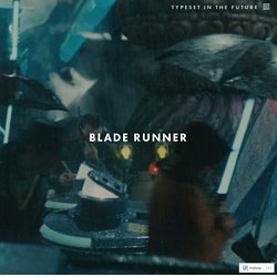
So if you need a typeface for AMC stuff, you can hardly go wrong here... google it up and I'm sure you;ll find it. ---------- Forwarded message ---------- From: Todd Ruel <todd@xxxxxxxxxx> Date: Fri, Aug 7, 2009 at 10:06 Subject: The Airflyte font To: tomj@xxxxxxx Tom, Hi, I'm Todd Ruel, the guy who created and sells the Airflyte font for 1940s and 1950s Nash fans. I wanted to share a little bit of information with you about Magneto Bold, a lookalike retro font that you display on your AMC Typeface web page. Typeset In The Future. After studying Alien in intimate detail, it’s time to look at the typography and design of Ridley Scott’s other classic sci-fi movie, Blade Runner.
Based on Philip K. Dick’s novel Do Androids Dream of Electric Sheep? , Blade Runner cements Scott’s reputation for beautiful, gritty, tech noir science fiction. (As with my previous articles, I should note that there are spoilers aplenty throughout the next 5,000 words. If you don’t want to know when Blade Runner’s sole appearance of Eurostile Bold Extended occurs, look away now.) Blade Runner’s opening crawl is distinctly un-futuristic in its choice of font. Stefan-George-Schrift (Font) Mexican Blackletter.