

Edlea. Smashing UX Design - Usability, UX design and Information Architecture Articles. Category: UX Design This category features quality articles on usability, information architecture, interaction design and other user experience (UX) related topics – for digital (Web, mobile, applications, software) and physical products.

Through these articles, experts and professionals share with you their valuable ideas, practical tips, useful guidelines, recommended best practices and great case studies. Curated by Chui Chui Tan. . Popular tags in this category: Freebies, Web Design, Techniques, Inspiration, Business A Guide To Validating Product Ideas With Quick And Simple Experiments You probably know by now that you should speak with customers and test your idea before building a product. Mistakes include testing the wrong aspect of your business, asking the wrong questions and neglecting to define a criterion for success.
Read more... Building Clickthrough Prototypes To Support Participatory Design Read more... Creating Responsive Prototypes With Adaptive Views In Axure RP 7. Good UX in the Wild: Dropbox's attention to detail on their download page.
Defining and Informing the Complex Field of User Experience (UX) Open-source governance. Open-source governance is a political philosophy which advocates the application of the philosophies of the open source and open content movements to democratic principles in order to enable any interested citizen to add to the creation of policy, as with a wiki document.
Legislation is democratically opened to the general citizenry, employing their collective wisdom to benefit the decision-making process and improve democracy.[1] Theories on how to constrain, limit or enable this participation vary however as much as any other political philosophy or ideology. Accordingly there is no one dominant theory of how to go about authoring legislation with this approach. There are a wide array of projects and movements which are working on building open-source governance systems.[2] Applications of the principles[edit] In practice, several applications have evolved and been used by actual democratic institutions in the developed world:[3] Common and simultaneous policy[edit] History[edit]
Mobile website strategy for customer engagement.
The vision for government corporate websites in the Single Domain (with product wireframes) This is the third in a series of posts sharing progress on how we are tackling objective two of the single domain ‘beta’ project: specifically the creation and test of a unified publishing platform capable of replacing many of the websites which government organisations currently run across separate domains – like dh.gov.uk or bis.gov.uk – to provide information on who they are and what they do.
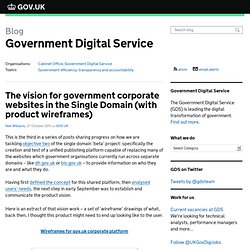
Having first defined the concept for this shared platform, then analysed users’ needs, the next step in early September was to establish and communicate the product vision. Here is an extract of that vision work – a set of ‘wireframe’ drawings of what, back then, I thought this product might need to end up looking like to the user. If you’re used to looking at wireframes, skip this paragraph. For everyone else, I should make clear that these drawings are by no means intended to give an impression of visual design.
More importantly, I want to put these out there to get your feedback now. Guideline for External Use of Web 2.0. 1.
Publication Date The publication date of this guideline is November 18th, 2011, and it will be reviewed and updated on an ongoing basis as appropriate. 2. Purpose This guideline is designed to provide specific guidance to Government of Canada departments on the use of externally facing Web 2.0 tools and services. This guideline does not alter or replace any existing legislation or policy instrument.
Designate clear accountability for the coordination of departmental Web 2.0 initiatives; and Develop guidance for personnel on the use of Web 2.0 that addresses expected behaviours, benefits, risks and consequences for all types of potential use (official use, professional networking use and personal use). This guidance may not cover every situation, but it will help departments make good choices that mitigate risks while maximizing benefits of these tools and services. 2.1 Application This guideline was released by the Treasury Board Secretariat (TBS) Chief Information Officer Branch.
Better User Orientation through Navigation. Users are constantly orienting themselves on your site.
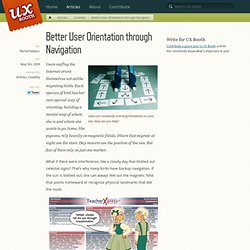
How can you help? Users surfing the Internet orient themselves not unlike migrating birds. Each species of bird has her own special way of orienting, building a mental map of where she is and where she wants to go. Some, like pigeons, rely heavily on magnetic fields. Others that migrate at night use the stars. What if there were interference, like a cloudy day that blotted out celestial signs? What to say? Users are the same way. If you implement the following tips, not only will your users be able to mentally picture where they are when they crash-land on any of your site’s pages, but they’ll be aware of the many other things around them in relation to the site’s structure. Keep a clearly marked home link on all interior pages. Some other user-friendly things to keep in mind when designing navigation: Dropdowns and flyouts should linger.