

Think Fast! Using Heuristics To Increase Use Of Your Product. People have many tough decisions to make; whether they should use your application or website to accomplish a task shouldn’t be one of them.
Your design team can take advantage of our knowledge of the human mind and human behavior by accounting for a number of heuristics, or mental shortcuts, that researchers have identified. You might be familiar with the term “heuristic” from the UX research method of heuristic evaluation. A heuristic evaluation involves experts evaluating the interface and interactions of a system based on accepted usability best practices. Forget about that for now. In psychology, a heuristic is simply a fancy word meaning mental shortcut.
The Subtle Magic Behind Why the Bootstrap 3 Grid Works. IMPORTANT NOTE: Bootstrap 4 will be out soon, and these articles will be updated to reflect both v3 and v4.
I do not expect major changes to how things work with regards to the content of these articles, but everything will be updated for continued education and assistance with Bootstrap. Read more here: Things like CSS grids should remain behind the curtain. No one really needs to know how it works, or why. What White Space Can Do For You. White space is a powerful tool that can take your designs to the next level.
When used strategically, that is. Debunking the Myth: White Space is Wasted Space Way back in 1930, groundbreaking Swiss designer and typographer Jan Tschichold wrote that white space "is to be regarded as an active element, not a passive background. " Long ago, Tschichold could see that white space was not simply dead space or wasted space, but rather, a design element in and of itself. Let’s talk about some things that can be improved using white space.
Readability Internet users don’t read, they scan. How to Use HTML5 History. HTML5 introduces a variety of new goodies for front-end developers, such as the additions to the browser's history object.
Understanding Mobile User Experience: the 3 Modes of Mobile Usage. Do you want your mobile project to succeed?
Whether it’s a mobile website, a mobile application, a mobile game or any combination of these, the success of your mobile initiative relies on how people use it. People are busy, their attention is in demand and they have existing patterns of behavior that your mobile project has to co-exist with. It makes sense to understand those patterns of behavior and to build your mobile strategy with that understanding – to work with existing behaviors instead of trying to invent new ones. So what are those existing behaviors? In statistics, the mode is the “[value occurring most frequently in a series of observations or statistical data.][]” Modes are a more precise way of describing the existing behaviours of people. Our friends at Google analyzed their mobile users and came up with a strategy to help guide its mobile web and app development strategy. The Return of the Scroll. The latest release of Apple’s eBook reading app called iBooks introduced a new navigation mode: the scroll.
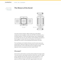
We’re all familiar with a scrolling interface, it’s what every Web browser uses to display pages on the Web, but until now, the interface used for eBooks was based on that of pages in a book, with the user having to click a button or tap/swipe the screen to move backwards and forward in the text. The new iBooks scroll interface behaves much the same way as you would expect: slide your fingers up or down the screen to scroll in the desired direction.
Is this mode better than the traditional pages approach and are we going to see other readers follow? Why pages? The ancients used scrolls as a primary writing medium for longer works. In time, the bound book succeeded the scroll as the medium of choice for written works. The scroll allowed only for sequential access, while the book gave you random access. Pages in eReaders. Free Keynote Mockup Templates for iPhone, iPad, Android, ... Click the orange button to pop-up a window where you can edit and confirm the tweet, then the download button will be activated Keynotopia Mockup Templates enable you to sketch user interfaces using Apple Keynote or Microsoft PowerPoint, without having to draw each component by hand!

All components are hand-drawn vector shapes created from scratch in Keynote and PowerPoint, and can be edited and customized directly, without needing additional design tools. When your mockups look like simple hand-drawn screens, it’s easier to get feedback on layout and structure, without getting distracted by the detail. And creating Keynote and PowerPoint sketches is better than drawing them by hand, because you can iterate and modify them quickly without having to redraw them from scratch. How To Recruit A UX Designer. Advertisement The Web has entered an era of user-centricity.
If businesses are to attract new customers and retain existing ones, they must create websites and apps that deliver intuitive and tailored experiences. Whether you run an online retailer or a not-for-profit community website, the user experience is mission critical. As a consequence, we have seen a real surge in the need for talented user experience (UX) designers who can help turn vision into reality.