

90 top-quality typography tutorials. The web is brimming with typography tutorials, but many are low quality and others are very out of date.
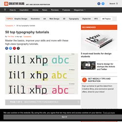
So we’ve trawled the internet to uncover the diamonds in the rough, in the form of 50 top-quality typography tutorials, to bring your knowledge and skills up to speed. Get Creative Cloud Perhaps you’re looking for a good introduction to the fundamentals of typography? TIPOGRAFIA. Font Recommendation Top 10 Lists for 2016 → Typewolf. Level 1: A Typographic Foundation. Thinking with Type. Typos. The League of Moveable Type. 25 Free Fonts Perfect for @fontface. 104 Free Fonts for Web Designers and Logo Artists.
It’s very essential for Designers to have an good understanding of typography and selection as the importance of typography in design can’t be neglected.

The proper selection of typography can convert your normal design into very attractive piece of art. Petit guide typographique à l’usage de l’internet. Cours de typographie - Serge Paulus. TYPOGRAHIE FRANCAISE : Manuel de typographie en ligne. Petites leçons de typographie.pdf. Table des matières du volume I — Orthotypographie, de Jean-Pierre Lacroux (Dictionnaire des règles typographiques françaises)
For Designers & Typography Enthusiasts. Revised Font Stack. Serious efforts are being made to get more typeface choices on the web to enhance web typography.
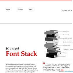
Still, most of us prefer web-safe fonts like: Verdana, Georgia, Times New Roman and Arial. Though choices are limited, yet the number can be increased by exploring other pre-installed fonts. “… font stacks are ultimately design factors, and should be scrutinized as such.” —Nathan Ford, Better CSS font stacks Baskerville, Garamond and Palatino have already been used a few times to create font-stacks that inspire.
I’ve selected 10 popular typefaces, serif and sans-serif, each from the survey. MicrosoftTahoma, Verdana, Segoe, sans-serif;Microsoft.com will be (in most cases) rendered in Verdana on Mac, and in Tahoma on Windows. Times New RomanIf we look at the above snapshots taken from Sushi & Robots’ about page, we will find that Palatino and Georgia have different x-height (and weight) than Baskerville and Garamond. 30 of the Best Web Typography Resources Online. It seems there are two camps among web designers: those who embrace web typography, experiment with it, and try new things in virtually all of their designs; and those who avoid it like the plague, opting to use standard, web-safe font stacks with little variation.
It also seems like a lot of the designers who fall into the second group wish they were more like the first. 10 Great Tips For Improving Your Web Typography. From the invention of the printing press in the 15th Century, to the creation and development of the Internet into the 21st, typography has evolved to reflect technological advancement to become both a science and an art form.

Once a specialist occupation, the digital age has opened typography to computer users and web designers. When creating pages and laying out text with other content there are several guiding principles that designers should bear in mind. Typography is a huge field of study, but this post brings together a handful of hints to help web designers improve their pages. 1. Typographica. Type Reviews, Books, Commentary. We Love Typography.
Typetester – Compare fonts for the screen. Typography for Headlines Design Showcase. They say that content is king.
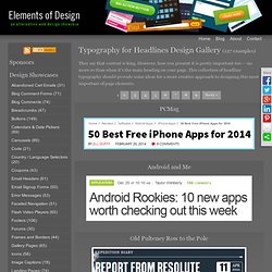
However, how you present it is pretty important too — no more so than when it's the main heading on your page. This collection of headline typography should provide some ideas for a more creative approach to designing this most important of page elements. Free fonts and premium fonts used by designers. There are usually two camps among designers when it comes to typeface choices.
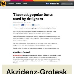
One group has a handful of favorite typefaces they adapt to every design they create, believing that these handful of typefaces can be suitable for every situation. The other camp believes in using a huge variety of typefaces, picking and choosing each one based specifically on the project at hand. Regardless of which camp you fit into, the typefaces below should interest you. They have proven popular among designers the world over, and are used in designs for everything from multi-national corporations to individual books or journals. Typefaces.pdf (Objet application/pdf) The 8 Worst Fonts In The World. We’d need another book, of course, to do this justice.
And where would one start? Fonts are like cars on the street--we notice only the most beautiful or ugly, the funniest or the flashiest. The vast majority roll on regardless. There may be many reasons why we dislike or distrust certain fonts, and overuse and misuse are only starting points. Fonts may trigger memory as pungently as perfume: Gill Sans can summon up exam papers. Most of the time we only notice typeface mistakes, or things before or behind their times. The Top Tens were: Used Regularly: Un peu de typographie... D'habitude je m'intéresse plus au fond qu'à la forme, mais voilà, je me suis découverte un penchant pour les mystères de la typographie.
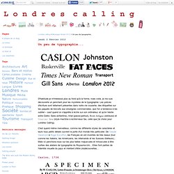
Les polices d'écriture sont tellement présentes dans notre vie courante, des étiquettes sur les paquets de biscuits aux enseignes commerciales, que l'on a tendance à les oublier – sauf quand on s'apprête à écrire sur son ordinateur, et qu'on hésite entre Comic Sans (enfantine), Arial (passe-partout), Book Antigua (sérieuse) et Courier New (style machine à écrire/vieux fax, celle que j'ai choisi pour Londres Calling). C'est quand même merveilleux, comme les différents styles de caractères et leurs tous petits détails ouvrent la porte d'un monde très particulier. A Quick & Comprehensive Type Guide.