

8 Key Points for Perfect Presentation Practice. When it comes to presenting, does practice make perfect?
In a word, no. Practice makes permanent. Your goal should be to practice perfectly, not just practice. The more you do something, the more comfortable it feels – whether right or wrong. So, we need to do it right when we practice our presentations. Knowing a subject doesn’t guarantee success. Practice Works for Me… A personal example that proves perfect practice works is a recent sales presentation that I was asked to deliver regarding BRODY Professional Development’s capabilities. After structuring my presentation, I first presented it to one of my account managers. After I updated my presentation, I practiced it with one of our facilitators who came to the meeting with me. When we arrived, we were ready, we had anticipated their questions, the timing worked, and best news of all — we got results (we made the sale)!
Images. Team Presentations. Steve Knight - How to be a great presenter. Your Presentation Is Drowning In Details, But Here’s How To Fix It. Remember that meeting last week when your coworker had to present an update on the project she’s leading–and you watched her go on and on, sharing detail after detail, until you wondered what the point was in the first place?
You’ve probably made the same mistake at one time or another, too. When you’re really close to the material you’re trying to communicate, it can be tricky not to fall down the rabbit hole or share every last detail with others. Can a slidedoc ever be a presentation? Share Tweet Email In scientific presentations, pre-made slides are a bane and a boon at the same time.
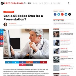
Some journals offer all the figures from publications as slides, but it’s usually as a single unalterable image, which make the slide often unsuited for presentation. In this article Dr Oliver Hauss highlights the dangers of assuming your audience will have the time, inclination or even patience to persevere with such a presentation. Understanding the differences between use for personal reference and use for presentation. 12 Visualizations to Show a Single Number. Infographics, dashboards, and reports often need to highlight or visualize a single number.

But how do you highlight a single number so that it has an impact and looks good? It can be a big challenge to make a lonely, single number look great. In this post, I show 12 different ways of representing a single number. Most of these visualizations have been created automatically using R. 10 Golden Rules You Should Live By When Combining Fonts: Tips From a Designer. A photography instructor once told me that “You have to know the rules before you can break them.”

That’s the (simultaneously frustrating and freeing) thing about art and design — there may be some rules; there may be some best practices; but there are very few that are set in stone. Bending or breaking the rules is always a possibility in the right context. So how do we go about learning how to effectively combine fonts? By looking a few guidelines, we can see what has proven to work well as a starting point, then get comfortable moving beyond those basics if a design calls for it.
5 Cool Presentation Technologies on the Cheap. Share Tweet Email Share on Pinterest From broadcasting webinars for free to downloading free powerpoint templates, we’re always working on sharing cost-effective solutions with our audience.

The Surprising Thing You Shouldn't Do When Giving a Presentation (Even Though Everyone Says the Opposite) "I always end up crying," the man said to me.
He had approached me after a presentation I gave about the power of storytelling in presentations and wanted to tell me his story. He had survived a tragic accident and now shares his story with audiences around the world. Even years later, telling the story still moves him to tears on stage. "That's okay, right? " he asked. I could tell by the way he smiled slightly that he thought I would praise him for being so present and open on stage. Want to Give a Great Speech? Take Your Audience on a Journey. Google's CEO Doesn't Use Bullet Points and Neither Should You. Google CEO Sundar Pichai recently announced at the company's 2017 developers conference that Google is "rethinking all our products" as it moves from a mobile-first world to an "A.I.
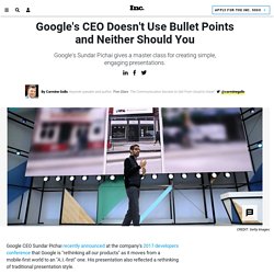
-first" one. His presentation also reflected a rethinking of traditional presentation style. Senior managers and executives at Google have told me that visual storytelling plays an important role in getting their messages across. In fact, Google's employees are being trained to present in a bolder, fresher style--less text heavy and more visual. "Since stories are best told with pictures, bullet points and text-heavy slides are increasingly avoided at Google," Pichai said at the conference. One researcher concludes that the average PowerPoint slide contains 40 words.
For example, Pichai's first slide had seven logos for Google's primary products (Search, YouTube, Android, etc.) and the following text: "1 Billion+ Users. " Pichai and Google's slide designers are creating brain-friendly presentations. 7 terrific speaking tactics—from the moment you hit your mark. Forget PowerPoint: 3 Ways to Make Your Presentation More Relatable. Slide schemes. Slide templates. Millenial presentation template. Google's CEO Doesn't Use Bullet Points and Neither Should You. 10 Golden Rules You Should Live By When Combining Fonts: Tips From a Designer.
Presentation Design: 15 Ways to Deliver the Perfect Message. To persuade, inspire, or inform with a presentation requires well organized and perfectly tailored content. 8 Keys to Your Excellent Q&A Session. Having fun during the Q&A in Elko, Nevada Audience members are shocked when I say, “Never close your speech with the Q&A.”

If you have some of my courses or are a member of my Speak and Prosper Academy, you’ve learned that it’s okay to have a Q&A period, but that you shouldn’t make it last thing your audience members hear. Why? Because people remember best what they hear first and what they hear last and you want to have complete control over that lasting message. Want to Nail Your Presentation? Why You Should Add Music (and Not the Lame Kind) Dull presentations, sermons and lectures are an inevitable part of life.
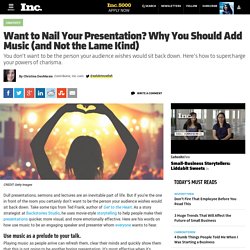
But if you're the one in front of the room you certainly don't want to be the person your audience wishes would sit back down. Take some tips from Ted Frank, author of Get to the Heart. As a story strategist at Backstories Studio, he uses movie-style storytelling to help people make their presentations quicker, more visual, and more emotionally effective. Are You A PowerPoint Addict? You Might Be Hurting Your Ability To Influence People. Giving a good presentation requires a lot of things.
There is even some science behind how to combine good content, good delivery, and good visual elements. And if standing in front of a large group scares you to death, some experts have ways to help you cope with stage fright you can fearlessly engage your audience. PowerPoint has become the presentation tool for most of the business world whether you are a massive Fortune 100 company or a small start-up pitching to angel investors for funding. Regardless of your company size, here is a scenario that might feel scarily familiar: These 5 Public Speaking Tips Will Make Your Next Pitch Sound Like a TED Talk.
The most popular TED Talks share five qualities that any entrepreneur or speaker can -- and should -- adopt in their very next pitch or presentation. The list below is based on an analysis of more than 500 TED Talks (150 hours), interviews with popular TED speakers, and backed by the current neuroscience on persuasion. 1. TED speakers are passionate Economics professor Larry Smith's blunt TED Talk on following one's passion went viral, attracting more than 5 million views. 5 Speaking Habits You Need To Adjust Depending On The Size Of Your Audience. When you’re preparing for a speaking gig, you've got to ask yourself a few questions: What am I going to say? How long do I have to present?
Who will be in the audience? Those are all important questions. But there's one that's easy to overlook yet can have a serious impact on how well you do: How many people am I speaking to? The size of your audience can affect how well your message is received in more ways than you might expect. 1. How a world champion of public speaking prepares for presentations. Seven Public Speaking Tips from Gina Barnett. One of the steps in my Year of Speaking Dangerously was to make an appointment with the lovely Gina Barnett, a respected consultant who works with many CEOs and TED speakers. Gina is a former actor and playwright, whose goal is to teach non-actors what actors know about the body and voice. I found my first session with Gina to be surprisingly fun. Here’s what I learned: 1) It’s not about you.
CANADIAN ROCKIES. 5 Presentation Design Hacks. 7 Credibility-Boosting Phrases to Include in Your Next Presentation. 5 Speaking Secrets From the Most Viewed TED Talks. 5 Foolproof Ways to Start Any Presentation. Over the past two decades, I've heard and reviewed hundreds of business presentations. Almost all of them open with an overview of the presenter's company and its offerings. How to Choose and Use Speech Props: A Speaker’s Guide. How to Create a Presentation in Less Than 30 Minutes That Will Wow Your Audience. Everyone Hated Your Presentation. Now What? You’ve just finished presenting to your leadership team, and you’re feeling conflicted. Garr Reynolds Official Site. 1. I Listened to 10,000 Presentations. Almost Everyone Made This Same Mistake. Nine Steps to a Great Presentation. I Listened to 10,000 Presentations. Almost Everyone Made This Same Mistake. The ultimate guide to becoming an excellent public speaker. Why This Ted Talk Has Everyone Rethinking Their First Impressions.
First impressions can make or break your business, but it's not just about the impression you and your employees make. Your products, advertisements, and website all have to make a memorable impression on customers as well. Chip Kidd has built his career out of making killer first impressions through book covers. A book designer for Random House, some of Kidd's designs have secured an iconic spot in pop culture--his outline of a Tyrannosaurus Rex on the cover for Michael Crichton's 1990 novel Jurassic Park was incorporated into the marketing for the 1993 film.
In a recent TED Talk, "The art of first impressions--in design and life" Kidd discussed how to grab people's attention through good design, without committing an artistic blunder. 7 Free Sources for Finding Engaging Online Images. Humans are visual creatures. In fact, the human brain can process an image a whopping 60,000 times faster than text.
This means, images -- good images -- play a huge role in user and customer engagement. For example, research by Hubspot shows that on Facebook photos get 53% more likes than textual posts. And according to B2B Marketing, articles with images get 94% more views than those without. Gates, Gladwell, Cain, and More: 17 Presentation Secrets From Superb TED Talks. This 10 Minute TED Talk by Bill Gates Will Teach You Everything You Need to Know About Presenting. With a net worth of $80 billion, Bill Gates happens to be the richest man on the planet. The Art of the Start 2.0 Presentation Checklist. Can You Present Well Sitting Down? How Long Should Your Talk Be? Never Give A Boring Presentation Again. 5-simple-tactics-to-stay-in-control-of-q-amp-as. The One Skill You Need to Master: Presenting Naked.
5 Presentation Tips From CEO Keynotes At CES. Five Resolutions For More Successful Presentations In 2015. 10 Ways to Fine-Tune Your Presentation Skills. Tailor Your Presentation to Fit the Culture - Erin Meyer. How to Present to a Small Audience - JD Schramm. What makes a great TEDx talk? — Tamsen S. Webster. Seven Tips For Jumpstarting Your Visual Storytelling Strategy. Why the Italians Hated Me, and Could Hate You, Too. Five presentation lessons from Apple’s new rising star. U2's Bono: How To Present Data Like A Rock Star. 8-bad-habits-that-ruin-good-presentations. 5 Ways to Give a Presentation That Nobody Will Ever Forget. 10-things-speakers-should-never-say-th. Organization & Preparation Tips. 6 Top Tips for Creating Memorable Handouts & Manuals by Steve Cherches. 7 Proven Presentation Principles that Tokyo used to win the 2020 Olympics. Why Most Presentations are Bad, and How to Make Yours Better.
Why the Title of Your Presentation Matters More Than You Think. The Three Basic Secrets of All Successful Presentations. Improve Your Presentations – Teeny, Tiny Touches For Great Big Walloping Improvements. How Good Are Your Presentation Skills? - Communication Skills Training from MindTools. What's Your Hook? Starting Your Presentation Powerfully. Don’t Be Boring: Your Presentation’s Missing Secret Ingredient — Part 2. Five Presentation Mistakes Everyone Makes - Nancy Duarte.
What Colors Communicate - A Visual Guide. 10 Sexy Presentation Slides, Tips on How You Can Design Awesome Pre...