

ES6 module loading: More complicated than you think - NCZOnline. One of the most long-awaited features of ECMAScript 6 is the formal definition of modules as part of the language.

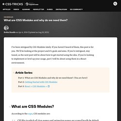
For years, JavaScript developers have struggled with organizing their code and needing to decide between alternate ad-hoc module formats like RequireJS, AMD, and CommonJS. What are CSS Modules and why do we need them? By Robin Rendle On April 4, 2016 css modules.
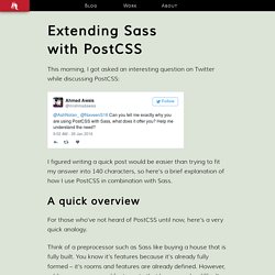
Extending Sass with PostCSS - AshleyNolan.co.uk - Blog and Portfolio for Ashley Nolan. This morning, I got asked an interesting question on Twitter while discussing PostCSS: I figured writing a quick post would be easier than trying to fit my answer into 140 characters, so here’s a brief explanation of how I use PostCSS in combination with Sass.
A quick overview For those who’ve not heard of PostCSS until now, here’s a very quick analogy. Think of a preprocessor such as Sass like buying a house that is fully built. You know it’s features because it’s already fully formed – it’s rooms and features are already defined. Input type=text object (Internet Explorer) Creates a single-line text entry control.
HTML information DOM Information Inheritance Hierarchy Members The input type=text object has these types of members: Events The input type=text object has these events. Methods The input type=text object has these methods. Properties The input type=text object has these properties. Standards information HTML 4.01 Specification, Section 17.4 Remarks Examples This example uses the input type=text element to create an empty text control that can contain 15 characters without requiring the user to scroll to read all of the text. Google Wants Developers to Inline Small CSS. META XHTML Element. Prerender and prefetch support (Windows) Use prerender and prefetch in Internet Explorer 11 to improve your website's navigation.
Prerender (also called preload) specifies a webpage to be loaded (rendered) in the background while the user reads the current page and prefetch identifies resources to be downloaded in the background. Because both features download content before it's needed, the resources are instantly available when needed by the user. Improve performance by getting things in advance. Responsive Image Breakpoints Generator, A New Open Source Tool. Responsive websites, even the most modern ones, often struggle with selecting image resolutions that best match the various user devices.

They compromise on either the image dimensions or the number of images. We can solve these issues and start calculating image breakpoints more mathematically, rather than haphazardly. The lives of web developers aren’t getting any simpler as the number of different devices and potential screen resolutions increase. The high-resolution arms race seems to be never-ending as vendors try to top one another with innovations in laptop and mobile device screens. New devices such as TVs and smartwatches are entering the market, making the race even more complex. To support the wide range of resolutions and devices, a website’s markup must adapt itself to look perfect on all the different devices and in various resolutions, pixel densities and orientations. Common Mistakes Link Many modern websites are responsive. New TypeScript Website. Today we are thrilled to release a new TypeScript website!
The new site delivers a fresh design, more up-to-date documentation, and soon a new series of quick start guides. Documentation TypeScript is developed on GitHub, and as such, all of the documentation is written in markdown on the TypeScript Handbook repo. This is primarily done to easily allow contributions. Any community member can make edits to the documentation by simply dropping a pull request on the handbook repo.
The new site surfaces several significant documentation changes: What's the deal with declaring font properties on @font-face? I hope you read that title out loud in your best Seinfeld impression.
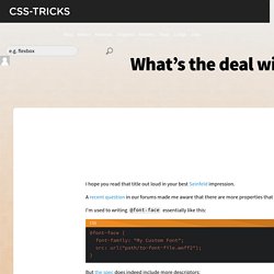
A recent question in our forums made me aware that there are more properties that can be added to @font-face than the usual font-family and src suspects. Houdini: Maybe The Most Exciting Development In CSS You've Never Heard Of. Have you ever wanted to use a particular CSS feature but didn’t because it wasn’t fully supported in all browsers?

Or, worse, it was supported in all browsers, but the support was buggy, inconsistent or even completely incompatible? If this has happened to you — and I’m betting it has — then you should care about Houdini1. Houdini is a new W3C task force whose ultimate goal is to make this problem go away forever. An Interview with Una Kravets. I had the pleasure of talking to Una Kravets one Sunny Sunday, and was super excited to do so because I'm a huge fan of her work.
If you're not that familiar with what she does, here are some pretty cool links to check out: The Fab Four technique to create Responsive Emails without Media Queries — Free Code Camp. The Fab Four technique to create Responsive Emails without Media Queries I think I found a new way to create responsive emails, without media queries. The solution involves the CSS calc() function and the three width, min-width and max-width properties. Or as I like to call them all together: the Fab Four (in CSS). The problem Making responsive emails is hard, especially since email clients on mobile (like Gmail, Yahoo or Outlook.com) don’t support media queries.