

Made in Hexels. Hex-Ray Studios. Hexels Isometric Tutorial - Doodle of the Day. 「*」 The Dark: An Illustrated Meditation on Overcoming Fear from Lemony Snicket and Jon Klassen. By Maria Popova A heart-warming allegory about what it means to make peace with our demons.
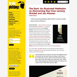
Daniel Handler — beloved author, timelessly heartening literary jukeboxer — is perhaps better-known by his pen name Lemony Snicket, under which he pens his endlessly delightful children’s books. In fact, they owe much of their charisma to the remarkable creative collaborations Snicket spawns, from 13 Words illustrated by the inimitable Maira Kalman to Who Could It Be At This Hour?
With artwork by celebrated cartoonist Seth. The latest Snicket gem is at least as exciting — a minimalist yet magnificently expressive story about a universal childhood fear, titled The Dark (public library) and illustrated by none other than Jon Klassen. In a conversation with NPR, Handler echoes Aung San Suu Kyi’s timeless wisdom on freedom from fear and articulates the deeper, more universal essence of the book’s message: Donating = Loving Bringing you (ad-free) Brain Pickings takes hundreds of hours each month.
Hot Dot Production. One Shirt A Day - Cheap 24 Hour Limited Edition TShirt Daily. How to Illustrate a Children's Book. Have you ever wanted to know how to create your own children’s book?
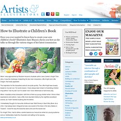
Illustrator Jane Massey shows you how as she talks us through the various stages of her latest commission When I was approached by Random House to illustrate author Jane Clarke’s Knight Time story, it was the challenge of depicting the two main characters, Little Knight and Little Dragon, that really appealed.
The inspiration for the characters came to me quite quickly. The Little Knight was loosely based on my own son. For some reason, I have always been drawn to illustrating children long before I had my own, but it is easier now I have references to hand every day. When I illustrate animal characters I still think of them as young children when I think of their expressions and actions. I immediately thought of a favourite childhood read: Walt Disney’s Giant Story Book. 1. 2. 3. 4. 5.
How to illustrate children's books: 7 top tips. Want to get into book illustration?
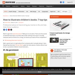
Well you're not alone. There are thousands of talented illustrators out there who'd like nothing more than to visually interpret works of fiction for a living. So how do you beat off the competition? Creating Seamless Textures. I think you’ll all agree that Illustrator is just plain awesome, and with the continual improvements we see with each new version, it keeps getting better and better.
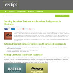
Previously, I created seamless textures for typography and seamless backgrounds for my web and illustration projects with Photoshop. Add depth and texture in Illustrator. Software: Illustrator CS5 or laterProject time: 2 hoursSkills: Add depth with the Grain effect; create halftone patterns; set up a grid in Illustrator Adding extra depth to an image can be a quick process that utilises some simple tools offered by Illustrator.
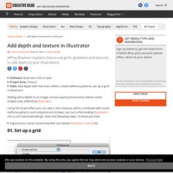
Using the Grain effect you can add a retro texture, which, combined with some halftone patterns and simple brush strokes, can turn a flat-looking illustration into a rich texturised design. Over the following steps, I'll show you how. Geometric sea. Create a Cute Bird With Geometric Shapes in Adobe Illustrator - Tuts+ Design & Illustration Tutorial. In this tutorial, you'll learn how to draw a cute geometric bird in Adobe Illustrator, with the use of the Shape Builder tool and Outline Stroke.
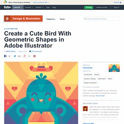
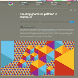
The main theme in this illustration is the word “ajua”. Creating geometric patterns in Illustrator. Create a cubical pattern background.
Geometric illustrator. How to Create a Bright Geometric Circle Pattern in Adobe Illustrator. The design is simple to make.
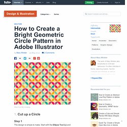
Start with the Ellipse Tool (L) and draw a circle. Copy (Control-C) and Paste (Control-V) that circle and make sure they're perfectly Aligned. Select the top circle and go to Effect > Distort & Transform > Pucker & Bloat and set the slider to -71%. Expand under Object. Select both shapes and use the Shape Builder Tool (Shift-M) to separate each section. I chose cream to serve as the base color for the pattern. I Copied and Pasted my initial circle design three times and grouped them together to form the design.
Delete any extraneous shapes so you're only left with the 21 objects seen below. Group together your design. Once you've got a decent amount of the design tiled, use the Rectangle Tool (M) to draw a rectangle that hits the "corners" of circles on its own corners (see below). Select the colorful portion of your design square, Copy, and Paste it. For the creamy centers of the design you'll have two groups of gradient shapes. 4 Typography Trends for 2014. Web design trends change from year to year – and thus, so do the trends in the components that make them up.

One of the most important components of web design is typography, and 2014 is going to bring some new, exciting and interesting trends in the way we see fonts across the web. Want to know more about typography trends in the upcoming year? Then check out the list below. Handwritten fonts Today is an age of social media – and people are communicating more rapidly, more frequently, and more publicly than ever before. Everglow Sprout Serif Handwritten Love Notes. Hounslow illustration project mood board on Pinterest. Samurai jack concept art. Samurai jack backgrounds. Samurai jack posters. Infographic: Shutterstock's Global Design Trends 2014. 5 big visual design trends for 2014. It's never a great idea to blindly follow trends, but it's good to know what they are.

It's kind of similar to the old maxim that 'you have to know the rules to break the rules'. But in fractured and disjointed world, working out what the latest visual design trends actually are can be difficult. A trend might be big in Europe but absent in North America; yet with more demand for designs that appeal across international boundaries, how do you get a handle on what will work? Well one way is to analyse the raw data.
Image library Shutterstock is in a good position to do just that - and so for its third annual global design trends infographic it extracted details of over 350 million downloads and found some revealing patterns. You can view the infographic in full here while some of the main trends are summarised below: Flat design elements are replacing skeuomorphism.