
Excel Hero discussion on Bullet Graphs. Another way to do bullet graphs in Excel. Those of you who know me, know I’m a huge fan of Stephen Few.
(I mean, I had him autograph my copy of Information Dashboard Design!) Few is highly regarded as an expert on data visualization and dashboard design. He is the original designer of bullet graphs. Bullet graphs are not native to Excel’s chart library. If you want to create a bullet graph, be prepared for some finagling with chart features, layouts, and color. How to Create Bullet Graphs To Replace Gauges in Excel. Bullet graph overview (wiki) A bullet graph is a variation of a bar graph developed by Stephen Few.
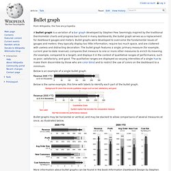
Seemingly inspired by the traditional thermometer charts and progress bars found in many dashboards, the bullet graph serves as a replacement for dashboard gauges and meters. Bullet graphs were developed to overcome the fundamental issues of gauges and meters: they typically display too little information, require too much space, and are cluttered with useless and distracting decoration. The bullet graph features a single, primary measure (for example, current year-to-date revenue), compares that measure to one or more other measures to enrich its meaning (for example, compared to a target), and displays it in the context of qualitative ranges of performance, such as poor, satisfactory, and good.