

Michael Spiccia - BADASS. Weheartit. Behance. Behance. Cedrick Lachot. I Buongiorno - Wines from Salento. Behance. 3 trends in landing page design – Muzli -Design Inspiration. 1.
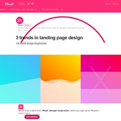
Diagonal layout 2. Wavy 3. Nord Typefamily. Behance. Behance. Eastern Airlines, 1960s (dmbb01002) : Duke University Libraries. Don't Kill your Friends. Dilbert fearlessly provides a string of negative examples of what not to do during aerial gunnery practice.
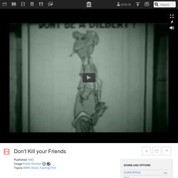
Run time 13 min.Production Company U.S. Dancing in the woods : KingWaylon - King of Vintage. Big Omaha. Carhartt WIP Lenticular Part 1 - SOLO Skateboardmagazine. Muted Colors: A new (and old) trend of which to take note. AVE AV-Exciters Architectural Visual Exciters. Arts et Cultures Numériques.
Accueil - Printemps Numérique. Société des Arts Technologiques. MUTEK. Avec Noisy Skeleton, devenez le pont entre son et image. Voilà qui devrait combler les adeptes de la télékinésie et autres fans de Star Wars.
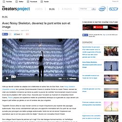
Avec Noisy Skeleton (Squelette sonore), les Lyonnais David-Alexandre Chanel et Jonathan Richer du studio Théoriz viennent de créer une installation immersive qui donne au public le pouvoir de contrôler l’environnement visuel et sonore d’une œuvre projetée à 360° autour d’eux. Associés pour l’occasion au musicien et compositeur David Guerra, Théoriz propose une expérience inédite de synesthésie artistique où la gestuelle du corps devient une langue à part entière qui génère un son et lumières des plus singuliers.
"Squelette Sonore utilise le corps humain comme un moyen d’expression pour explorer des paysages audiovisuels. Nous avons volontairement opté pour une approche minimaliste tant d’un point de vue visuel qu’audio pour provoquer une réelle synergie audiovisuelle. Notre but est de donner l’impression aux spectateurs que le son leur passe entre les doigts. " résume son concepteur David Chanel. Un mapping minimaliste qui prouve qu’il faut parfois savoir rester simple. Ce n’est pas la première fois que The Creators Project vous parle de mapping, du complexe « Box » par Bot&Dolly, en passant par le gigantisme de l’installation du collectif URBANSCREEN dans les entrailles d’une usine à gaz, nous pensions avoir fait le tour de la question.
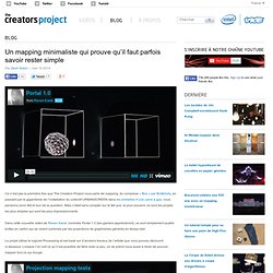
Mais c’était sans compter sur le fait que, le plus souvent, ce sont les projets les plus simples qui sont les plus impressionnants. Dans cette nouvelle vidéo de Raven Kwok, nommée Portal 1.0 (les gamers apprécieront), ce sont simplement quatre boîtes en carton qui se voient sublimés par les projections de graphismes générés en temps réel. Raven kwok. Created in Dec.2013 ECO was originally shown on December 8th, 2013 at West Hall 211, Rensselaer Polytechnic Institute.
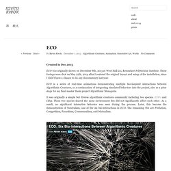
These footage were shot on May 22th, 2014 after I restored the original layout and setup of the installation, since I didn’t have a chance to do any documentary last year. Robert Henke 'Lumière' - Cutting the room with vectors and lasers (@robert_henke) As Robert Henke sets of on his tour with the new project Lumière, kicking off in NYC on the 10th May, followed by shows in Helsingor, Montreal (MUTEK/Elektra), London, Riga, Nantes and others, we offer a little preview of what is to come.
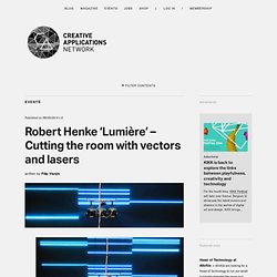
If you don’t know Robert Henke, he is probably best known for his somewhat free floating role within Ableton and doing splits between creating his own art and software – Ableton Live. Robert also writes and lectures about sound and the creative use of computers, and held teaching positions at the Berlin University of the Arts, the Center for Computer Research in Music and Acoustics (CCRMA) at Stanford University, and the Studio National des Arts Contemporains – Le Fresnoy in Lille, France. Lumière – Based on self written software, this work on the edge of concert and site specific installation finds previously unseen beauty and minimalistic elegance in a commonly underrated medium.
Six Mil Antennas [soundtrack] Blur Rouge Carmin. Abstract Streak Lines using X-Particles, Ray Connector and SplineNoiseDeformer Tutorial. 80% of Luxury Shoppers Want Omnichannel Experiences. BOSTON, MA--(Marketwired - Sep 22, 2016) - More than 85% of millennials and even 75% of baby boomers and older people who buy luxury brands are ready for so-called omnichannel interactions, ranging from e-commerce to social sharing to digital in-store experiences.

And six out of ten luxury sales are now swayed by digital approaches such as researching online before purchasing offline. Those are some of the findings presented in Digital or Die: The Choice for Luxury Brands, a new report published today by The Boston Consulting Group (BCG), one of the world's leading management consulting firms. The publication, based on surveys of approximately 10,000 consumers in ten countries and interviews with industry leaders, confirms that digital technology is heavily influencing the luxury sector, whether brands are ready for it or not. Recreate classic MP3 visualizers, free - and use them in VJ apps - CDM Create Digital Music.
It’s funny, some things you really didn’t imagine looking back on with nostalgia.
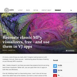
And yet, there you are – reminiscing about the days of staring at your Winamp MP3 visualizer. TouchDesigner 099 does everything with live visuals - now on Mac, too - CDM Create Digital Music. It makes things look prettier, with something called “physically based rendering.”
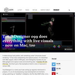
It has crazy compositing and capture powers. It’s networked with Web support, talks to DMX gear, and intelligently handles all your MIDI gadgets and capture cards and everything else. It handles VR with HTC Vive. And that’s just a few examples of what is new or improved in version 099. TouchDesigner is a name you’ll see coming up regularly mentioned in projects. Behance. Behance. Julot. Kendrick Lamar - HiiiPower - Hip-Hop Quoted. Visions of Martin Luther staring at me, Malcolm X put a hex on my future, someone catch me.
I'm falling victim to a revolutionary song, the Serengeti's clone, Back to put you backstabbers back on your spinal bone. You slipped your disc when I slid you my disc, You wanted to diss but jumped on my dick. Grown men never should bite their tongue, Unless you eating pussy that smell like it's a stale plum, I got my finger on the mothafuckin' Pistol. Aiming it at a pig, Charlotte's web is going to miss you, My issue isn't televised, and you ain't gotta tell the wise. How to stay on beat, because our life's an instrumental, This is physical and mental, I won't sugar coat it, You'd die from diabetes if these other niggas wrote it.
Kendrick Lamar - HiiiPower - Hip-Hop Quoted. Self-Portfolio: Ordinary Man. Life. on Behance. PC SHOP by Davit Petriashvili - Dribbble. Web design inspiration. Corporate Page. A Beautiful Way to Display Your Photos. Image Tilt Effect. How it works A normal image is replaced with layers of semi-transparent divisions of the same image. Every layer moves according to the configuration, creating a subtle motion effect.
Hover over the grid images to see how the effect works: Options A normal image is replaced with layers of semi-transparent divisions of the same image. Color Extraction Effect with Vibrant.js. Où trouver des vidéos gratuites pour vos créations ? WebGL Fluid Experiment. Mint Design Company : Melding Art With Technology. Soleil Noir. 35 Stunning Parallax Scrolling WordPress Themes For Agencies, Designers, Apps and Portfolio 2014. Hand picked list of the best WordPress parallax themes designed and developed in 2014. These themes suited for business, portfolio, corporate, personal and any other websites. Morpheus. The 30 greatest free web fonts. Fonts Actor. Fonts Stalemate. Grumpy wizards make toxic brew for the evil Queen and Jack. Normal 400Grumpy wizards make toxic brew for the evil Queen and Jack. One morning, when Gregor Samsa woke from troubled dreams, he found himself transformed in his bed into a horrible vermin.
He lay on his armour-like back, and if he lifted his head a little he could see his brown belly, slightly domed and divided by arches into stiff sections. The bedding was hardly able to cover it and seemed ready to slide off any moment. 2014 Logo Trends on LogoLounge.com. If home is our first place, and work is our second place, then mobile screens have definitely become our third place. Smart phone use has increased from 21 percent in 2010 to more than 63 percent today, and with 83 percent of all Americans online regularly, that percentage of mobile users is bound to keep edging up. The fact that so many people now view the world through a window the size of a business card has spelled an inevitable change in logo design.
It used to be that minute favicons had to be kept extremely simple: Now, as a rule, logos must be as well, but that doesn’t mean boring. Agence de communication Paris Lyon Graphéine. Louis Ansa - Interactive Designer. Les animations autour des logos : 25 exemples en mouvement. 50 créations autour de la typographie et du graphisme. The Carp and The Seagull. Cabinets d'avocats Alcya conseil : cabinet d'avocat en conseil et défénse de l‘entreprise. The 100 Greatest Free Fonts for 2014. Here we are, once again, with our now-famous selection of the top 100 free fonts for 2014. This year we have only selected fonts published or updated in late 2013 and 2014, giving you one of the most up-to-date lists around. The majority are completely free with licenses for commercial use; the odd few available for personal use only have extended license options at a very reasonable price.
New logo. New site. Still Huge. Evolution. Logo Process - Tamara Kauffman Interior Design Identity Development. This logo process post is for the Tamara Kauffman identity design. A company in design and project management on the refurbishments of domestic properties. Designing kitchens, bedrooms, bathrooms and office spaces. Initial thoughts I was quite excited when I read the initial brief for this project as Tamara does get involved with certain structural aspects with her job, a new kitchen to be planned, or a new bedroom suite, as well as paint and decoration. So the fact that there was a structural element meant I could explore more than just cosmetic enhancements. WANKEN - The Art & Design blog of Shelby White. Studio Projects. Custom Suits & Mens Suits. Browser Display Statistics. Make Me Pulse.
30 web designs utilisant les aplats de couleurs pour des sites efficaces. Zero Landfill - Site of the Day October 29 2015. Edits Quarterly × Ian Coyle. Rolf A. Jensen. ANDY: A Popera - Opera Philadelphia. World Premiere Music by Heath Allen and Dan Visconti Directed by John Jarboe Text by John Jarboe in development with Sean Lally and ensemble Additional lyrics by Liz Worth Performed in English without supertitles Opera in the City A musical mélange inspired by the life, fame, and the philosophy of Andy Warhol—ANDY: A Popera is, like its eponymous hero, a fabulous collision of the high and low, the commercial and the artistic, the traditional and the innovative.
Zero Landfill - Site of the Day October 29 2015. Save the Rainforest. Stageverslag Colours by Jelle Clignet. 2nd Internship report by Damiën Kooij. Graphiste du mois #22 : Jerome Monimart, noir et sauvage. Safe at Isa: compass.rose. Épingles de digponygold.tumblr.com sur Pinterest. Graph and compass. Installation Decorates Hotel Room With An Interactive Wooden Skyline. It's often the case that you'll see a work of art in an exhibition space and spend a good half hour or so in its company, but it's not often that you'll spend the night with it. Un vêtement intelligent au croisement entre le paon et le caméléon. Le studio londonien THE UNSEEN a réalisé un vêtement qui ferait passer les caméléons pour des amateurs en terme de mimétisme.
La boite verte : Site de découverte sur la photographie, la science, les arts et tout ce qui est insolite. Journal du Design - Le site du design, de l'architecture, de l'art, du high-tech, de la mode et des tendances urbaines. Grafik.