

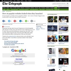
20130902-DynamiqueEntrepren. 100 Start-up où investir par Challenges.fr. Partir de 0€ et vendre son entreprise 33 millions d’euros #W2C11. How 20 popular websites looked when they launched. 2. facebook.com - launched in 2004 3. myspace.com - launched in 2003 4. yahoo.com - launched in 1994 5. youtube.com - launched in 2005 6. wikipedia.org - launched in 2001 7. msn.com - launched in 1995.
15 in-Depth Examples of Addictive User Experience. Today we are going to examine 15 bits of user interface and experience design that really heighten the experience of using a site or application.
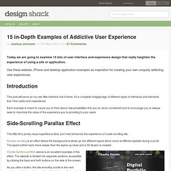
Use these website, iPhone and desktop application examples as inspiration for creating your own uniquely addicting user experiences. Introduction This post will serve as my own little interface hall of fame. It’s a complete hodgepodge of different types of interfaces and elements that I find useful and inspirational. Each example is meant to cause you to think about new possibilities that you’ve never considered and to encourage you to always seek to maximize the value of the experience you’re providing to your users. Side-Scrolling Parallax Effect This little bit is purely visual superfluous flare, but it real enhances the experience of a side-scrolling site. Parallax scrolling is an effect where the background is sliced up into different layers which move at different speeds during a scroll.
iPhone Pull Down to Refresh Globally Accessible HUDs. Should We Focus on User Experience? In the next seven minutes or so, this article hopes to convince you that our current notion of UX design mistakenly focuses on experience, and that we should go one step further and focus on the memory of an experience instead.
Studies of behavioral economics have changed my entire perspective on UX design, causing me to question basic tenets. This has led to ponderings like: “Is it possible that trying to create ‘great experiences’ is pointless?” Nobel Prize-winning research seems to hint that it is. Via concrete examples, additional research sources, and some initial how-to tips, I aim to illustrate why and how we should recalibrate our UX design processes. Imagine Two Scenarios. What can we learn from 3 of the world’s most innovative marketing campaigns?
By Andrew Valentine on 21 May, 2013 21.
The 10 Types of Startup Press Release. Press releases are one of the most effective ways of keeping journalists, investors and potential investors up to date with what's going on at your company.
By creating and maintaining this relationship, your chances of being covered in the media or being approached by investors / partners increases exponentially. Sending a press release is different to writing blog posts. On your company blog you might write all sorts of content for marketing purposes or inform users of product tweaks etc - content that is valuable to your immediate audience but not "newsworthy" to a greater audience. And in fact, reaching out to journalists with non-newsworthy announcements can be counter-productive to creating a relationship.
So what is newsworthy? 1) We've launched Your company launch is the first time you'll think about sending a press release. What pain point are you solving and why? 2) We've rolled out an amazing new feature. How did you find your early adopters? Running Marketing Tests with a Purpose. Over the past few years, marketing on the web has become way too much fun.
I remember trying to figure out what “hits” on awstats meant in high school, and I distinctly can recall how disappointed I was when I found out the true meaning. Nowadays, we have a plethora of useful programs that provide deep insight into how visitors use web applications. Many of these programs have a fire hose of data, and it can seem very daunting. I’ve been reading Lean Analytics, and it’s caused me to question some of my habits as a marketer. The first and most important thing that I’ve been reminded of, is that marketing on the web is all about running experiments based on intuition.
In short, I believe marketing has become much less risky. With this new style of marketing, I believe it’s important to keep track and learn from every experiment (and also keep record). What are you Testing? This is a very basic question, and is used primarily for categorization purposes. Une success story en toutes lettres. En à peine 4 ans, la newsletter de My Little Paris a réussi à s’imposer dans la boite email et dans le cœur de près d’un million de parisiennes.
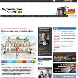
Retour sur la recette d’une newsletter qui est devenue une référence en la matière pour nombre d’entrepreneurs et génère tout de même 8 millions d’euros de chiffre d’affaires. Vous êtes dans le métro parisien. Devant vous, une jeune femme frétille, son smartphone à la main. Elle se met à appeler compulsivement toutes ses copines pour leur parler d’un bon plan qu’elles vont tester ce week-end. Hé oui, vous venez d’assister au « double effet » My Little Paris ! Le développement d’une newsletter entre copines La belle histoire de My Little Paris commence il y a 4 ans. Fabrication artisanale et ton chaleureux Celle qui se qualifie volontiers d’« artisan » ou de « bricoleuse » tient à garder dans ses newsletters un côté « fait maison » qui dénote avec tout ce qu’on peut voir d’habitude sur le web.
Trouver les sujets dont tout le monde va parler. Michael Wolfe's answer to What are some of the most ridiculous startup ideas which eventually became successful. Des gens qui parlent a des marques.