

What the #$%@ is UX Design? Android 4 Controls.
UXPin: UX Design & Wireframing Tools As Beautiful As Your Work. How To Get Started In UX Design. UI vs UX: what’s the difference? UI is the saddle, the stirrups, and the reigns.
UX is the feeling you get being able to ride the horse, and rope your cattle. At least that’s what they used to say in the olden days. Rather, that is what I wished they’d say. Despite how simple that may have sounded, there are many complications and misconceptions when it comes to the differences between UI and UX design, and they cause the design community to go into quite a stir whenever they are brought up. An interesting note to that is that I’ve found the people who work at jobs with titles such as Interaction Designer to get paid more simply because they know and act on the differences between those two fields (typically harnessing a little of both).
UX Books. Website Usability and User Experience Training Course. 55 Stunning Freebies from Dribbble. Dribbble is awesome source of inspiration, cool stuff and useful elements.
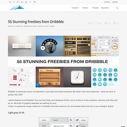
But what is the most awesome – there are tons of quality free stuff! I adore freebies from Dribbble! You can find there cool designed UI kits, icons, buttons, forms, patterns, textures, psd files and so on. All kinds of graphic materials are waiting for you! Today I’ve gathered a huge collection of freebies from this resource. Light grey UI kit Black Chunky Ui Kit – Free psd “Pizza” UI Kit – PSD Free iLiquid Interface Design Retina Free Soft User Interface Kit Retina Freebie UI PSD Login Form UI element Simple gray ui.
A List Apart: Articles: Responsive Web Design. The English architect Christopher Wren once quipped that his chosen field “aims for Eternity,” and there’s something appealing about that formula: Unlike the web, which often feels like aiming for next week, architecture is a discipline very much defined by its permanence.
Article Continues Below A building’s foundation defines its footprint, which defines its frame, which shapes the facade. Each phase of the architectural process is more immutable, more unchanging than the last. Creative decisions quite literally shape a physical space, defining the way in which people move through its confines for decades or even centuries. Working on the web, however, is a wholly different matter. But the landscape is shifting, perhaps more quickly than we might like. In recent years, I’ve been meeting with more companies that request “an iPhone website” as part of their project. A flexible foundation#section1 Let’s consider an example design.
Becoming responsive#section2 responsive architecture. Colors and the UI. As the name suggests, GUIs (Graphical User Interfaces) present their features and functions visually.
The human-computer interaction is heavily based on seeing things, looking for things and interacting with graphical UI elements. Color is a main characteristic of any visual scene, not only on computer screens, but in any situation where we see something. Because most of what we see and interact with in our everyday life is colored (as opposed to shades of white-gray-black), we are very familiar with colors – maybe so much that we don’t think about them a lot.
On the other hand, it does bother us when we need to read a dark-gray label on a black button. So colors have the potential to boost or wreck the user experience. More, better, faster: UX design for startups. Startups don’t have capital to burn or luxurious schedules for big-design-up-front.
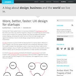
But unless your idea is by-and-for-engineers, design isn’t something you want to skip on your way to market. For a startup, design may mean the difference between simply shipping, and taking the market by storm. But with tight budgets, and aggressive timelines, how to include design and get the best value for the investment? Eric Ries proposes a cyclical model for development in a startup: Build > Measure > Learn (repeat). Lots of smart people think he’s onto something.
In a recent Lean UX workshop hosted by the fantastic Janice Fraser (Luxr) and Cooper’s own Tim McCoy and Suzy Thompson (also of Cooper) suggested that the cycle was right, but that it begins in the wrong place. I buy it. So we have a cycle of Learn > Build > Measure (repeat). Faster How fast can we run the cycle? Playful UX Design: Building A Better Game. Advertisement I sincerely believe that the user experience community should add game design to its toolbox of competencies.
If we’re truly committed to creating satisfying user experiences, then there’s no reason why games, which can satisfy people so richly, should be excluded. Operating successfully in the games domain means learning a new set of competencies, and I don’t want to oversimplify the challenges of designing high-quality game experiences. However, if you’re in a position to jump in and start designing, then I can at least offer a primer to help you steer clear of some of the most common mistakes. 1. Trading off the quality of the player experience in favor of some real-world objective is always self-defeating.
Mobile Considerations in User Experience Design: “Web or Native?” Advertisement Our brand new Smashing Books #3 and #3⅓1 have been released last month and we’re sincerely grateful for the tremendous feedback, reviews and photos submitted by our truly smashing readers across the world.

We appreciate your time and your interest, and thank you for your support and love. Today we are happy to present a yet another sample chapter from the book. In his chapter, Aral Balkan explores what “native” actually means, what options designers and developers have and gives practical advice on what you need to know when deciding on tools for your next mobile-optimized project.
The sample is also available for free download in PDF2, EPUB3 and MobiPocket4 or .ZIP with all files.