

Graphic design. Pin by Jod Kaftan on Information design. 25 beautiful web designs. 5 Ways Big Companies Can Pivot Like Lean Startups. Innovation.
You’ve either got it or you haven’t. Right now, Procter and Gamble hasn’t. Its recent mediocre results have been blamed on a drought of new blockbusters. It’s not alone. Microsoft has been panned for bringing so little to market, and even Apple’s share price has sagged recently as the market tires of tweaks to their existing techno-slabs. Has the corporate world run out of ideas?
Did you know that Twitter used to be a podcast subscription service called Odeo, or that Flickr was once something called Game Neverending? Pivoting means that new technologies don’t get wasted. 1. Most big organizations are idea-generating machines. In theory, anything that makes it alive through this gauntlet should triumph in the market. What if your process forced innovations to evolve rather than die? We’ve found the best way to do this is with a pivot workshop. The next bit is simple. 2. The pivot process is a hungry beast; it’s hungry for insight into consumer needs. . • Go wide, not deep. 3. Getting the Most Out of QR Codes Using URI Schemes. Lately, everyone has been talking about the potential of the QR code.
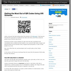
It has become the Internet’s equivalent of traditional barcodes (like those you’d find on physical goods at your favorite retail store). Someone can take a quick snapshot of a QR code with their smartphone and immediately have a website up and loaded, so we could print QR codes on paper and physical goods such as business cards, magazine ads and posters in order to lead people to our site. But, more often than not, web developers don’t use QR codes to their fullest potential. In this article, we’ll discuss a technique that will unlock the full potential of QR codes through URI schemes. How QR Codes Work in a Nutshell Let’s learn how the QR code mechanism actually works. Certain commands (known as responses) are built in, and when a QR code is captured by a camera (usually one on a smartphone or tablet), the image of the QR code is processed and then the built-in response is carried out. New Approaches To Designing Log-In Forms - Smashing UX Design.
Advertisement For many of us, logging into websites is a part of our daily routine.
In fact, we probably do it so often that we’ve stopped having to think about how it’s done… that is, until something goes wrong: we forget our password, our user name, the email address we signed up with, how we signed up, or even if we ever signed up at all. These experiences are not just frustrating for us, but are bad for businesses as well. How bad?
User Interface Engineering’s analysis of a major online retailer found that 45% of all customers had multiple registrations in the system, 160,000 people requested their password every day, and 75% of these people never completed the purchase they started once they requested their password. To top it off, visitors who are not logged in do not see a personalized view of a website’s content and recommendations, which reduces conversion rates and engagement. Is This You? The sign-in form on Gowalla. 25 jQuery Tutorials for Improved Navigation Menus. Get the FlatPix UI Kit for only $7 - Learn More or Buy Now In this post, I have collected 26 useful jQuery navigation menu tutorials.

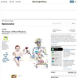
Enjoy! Mega Drop Down Menus w/ CSS & jQuery Animated Navigation with CSS & jQuery Create Simple Dropdown Menu Using jQuery. Ethan Marcotte's 20 favourite responsive sites. The Future of Moral Machines. The Stone is a forum for contemporary philosophers and other thinkers on issues both timely and timeless.
Patterns - Theresa Neil. Examples of Orange in Web Design. Here at DesignM.ag we have done round ups in the past dedicated to more popular of colors such as reds and blues, but in today’s post, we will share with you 22 examples of the color orange in web design.
Eight Hour Day. Showcase of Big, Bold Typography. Screen Capture (by Google) Urban Landscape Photography Showcase - Web Design Blog – DesignM.ag. Get the FlatPix UI Kit for only $7 - Learn More or Buy Now Beautiful urban photos can be quite interesting and inspirational.

I hope you enjoy the selection that is featured here. If you see something you like, click through and check out some of the other work from the photographer. Source: Konrad Jakubowski Source: Marlon Krieger Source: Rinze van Brug. 30 More Portfolio Sites for Your Design Inspiration - Web Design Blog – DesignM.ag. Designers and developers are growing in numbers and plenty of these folks have outstanding portfolios.
The common advantage of the Internet is that anybody from anywhere in the world can check out your projects during any time of the day! If you wish to land more freelance work then I would recommend taking a peek at your current portfolio to see if anything could be updated. And to help with building ideas for your own website, I have collected 200 various portfolios of graphics designers, developers, writers, and other digital creatives. This is a massive showcase gallery full of design inspiration for unique portfolio layouts. I strived to include only designs which really change things up from the typical portfolio website templates.
41 Textured Websites for Design Inspiration - Web Design Blog – DesignM.ag. Get the FlatPix UI Kit for only $7 - Learn More or Buy Now One design element or technique that can quickly take a good design and turn it into something that truly stands out is the use of texture.
As you look around at well-designed sites, texture is very popular right now. In this post we’ll showcase 41 websites that make good use of texture. Brusheezy Family Life Bike & Saddle Decent Weblog Istok Pavlovic Nue(me)dia Rock Point Giblette Spout Creative. 13 Sexy Sign-up Forms - Web Design Blog – DesignM.ag. Get the FlatPix UI Kit for only $7 - Learn More or Buy Now When it comes to online strategies you should never overlook the design of your sign up page.
Some of the given examples are sites than many of you I’m sure are familiar with, although, I feel there are some growing gems among the group. (And when I say sexy, I really mean quality. UX. Why the future of mobile is screenless, touchless. "A phone today is a a value-added service, a 'teleputer,' a creature born with genes coming from a cell phone and a personal computer," according to independent researcher Szymon Slupik . Speaking yesterday at the invitation-only Emerging Communications Conference & Awards (eComm), the Krakow-based futurist explained that by 2020, a mobile phone as we know it will disappear, evolving into a device linking our senses directly with senses of other people or with machines.
What device will displace the role of today's smartphone: . Internet eyeglasses concept presented by Szymon Slupik at eComm 2011 "Voice was always organized in sessions with a beginning and an end. Today we have threads. So how do we get there and when? - MEMS (microelectromechanical systems)-based laser projectors can display images directly on our retinas while not blocking our sight, enabling mixed reality vision.
. - We need to control the functions by the mind to become really hands free.