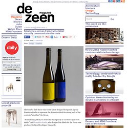

Scratches across Feroz wine label visually communicate the taste. Claw marks slash these wine bottle labels designed by Spanish agency Franziska Studio to represent the degree to which the strong body of the contents "scratches" the throat.

"At swallowing when you notice the strong body: it 'scratches' you from inside," said Franziska Studio, who designed the labels for the Feroz wine produced by David Rodríguez Vineyards. Feroz - meaning "fierce" – is an artisanal wine from the Valdeorras region of Spain, described as having a "pleasant fruity smell" but a very strong body. "Once you taste the wine, you understand everything," Franziska Studio's Javier Morón Belso told Dezeen. The company communicated this with a series of four slashes across the high-density paper of the block colour label.
"We took the decision to design something that looked like it had done by an animal or a dangerous being," said Morón Belso. EL NOMBRE DE LAS COSAS - FERNANDO BELTRAN, comprar el libro en tu librería online Casa del Libro. El nombre de las cosas. How Cereal Boxes Are Designed To Hypnotize You. Next time you wander down the cereal aisle with your shopping cart, ask yourself this: Why on Earth are all the cartoon mascots--Fred Flintstone, Cap'n Crunch, the Trix Rabbit, and so on--staring directly at your crotch?

As it turns out, there's a reason for that. Cereal boxes aimed at children are specifically designed so that the eyes of the mascots look downward, making direct eye contact with the sugar goblins that they are hoping to seduce. In a study of over 65 cereals and 86 mascots across 10 different grocery stores in New York and Connecticut, Cornell's Food and Brand Lab studied the characters on the front of cereal boxes. What they found is that all characters and people on cereal boxes --whether Lucky the Leprechaun, or Michael Jordan on a box of Wheaties--are designed to make eye contact with the intended consumer.
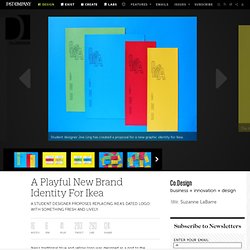
That makes sense. And it works. A Playful New Brand Identity For Ikea. Ikea's traditional blue and yellow logo was designed as a nod to the company's Swedish heritage.

It's easy to recognize and can be seen from a distance, as you drive up to the warehouse-sized store. Other than that, the logo is pretty bland. Ikea’s merchandise, however, has many characteristics: It’s minimalist, affordable, space-friendly, and has tongue-twisting Swedish product names. Its graphic identity just doesn't really speak to any of them. "It’s instantly recognizable as being a Swedish institution, but does it suit Ikea as a company in 2014?” Ling decided to do some course correcting, in a project for a class at the Norwich University of the Arts, in the United Kingdom. “I remember as a child going to Ikea with my family and running up and down the seemingly never-ending aisles of cardboard boxes filled with flat packaged furniture,” he tells Co.Design. Ling's logo is a 3-D outline of the Ikea letters, stacked unevenly. Graphic redesigns don’t come easy. The 10 Commandments of Content.
The challenge is clear by now: Intrusive, interruptive, self-centered marketing no longer works the way it once did, and its effectiveness will only continue to diminish in the social age.

The question is what will replace the legacy model. There’s a one-word answer: stories. It makes sense. Finding--or creating--a narrative thread has always been how we as a species find order in the chaos of life. And it’s how smart brands are defining what’s next in the chaos of modern marketing. What’s the case for content? There are also business reasons. Here’s another good reason to believe in the power of stories: You have no choice. The empowered consumer will bypass or ignore communications that aren’t relevant and don’t add value to their lives. After years of observing, creating and judging brand stories, it’s clear that there are some guiding principles behind great brand storytelling. 1. 2.
Few people enjoy conversations with people who talk only about themselves.