Social media curation services for 2011
Another Web 2.0 platform type is emerging this year. Social media curation tools (to coin a phrase) are appearing in growing numbers. These are Web services which let users easily assemble multiple bits of social multimedia content. Twitter updates, blog posts, Facebook content, and more can be hauled into a single stream, which in turn can be presented as a collection or story. Each of these services is based on preexisting content, not creating new media.
日本人起業家のAppGrooves、Hot Or Notタイプのクールなアプリ推薦エンジンをApp Storeにリリース
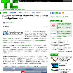
モバイル・アプリが増えれば増えるほど、ユーザーが自分にとって適切なアプリを見つけ出すのは難しくなる。たとえばAppleは最近、App Storeに42万5000のアプリが登録されていると発表した。プラットフォームの運営者もランキングや推薦を行っているが、多くの場合、それだけでは不十分だ。今日v2.0がリリースされたAppGrooves [無料。 もちろんアプリの推薦エンジンはChomp、Frenzappなどすでにいくつか出ているが、AppGroovesのアプローチは、独自に開発された推薦アルゴリズムとHot or notタイプのユーザーによる投票を組み合わせるというユニークなものだ。 まず最初にAppGroovesはユーザーがデバイス上にインストールしているアプリを調べる。 面白いのは、AppGroovesでは、単に自分の選択を投票できるだけでなく、Facebookの友だちに同じ質問をすることができる点だ。 AppGroovesは500 Startupsが主催した2011夏のアクセラレータ・プログラムでデビューした会社の一つだ。 柴田博士の目標はスタート当初からグローバルな企業を創立することだった。 [原文へ] (翻訳:滑川海彦 @namekawa01 Google+)
Introducing Bing Editors’ Picks: A Guide to Great Sites - Search Blog - Site Blogs - Bing Community
7 Content Curation Tools to Keep up With (and Share) Industry News
Guest post by Courtney Seiter Show of hands: Who has enough time every day to read up on your industry’s news? Oh, and everything new you need to know to market your business? Yeah, me neither. To cut through the glut of information to make sure the good stuff rises to the top, I employ a lot of help in the form of content curation tools. Here are 7 of my favorite content curation tools and a little information about how they can make you more efficient. Tool: Google ReaderUse with: Blogs, news sites, Google Alerts, Facebook, TwitterWhy it’s great: This isn’t exactly a groundbreaking tool, but I would be lost without Reader. Tool: Trunk.lyUse with: Twitter, FacebookWhy it’s great: Sometimes you want the social media news without all the social media noise. Tool: SummifyUse with: Blogs, Facebook, TwitterWhy it’s great: Summify is my secret weapon.

Utopic.me launches new design and visual bookmarking to help discovery
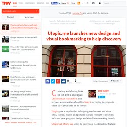 Curating and sharing links on the web is a hot space. Delicious has relaunched, and services we’ve written about like Snip.it are trying to get you to share all of your links on its service. Utopic goes a step further in helping you discover and share links, videos, music, and pictures that are relevant to you with its brand new gorgeous design and visual bookmarking launch. Utopic had this to say about its new visual bookmarking feature: With one click you can now save, tag, share and later quickly recover anything on the internet that you find interesting. Discovery When you sign-up for Utopic, you can connect your Facebook, Twitter, YouTube, and Google reader accounts. Once you’ve connected your accounts, Utopic takes about a half hour to go through your links. The design is visually stunning, and doesn’t make you feel like there are too many options, something other bookmark sharing sites suffer from. Sharing is caring Sharing content can be done in two ways.
The Three C’s of Managing Your Content In A Global Environment
On January 30th, I’m speaking at the Social Media for Nonprofits in New York City. (You can get a discount of $20 off the registration by entering the code “Beth” when you sign up although the discount only works on the more expensive tickets). This year, since content curation, is a social media competency that I’m focusing in my own learning and teaching , I’ll be doing a conversational presentation on the topic. Robin Good, one of the best content curators on the planet, will join me via skype from Italy. In preparation, I’m doing a pre-recorded skype interview with Robin as a back up for a live interview. Here’s why I think content curation, especially the practice, is very important for us to embrace in the nonprofit sector: On an individual practice level, with more and more information being shared and published on the web, the act of content curation can actually reduce our information overload. I also think that 2012 will be the year of content curation.

Best Practices for Content Curation for Nonprofits at Social Media for Nonprofits Conference

情報収集がラクになる 話題のキュレーションサービスまとめ « yotalog
あけましておめでとうございます。 どうも私です。 自分の関心領域に関して効率よく情報収集するための方法として 便利なキュレーションサービスを以下にまとめました。 キュレーションって何って人は→ こちら とは言え ニュースとかがあまり好きでなかったら Gunosy、Zite、テック系ツイッタラーを見ておけば良いと思います。 (☆の数は個人的なおすすめ度です) ☆ Gunosy (日本語) メール、Webサービス。 Twitterやfacebook、はてブから得た情報を元に、 毎日おすすめのニュースが登録したメールアドレス宛に10個程度送られてくる。 ☆☆ Zite スマホアプリ。 TwitterやGoogle Reader、 Read It Later の登録情報を元に、 カテゴリーごとの最新ニュースを見られる。 情報量が多いので漏らすこと無く見られておすすめ。 ONETOPI (日本語) ウェブサービス、スマホアプリ。 政治やIT等幅広くホットトピックスを斜め読みできる。 アニメなどエンタメ系も充実。 連載を登録すればRSSリーダー代わりに使える。 ☆ Summify (日本語) Twitter、facebook、Read It Laterから得た関心領域から、 ソーシャルグラフを中心におすすめのニュースを配信してくれる。 Crowsnest × ソーシャルグラフという感じで情報抽出の精度高い。 (Crowsnestの類似だけど、 Twitterfall というのは見せ方が面白い) vingow (日本語) (情報の偏りが無い時点でキュレーションではないとは言っているけど、 情報集約的という意味で) 自分の関心をタグとして保存しておくと、 その情報が閲覧できる。 vingowサイト内にお気に入り登録して保存できるので、 はてブ等に遷移しなくて良いので便利。 Storify ウェブサービス。 震災やテロなどの緊急時に役立った、ユーザー投稿型のニュースサイト。 編集後のニュースでは得られない即時性とリアル感がある。 ☆ subjot カテゴリーごとに分かれたTwitterのような感じ。 doctorカテゴリーでは「どこどこのどの医者がいい」とか musicカテゴリーでは「この音楽がすき」とかがウォールに流れる。 paper.li (日本語) ウェブサービス、iPhoneアプリ。 また他のユーザーをフォローしてその新聞を読むことができる。 ウェブサービス。 追記
Eqentia Content Curation, Monitoring, Aggregation and Re-publishing for the Enterprise
The impetus to this blog post (developed via curation and creation), was my fascination when I came across the following story that broke in the middle of May: ”Man tracks stolen laptop hundreds of miles away, calls thief”. – A very real example of what is going on in the content curation space today. @seanpower (Sean Power), an Ottawa, Canada native living in New York, was on a visit to Canada (without his laptop), when he discovered, through his Prey software, that his laptop was in the hands’ of a stranger back in New York. Immediately, the tweeting began. In Florida, @btballenger (Brandon Ballenger), came across the story on twitter, immediately felt sympathy for Sean and his problem, and started covering the event, trying to help. On the other side of the Atlantic Ocean, in Norway, @myrstad (Morten Myrstad) came across the story while surfing the Internet, started reading and experienced an immediate lightbulb moment – at this point with the curated story as his only source. And
Content Curation – Growing Up and Coming of Age

지난 5월 18일, K모바일에서 '통찰의 시대, 소셜을 넘어 이젠 큐레이션이다'라는 주제의 세미나가 개최되었다. 주최측에게 핀터레스트를 중심으로 큐레이션 서비스의 사례를 소개해달라는 요청을 받고 두번째 세션을 발표하였다. 세션 제목은 '5 Steps Of Curation Service'으로 정했고 전체 발표 내용은 위와 같다. 현대사회는 정보화의 시대이다. 온라인 서비스도 정보를 어떻게 생산하고 유통한 후에 잘 소비하느냐가 계속된 화두였다. 최근에 급성장한 큐레이션 서비스에 대해서는 다양한 해석과 관점이 가능하다. 과거에는 정보를 모으는 능력이 중요했다. 그런데, 최근에는 정보가 너무 많아지면서 어떤게 진짜 정보이고, 가치있는 정보인지 알 수가 없다. 큐레이션이 갑자기 주목받게 된 것은 환경적인 변화에 원인이 있다. 1%룰과 파레토 법칙은 오랜 기간 동안 온라인 서비스를 지배해 왔다. 최근 comScore에서 발표한 Mobile Matrix 2.0은 이러한 변화를 명확하게 보여준다. 온라인 환경 변화는 정보 생산의 패러다임까지 바꾸고 있다. 사실, 큐레이션은 국내에서는 매우 익숙한 개념이다. 국내 포탈의 Top 화면 큐레이션 기능을 포함하고 있는 영역이고, 독립적인 서비스로 구축된 것은 MSN Now 가 대표적인 사례이다. Web 2.0이 각광받으면서 탄생한 여러 서비스 중에 하나가 소셜 북마크이다. 3단계는 단순한 수집을 벗어나 재생산에 초점이 맞추어져 있다. 대표적인 서비스가 Scoop.it 이다. 4단계는 특정 정보를 가지고 큐레이터 의견을 추가하여 새로운 정보로 재탄생시킨다. 5단계는 정보를 생산하기 위한 큐레이션 서비스라는 점에서 4단계와 유사하다. Storify는 트위터, 페이스북, 플리커, 유튜브, 구글, RSS등과 같은 글재료를 제공해주어 쉽게 내용을 구성할 수 있게 한다. 지금까지 정리한 5단계를 보면 1단계로 갈수록 정보를 모으는데 집중하고 5단계로 갈수록 생산에 초점이 맞추어져 있다는 것을 알 수 있다. 국내 사례는 어떨까?
[K모바일]5 Steps Of Curation Service
![[K모바일]5 Steps Of Curation Service](http://cdn.pearltrees.com/s/pic/th/k-5-steps-of-curation-service-34760985)
Content Curation Strategy 2012
Content Curation Services
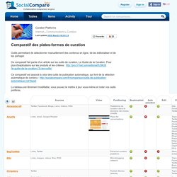 Collaborative comparison engine Register Sign in Sign in Sign out 's dashboard Curation Platforms Internet > Communications > Curation Likes 2018 Sep 23 18:01:13 Comparatif des plates-formes de curation Embed 2011-03-11 15:58:42 2018-09-23 18:01:13 Curation Compare Amplify vs BagTheWeb vs BlogBridge vs CurationStation vs Eqentia vs Flockler vs HabitStream vs KeepStream vs Knowledge Plaza vs Kweeper vs LinkedIn Today vs Pinterest vs Pricemetry vs Storify vs Scoop.it ... More comparisons Comments see older comments Leave a comment Build comparison tables or lists about everything ! It's free and fast to publish data into original tables Create a table SocialCompare Help us grow! Spread the word, tell your friends about us and our service. © 2010 - 2019 SocialCompare.
Curation Platforms
Pearltrees, the Paris-based online curation service that launched in late 2009, was always known for its rather quirky Flash-based interface that allowed you to organize web bookmarks, photos, text snippets and documents into a mindmap-like structure. For users who got that metaphor, it was a very powerful service, but its interface also presented a barrier to entry for new users. Today, the company is launching a radical redesign that does away with most of the old baggage of Pearltrees 1.0. Here is what Pearltrees 1.0 looked like: And here is the new version: Pearltrees’ mission is still to allow you to organize everything you want on the service (in that respect, it almost competes with Evernote). As Pearltrees CEO Patrice Lamothe stressed when I talked to him last week, all of the existing content the company’s over 2 million contributors have added in the past simply transfer over to the new site. 3. The new grid definitely does away with many of the problems of the early version.
Pearltrees Radically Redesigns Its Online Curation Service To Reach A Wider Audience

Pearltrees releases a new version, without any pearls nor trees
The Paris-based startup founded in 2009 once declared: “We focus on the visual potential of Pearltrees to let people dive deeply into their interests and nearly feel them”. Their product, offering a digital curation tool, was unique because of the visual interface voluntareely original: links and folders symbolized by rounded pearls attached together like the branches of a tree. Today, pearls and trees have disappeared to make room for a brand new and larger organisation tool. Two years ago, everyone wanted to build products around “curation” and “interest graph”. The other main improvement lies in the shift from Flash to HTML5 technology, which will make a huge difference for all those who never update their Flash player – and those who think Flash is “so 2011”. Why giving up the core of the product, after 4,5 years of existence and 1,7 million users? The only drawback is that the design of the app has not changed much and looks a little old to create a real agreeable experience.
Pearltrees, the service that allows you to arrange Web content, photos and more (‘pearls’) into mindmap-style ‘trees’, has updated its Web and mobile apps today in order to bring a more seamless user experience and new features to the platform. The company said the Web platform has been fully redesigned and rebuilt in HTML5, making it more easily accessible on a range of different devices, as well as introducing new features also now found in its iOS and Android apps. It seems it’s becoming a bit of a habit for Pearltrees to significantly revamp its website at about this time each year, and this time around it’s gone all-out to make collections, and collecting, “simpler, more accessible and more shareable,” CEO and co-founder Patrice Lamothe said. As well as rebuilding it using HTML 5, there are now new features like ‘extended drag-and-drop’ which allow you to quickly add ‘pearls’ from your hard drive, the Web or a document. ➤ Pearltrees | Google Play | App Store
Social Curation Service Pearltrees Revamps Web and Mobile Apps
Pearltrees Radically Redesigns Its Online Curation Service To Reach A Wider Audience
Social Curation Service Pearltrees Revamps Web and Mobile Apps
Today Pearltrees officially separated itself from its unique visual interface made of pearls and pearltrees, finally succumbing to the trend of Pinterest-like user experience. It might be more practical for the majority of users to sort and collect content with the new Pearltrees 2.0, however, some people might regret the innovative former interface that allowed to discover related content rapidly by browsing an “ocean” of Pearls. Users still have the possibility to go back to the “pearly” version accessible from the menu in the settings section. Now the Pearltree has been replaced by the “Collection” which is basically a “folder” (or a board) containing various types of content of a topic, for instance, you can collect web pages, images, and notes, just like you can do with Evernote and Pinterest. Unlike Evernote, you are able to browse the public content collected by other users, and if you feel the need to make your content private, the premium version offers the feature.
Pearltrees 2.0 Launches with a Brand New User Interface
startup{ery : gather resources for your business
Rancho BioSciences Curation Services
Rancho BioSciences provides on site or off site curation services for all types of data including OMICs and clinical data, preparing data for loading in tranSMART, developing ontologies and vocabularies. We have robust and reproducible manual curation workflows that are supplemented with an application of controlled vocabularies from scientific ontologies and dictionaries, such as CDISC MeSH, MedDRA and SNOWMed. We can also provide OMICs data pre-processing and annotation to enable in-house analyses of public datasets. Rancho Data Curation Services Download Szalma et al. Multiple Sclerosis Data Curation Project with Accelerated Cure funded by Orion Bionetworks Case Study.
A look at how some companies are using paid curation services
Posted on July 5, 2011 3:33 pm by Shel Holtz | Content Curation With the variety of free and paid content curation tools hitting the market, finding the right one for you or your organization can be as daunting as choosing a good toothpaste or pasta sauce from the wealth of choices that confront you on store shelves. One factor that can help you decide is seeing how the services are being used by others. Most of the fee-based services perform roughly the same tasks: They search for content based on the keywords you’ve set up and display them in portal-like interfaces. Here’s a quick review of some of the curated pages used by customers of some of these curation companies: Curata Curata, which runs $1,500 per month (first 30 days free), describes its products a “a web-based content marketing and content curation solution that helps you easily update your microsites in 19 minutes a day with new, fresh and relevant content.” I’m sharing two examples of companies using Curata. Curation Station
25 Killer Websites that Make You Cleverer
OutWit
The Future Of Content Curation Tools - Part I
Curation tools - eLearning - The University of Queensland, Australia
Comparison between Confluence and Share point Features
Pearltrees Radically Redesigns Its Online Curation Service To Reach A Wider Audience
6 reasons to use Pearltrees
Social Curation Service Pearltrees Revamps Web and Mobile Apps
Pearltrees Radically Redesigns Its Online Curation Service To Reach A Wider Audience
Pearltrees Radically Redesigns Its Online Curation Service To Reach A Wider Audience | TechCrunch
Social Curation Service Pearltrees Revamps Web and Mobile Apps


 日本人起業家のAppGrooves、Hot Or Notタイプのクールなアプリ推薦エンジンをApp Storeにリリース
モバイル・アプリが増えれば増えるほど、ユーザーが自分にとって適切なアプリを見つけ出すのは難しくなる。たとえばAppleは最近、App Storeに42万5000のアプリが登録されていると発表した。プラットフォームの運営者もランキングや推薦を行っているが、多くの場合、それだけでは不十分だ。今日v2.0がリリースされたAppGrooves [無料。 もちろんアプリの推薦エンジンはChomp、Frenzappなどすでにいくつか出ているが、AppGroovesのアプローチは、独自に開発された推薦アルゴリズムとHot or notタイプのユーザーによる投票を組み合わせるというユニークなものだ。 まず最初にAppGroovesはユーザーがデバイス上にインストールしているアプリを調べる。 面白いのは、AppGroovesでは、単に自分の選択を投票できるだけでなく、Facebookの友だちに同じ質問をすることができる点だ。 AppGroovesは500 Startupsが主催した2011夏のアクセラレータ・プログラムでデビューした会社の一つだ。 柴田博士の目標はスタート当初からグローバルな企業を創立することだった。 [原文へ] (翻訳:滑川海彦 @namekawa01 Google+)

 Curating and sharing links on the web is a hot space. Delicious has relaunched, and services we’ve written about like Snip.it are trying to get you to share all of your links on its service. Utopic goes a step further in helping you discover and share links, videos, music, and pictures that are relevant to you with its brand new gorgeous design and visual bookmarking launch. Utopic had this to say about its new visual bookmarking feature: With one click you can now save, tag, share and later quickly recover anything on the internet that you find interesting. Discovery When you sign-up for Utopic, you can connect your Facebook, Twitter, YouTube, and Google reader accounts. Once you’ve connected your accounts, Utopic takes about a half hour to go through your links. The design is visually stunning, and doesn’t make you feel like there are too many options, something other bookmark sharing sites suffer from. Sharing is caring Sharing content can be done in two ways.
 Best Practices for Content Curation for Nonprofits at Social Media for Nonprofits Conference
 情報収集がラクになる 話題のキュレーションサービスまとめ « yotalog
あけましておめでとうございます。 どうも私です。 自分の関心領域に関して効率よく情報収集するための方法として 便利なキュレーションサービスを以下にまとめました。 キュレーションって何って人は→ こちら とは言え ニュースとかがあまり好きでなかったら Gunosy、Zite、テック系ツイッタラーを見ておけば良いと思います。 (☆の数は個人的なおすすめ度です) ☆ Gunosy (日本語) メール、Webサービス。 Twitterやfacebook、はてブから得た情報を元に、 毎日おすすめのニュースが登録したメールアドレス宛に10個程度送られてくる。 ☆☆ Zite スマホアプリ。 TwitterやGoogle Reader、 Read It Later の登録情報を元に、 カテゴリーごとの最新ニュースを見られる。 情報量が多いので漏らすこと無く見られておすすめ。 ONETOPI (日本語) ウェブサービス、スマホアプリ。 政治やIT等幅広くホットトピックスを斜め読みできる。 アニメなどエンタメ系も充実。 連載を登録すればRSSリーダー代わりに使える。 ☆ Summify (日本語) Twitter、facebook、Read It Laterから得た関心領域から、 ソーシャルグラフを中心におすすめのニュースを配信してくれる。 Crowsnest × ソーシャルグラフという感じで情報抽出の精度高い。 (Crowsnestの類似だけど、 Twitterfall というのは見せ方が面白い) vingow (日本語) (情報の偏りが無い時点でキュレーションではないとは言っているけど、 情報集約的という意味で) 自分の関心をタグとして保存しておくと、 その情報が閲覧できる。 vingowサイト内にお気に入り登録して保存できるので、 はてブ等に遷移しなくて良いので便利。 Storify ウェブサービス。 震災やテロなどの緊急時に役立った、ユーザー投稿型のニュースサイト。 編集後のニュースでは得られない即時性とリアル感がある。 ☆ subjot カテゴリーごとに分かれたTwitterのような感じ。 doctorカテゴリーでは「どこどこのどの医者がいい」とか musicカテゴリーでは「この音楽がすき」とかがウォールに流れる。 paper.li (日本語) ウェブサービス、iPhoneアプリ。 また他のユーザーをフォローしてその新聞を読むことができる。 ウェブサービス。 追記

![[K모바일]5 Steps Of Curation Service](http://cdn.pearltrees.com/s/pic/th/k-5-steps-of-curation-service-34760985)
 Collaborative comparison engine Register Sign in Sign in Sign out 's dashboard Curation Platforms Internet > Communications > Curation Likes 2018 Sep 23 18:01:13 Comparatif des plates-formes de curation Embed 2011-03-11 15:58:42 2018-09-23 18:01:13 Curation Compare Amplify vs BagTheWeb vs BlogBridge vs CurationStation vs Eqentia vs Flockler vs HabitStream vs KeepStream vs Knowledge Plaza vs Kweeper vs LinkedIn Today vs Pinterest vs Pricemetry vs Storify vs Scoop.it ... More comparisons Comments see older comments Leave a comment Build comparison tables or lists about everything ! It's free and fast to publish data into original tables Create a table SocialCompare Help us grow! Spread the word, tell your friends about us and our service. © 2010 - 2019 SocialCompare.
Curation Platforms
