Designing Headlines Tips and Tricks Tutorial
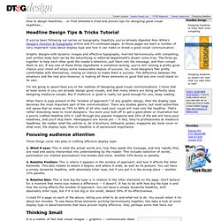 How to design headlines... or Fred Showker's tried and proven tips for designing good visual headlines... Headline Design Tips & Tricks Tutorial If you've been following our series on typography, hopefully you've already digested Alex White's Design's Function & Typography article and it's continued pages. In those pages we learn a number of very important rules about display type and how it can make or break a good visual communication. Graphic designs with dynamic images and effective typography, married harmoniously with compelling, well written body text can be the advertising or editorial department's dream come true. I'm not going to spoon-feed you to the realities of designing good visual communications. When there is type present in the "window of approach¹" of any graphic design, then the display type becomes the most important part of the communication. Focusing audience attention Three things come into play in crafting effective display type: 1. 2. 3. Thinking Small
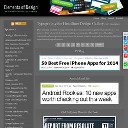
They say that content is king. However, how you present it is pretty important too — no more so than when it's the main heading on your page. This collection of headline typography should provide some ideas for a more creative approach to designing this most important of page elements. 1 2 3 4 5 6 7 8 9 Next » PCMag Android and Me Old Pulteney Row to the Pole Rob Goodlatte The Statement New Concept Design 2.0 David's Kitchen frequency decoder we make money not art Time Challies.com Earth 911 Modern Life
Typography for Headlines Design Showcase
cufón - fonts for the people
Smashing Post - Resource Gallery for Web Designer and Developers
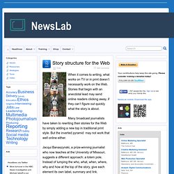
When it comes to writing, what works on TV or in print doesn’t necessarily work on the Web. Stories that begin with an anecdotal lead may send online readers clicking away, if they can’t figure out quickly what the story is about. Many broadcast journalists have taken to rewriting their stories for the Web by simply adding a new top in traditional print style. But the inverted pyramid may not work that well online either. Jacqui Banaszynski, a prize-winning journalist who now teaches at the University of Missouri, suggests a different approach: a totem pole. At a SABEW workshop for business journalists, Banaszynski offered five additional things to keep in mind to improve Web stories: 1. 2. 3. 4. 5.
Story structure for the Web | NewsLab
Dzine Blog | Design inspiration and Resources
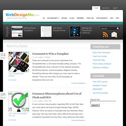 Comment to Win a Template Posted by admin in Freebies Today we’re pleased to announce a giveaway from TemplateMonster, a US based template selling company. The TemplateMonster team is known for their website templates, WordPress themes, Joomla templates, Magento themes, PrestaShop themes other designs you may need to make a website. There are more than 30,000 templates at templatemonster.com and Continue Reading » Common Misconceptions about Use of Flash and SEO Posted by admin in SEO, Tips A very common misconception regarding SEO is that Flash sites can’t rank well in the Search Engine Results Page (SERP). Continue Reading » Designing tips for global websites Posted by admin in Design, Tips It is perhaps an obvious thing to say, but the world wide web truly is a global phenomenon. Continue Reading » How To Edit Accordion Template Posted by admin in Flash, Tutorials This tutorial shows you how to modify the contents of Accordion Template. 1. Continue Reading »
Web Design
User Interface Engineering - Usability Research, Training, and Events - UIE
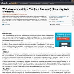 Introduction There are a few standard files that every Web site should really have, but that most neglect. Most of these are matters of convention, not of technical requirement, but you are doing your site wrong not to provide them. Let users who make a wild guess about what they want to find usually succeed when they guess URLs. This tip discusses each of these standard files briefly. Exactly how a given resource is provided depends on the Web server and Web application layers you use. 404.html When users use your Web site, they will inevitably seek resources that do not exist. A warning when you create a custom 404.html (or whatever mechanism your Web server uses to deliver a custom "not found" message): Far too many Web sites are misconfigured to deliver "soft 404" messages. about.html So why did you create your Web site, anyway? contact.html So who are you? copyright.html To whom does this stuff belong? Obviously, different pages or resources might have different copyright information.
Web development tips: Ten (or a few more) files every Web site needs - StumbleUpon
Good Web Site Navigation - Reaching The Information Instantly - Accessible Web Design
Creating good web site navigation is the most important task a web designer has to accomplish in the web design process. Web site navigation is the pathway people take to navigate through sites. It must be well constructed, easy to use and intuitive. Good navigation is fundamental to good web design - in both business and informational sites - users should be able to find information easily. Checklist and key points to consider when designing navigation People can enter a site through any other page, not just the homepage. Think and act like the average user does. The most frequent issue in web design is that designers do not act and do not try to experience web sites from the user perspective. It would be useful to open up a few sites and take a look at the web site navigation, how it's positioned, how easy it is to go through etc. Design good primary web site navigation Left navigation. Design good secondary navigation Position of the secondary navigation does not have a general rule
960 Grid System
5 Easy Ways to Prepare Your Web Designs for Coding | cssWOW:: CSS Gallery
Design Gallery, Deals, Tutorials & Community
Best Open Source Resources for Web Developers | WebAppers
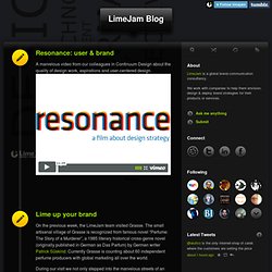
A marvelous video from our colleagues in Continuum Design about the quality of design work, aspirations and user-centered design. On the previous week, the LimeJam team visited Grasse. The small artisanal village of Grasse is recognized from famous novel “Perfume: The Story of a Murderer”, a 1985 literary historical cross-genre novel (originally published in German as Das Parfum) by German writer Patrick Süskind. Currently Grasse is counting about 60 independent perfume producers with global marketing all over the world. During our visit we not only stepped into the marvelous streets of an ancient city that, literally, smells history of artisanal perfume production, but also discussed possible collaboration possibilities in the field of aromamarketing. LimeJam visited one of the biggest and famous perfume family factories in France - Fragonard. Brand and scent marketers are very particular when it comes to choosing a scent that will connect with their target market. Zoom Info
LimeJam Blog
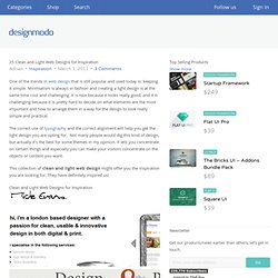 Startup Framework Close 25 Clean and Light Web Designs for Inspiration Adrian • Inspiration • March 1, 2011 • 3 Comments One of the trends in web design that is still popular and used today is: keeping it simple. Minimalism is always in fashion and creating a light design is at the same time cool and challenging. It is nice because it looks really good, and it is challenging because it is pretty hard to decide on what elements are the most important and how to arrange them in a way for the design to look really simple and practical. The correct use of typography and the correct alignment will help you get the light design you are opting for. This collection of clean and light web design might offer you the inspiration you are looking for. Clean and Light Web Designs for Inspiration Adrian If you would like to be kept up to date with our posts, you can follow us on Twitter, Facebook, Google+, or even by subscribing to our RSS Feed. Related Posts Newsletter 239,770 Subscribers 3 Comments Sponsors
25 Clean and Light Web Designs for Inspiration
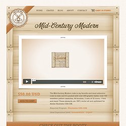 Mid-Century Modern The Mid-Century Modern crate is my favorite and most extensive crate to-date and it's packed with over 200 graphic styles, over 100 seamless pattern swatches, 60 brushes, 3 sets of 32 icons, 1 font and more! These elements are 100% vector art and optimized for Adobe Illustrator CS4-CS6. Required Program: Illustrator CS4-CS6 Ideal Experience Level: Intermediate - Expert Check Out the Booty Vintage Mill Icons The Vintage Mill Icon set contains 32 icons in 3 different color palettes. Heritage UI Graphic Styles The Heritage UI set of graphic styles is brimming with 30 graphic styles for buttons, typography, sliders, radio buttons, check boxes, drop downs, and more. Vintage Wood Seamless Pattern Swatches The Vintage Wood seamless pattern swatches consist of 4 wood styles in 6 colors oriented vertically and horizontally making a total of 48 pattern swatches. Murky Neon Graphic Styles Dusty Daze Seamless Pattern Swatches Vintage Gadget Graphic Styles Stamps & Stationery Graphic Styles
Vector Mill — Mid-Century Modern
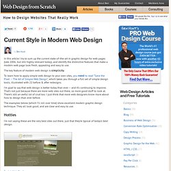 In this article I try to sum up the current state-of-the-art in graphic design for web pages (late 2006, but still highly relevant today), and identify the distinctive features that make a modern web page look fresh, appealing and easy to use. The key feature of modern web design is simplicity. To learn how to apply simple web design to your own sites, you need to read “Save the Pixel – The Art of Simple Web Design”, which takes you through a full set of simple design tools, illustrated with 22 before & after redesigns. I’m glad to say that web design is better today than ever – and it’s continuing to improve. That’s not just because there are more web sites out there, so more good stuff to look at. There’s still an awful lot of crud too. The examples below (which I’ll roll over time) show excellent modern graphic design technique. Hotties I’m not saying these are the very best sites out there, just that they’re typical of today’s best design. Common features Simple layout To take away… Links
Current style in web design
Rapha
Web Design: Proximity Principle.© UPV
Complete Guide To Responsive Web Design | Tech Stream
In this article we'll discuses on Responsive Design and Steps to implement Responsive Design in the web. Responsive Web design is the approach that suggests the design and development should respond to the user's behavior, responding to behavior means the website must adopt to environment based on platform & orientation and also screen size even if the user changes the size of browser or screen. It's a practice consisting of a mix of flexible grids and layouts, images and an intelligent use of CSS media queries. The web site must automatically switch to accommodate for resolution, image size and scripting abilities as the user switches from their laptop to tablets or change the screen size. Responsive web design is not a new concept it's just the process restoring the original fluidity of the web, which we destroyed. Emergence of Responsive Design Almost every client these days wants a mobile version of their website build up. Why Use Responsive Web Design What Made it a Big Thing? @import
Welcome to Shaw Website Design Group's Mobile Web Design, Learning Resource Bubbles. Here you will find that no matter what your skill level, our Mobile Web Design Resource bubbles will offer you a wealth of resources to seize your interest and guide your learning experience. At Shaw Website Design Group, we hope what we have gathered allows you to float your curiosity and inflate your knowledge about Mobile Web Design. The mobile Audience is growing In the not too distant future, mobile devices will outstrip the demand made by personal computers. The Challenges in Mobile Design Today The biggest challenge for a mobile web designer is in developing mobile sites that take advantage of both older lower-end devices that are limited in memory and features and at the same time offer high-end devices more bang for the buck. The following Web Design Resources have been gathered from around the web and will be periodically updated. Learn more about Mobile Web Design using Resource Bubbles
Mobile Web Design Resource Bubble
Dayton Web Design | Ohio Web Design | Web Marketing | Interactive
Trilium Web Design
UK Web Design Association - the Web Standards Organisation in the UK
What are Frameworks? 22 Best Responsive CSS Frameworks for Web Design
This post aims to present what frameworks are and what they are used for, alongside a selection of the best that can be got for free on the internet. In this way, we want to help web designers and developers who are starting out to discover new resources and possibilities, as well as setting out concepts that can sometimes be too abstract for those who have already travelled far in the world of web design. What is a framework? A framework is a standardized set of concepts, practices and criteria for dealing with a common type of problem, which can be used as a reference to help us approach and resolve new problems of a similar nature. In the world of web design, to give a more straightforward definition, a framework is defined as a package made up of a structure of files and folders of standardized code (HTML, CSS, JS documents etc.) which can be used to support the development of websites, as a basis to start building a site. To summarize: there’s no need to reinvent the wheel. 1.
A Love For Design » Web Design & Graphic Design Tutorials
Web designer freelance Pisa - Fabrizio del Gaudio. Realizzazione siti internet, web designer, realizzazione loghi, locandine, grafico, brochure
Web designer freelance Milano [¯|¯] FBDM Italia


 How to design headlines... or Fred Showker's tried and proven tips for designing good visual headlines... Headline Design Tips & Tricks Tutorial If you've been following our series on typography, hopefully you've already digested Alex White's Design's Function & Typography article and it's continued pages. In those pages we learn a number of very important rules about display type and how it can make or break a good visual communication. Graphic designs with dynamic images and effective typography, married harmoniously with compelling, well written body text can be the advertising or editorial department's dream come true. I'm not going to spoon-feed you to the realities of designing good visual communications. When there is type present in the "window of approach¹" of any graphic design, then the display type becomes the most important part of the communication. Focusing audience attention Three things come into play in crafting effective display type: 1. 2. 3. Thinking Small

 Story structure for the Web | NewsLab
 Comment to Win a Template Posted by admin in Freebies Today we’re pleased to announce a giveaway from TemplateMonster, a US based template selling company. The TemplateMonster team is known for their website templates, WordPress themes, Joomla templates, Magento themes, PrestaShop themes other designs you may need to make a website. There are more than 30,000 templates at templatemonster.com and Continue Reading » Common Misconceptions about Use of Flash and SEO Posted by admin in SEO, Tips A very common misconception regarding SEO is that Flash sites can’t rank well in the Search Engine Results Page (SERP). Continue Reading » Designing tips for global websites Posted by admin in Design, Tips It is perhaps an obvious thing to say, but the world wide web truly is a global phenomenon. Continue Reading » How To Edit Accordion Template Posted by admin in Flash, Tutorials This tutorial shows you how to modify the contents of Accordion Template. 1. Continue Reading »
Web Design
 Introduction There are a few standard files that every Web site should really have, but that most neglect. Most of these are matters of convention, not of technical requirement, but you are doing your site wrong not to provide them. Let users who make a wild guess about what they want to find usually succeed when they guess URLs. This tip discusses each of these standard files briefly. Exactly how a given resource is provided depends on the Web server and Web application layers you use. 404.html When users use your Web site, they will inevitably seek resources that do not exist. A warning when you create a custom 404.html (or whatever mechanism your Web server uses to deliver a custom "not found" message): Far too many Web sites are misconfigured to deliver "soft 404" messages. about.html So why did you create your Web site, anyway? contact.html So who are you? copyright.html To whom does this stuff belong? Obviously, different pages or resources might have different copyright information.
Web development tips: Ten (or a few more) files every Web site needs - StumbleUpon
 Good Web Site Navigation - Reaching The Information Instantly - Accessible Web Design
Creating good web site navigation is the most important task a web designer has to accomplish in the web design process. Web site navigation is the pathway people take to navigate through sites. It must be well constructed, easy to use and intuitive. Good navigation is fundamental to good web design - in both business and informational sites - users should be able to find information easily. Checklist and key points to consider when designing navigation People can enter a site through any other page, not just the homepage. Think and act like the average user does. The most frequent issue in web design is that designers do not act and do not try to experience web sites from the user perspective. It would be useful to open up a few sites and take a look at the web site navigation, how it's positioned, how easy it is to go through etc. Design good primary web site navigation Left navigation. Design good secondary navigation Position of the secondary navigation does not have a general rule
 LimeJam Blog
 Startup Framework Close 25 Clean and Light Web Designs for Inspiration Adrian • Inspiration • March 1, 2011 • 3 Comments One of the trends in web design that is still popular and used today is: keeping it simple. Minimalism is always in fashion and creating a light design is at the same time cool and challenging. It is nice because it looks really good, and it is challenging because it is pretty hard to decide on what elements are the most important and how to arrange them in a way for the design to look really simple and practical. The correct use of typography and the correct alignment will help you get the light design you are opting for. This collection of clean and light web design might offer you the inspiration you are looking for. Clean and Light Web Designs for Inspiration Adrian If you would like to be kept up to date with our posts, you can follow us on Twitter, Facebook, Google+, or even by subscribing to our RSS Feed. Related Posts Newsletter 239,770 Subscribers 3 Comments Sponsors
25 Clean and Light Web Designs for Inspiration
 Mid-Century Modern The Mid-Century Modern crate is my favorite and most extensive crate to-date and it's packed with over 200 graphic styles, over 100 seamless pattern swatches, 60 brushes, 3 sets of 32 icons, 1 font and more! These elements are 100% vector art and optimized for Adobe Illustrator CS4-CS6. Required Program: Illustrator CS4-CS6 Ideal Experience Level: Intermediate - Expert Check Out the Booty Vintage Mill Icons The Vintage Mill Icon set contains 32 icons in 3 different color palettes. Heritage UI Graphic Styles The Heritage UI set of graphic styles is brimming with 30 graphic styles for buttons, typography, sliders, radio buttons, check boxes, drop downs, and more. Vintage Wood Seamless Pattern Swatches The Vintage Wood seamless pattern swatches consist of 4 wood styles in 6 colors oriented vertically and horizontally making a total of 48 pattern swatches. Murky Neon Graphic Styles Dusty Daze Seamless Pattern Swatches Vintage Gadget Graphic Styles Stamps & Stationery Graphic Styles
Vector Mill — Mid-Century Modern
 In this article I try to sum up the current state-of-the-art in graphic design for web pages (late 2006, but still highly relevant today), and identify the distinctive features that make a modern web page look fresh, appealing and easy to use. The key feature of modern web design is simplicity. To learn how to apply simple web design to your own sites, you need to read “Save the Pixel – The Art of Simple Web Design”, which takes you through a full set of simple design tools, illustrated with 22 before & after redesigns. I’m glad to say that web design is better today than ever – and it’s continuing to improve. That’s not just because there are more web sites out there, so more good stuff to look at. There’s still an awful lot of crud too. The examples below (which I’ll roll over time) show excellent modern graphic design technique. Hotties I’m not saying these are the very best sites out there, just that they’re typical of today’s best design. Common features Simple layout To take away… Links
Current style in web design