

RefreshBox. RefreshBox. RefreshBox. RefreshBox. Gigster Does The Dev Dirty Work To Turn Your Idea Into An App. Got a startup idea?

That and some cash is all you need to get a fully functional app built for you by Gigster. Launching today, Gigster is a full-service development shop, rather than a marketplace where you have to manage the talent you find. Just go to Gigster’s site, instant message with a sales engineer, tell them what you want built, and in 10 minutes you get a guaranteed quote for what it will cost and how long it will take. Give Gigster the go-ahead, and it will manage an elite set of freelance coders and designers to build your product and give you status reports each week.
Once you get your project back, Gigster will even maintain the code, and you can pay to add upgrades or new features. There’s a massive talent crunch in tech. The Struggle Is Real “I’ve been coding since elementary school” Gigster co-founder Roger Dickey tells me. Last year, Dickey tried building out 15 different ideas in search of a winner. Built on Gigster.
Podcast - Conflating creativity and business by exploring ways to make a living doing what you love. You failed.
Now what? How do you come back from that? A true UX tool. The non-prototyping work we do Perhaps it seems like I take aim at prototyping tools, while ignoring the non-prototyping tools.

Clearly there are many specialized tools for the other parts of the UX design process. For instance, there are tools for user testing and feedback like Uservoice, Usabilla, and Survey Monkey. And tools for flowcharts, mindmaps and sitemaps like Visio, OmniGraffle or even Powerpoint. The 4 Essential UX Documents Every Designer Needs. When it comes to UX documentation, wireframes and prototypes are certainly among the most important.
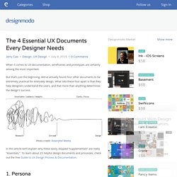
But that’s just the beginning. We’ve actually found four other documents to be extremely practical for everyday design. What sets these four apart is that they help designers understand the users, and that more than anything determines the design’s success. Photo credit: Rosenfeld Media. In this article we’ll explain why these easily skipped “supplementals” are really “essentials.” 5 simple UX principles to guide your product design - InVision Blog Thoughts on users, experience, and design from the folks at InVision. Few things in life are constant: death, taxes, and strangers asking “So what do you do?”
Enhance Your User Experience with Animated Transitions — Yummygum Journal. Animation and User Experience In order to define a good transition, understanding the relation between animation and the User Experience is key.
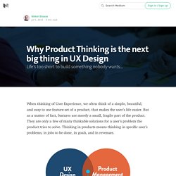
Animation maintains context Our digital products enable us to do the unimaginable these days, like ordering a cab from your wrist or preparing a meal without having to think. Subsequently, it means our job as interface designers is crucial for a successful product. With all these complex interactions and possibilities, users can quickly lose context and orientation within the product. Animation provides feedback. Why Product Thinking is the next big thing in UX Design.
Uncover the jobs the product is hired for A product has a core user experience, which is basically the reason the product exists.
Why You're Over-Thinking Your UI/UX with Rohan Puri. 9 Pieces of UX Advice I Stole From People Smarter Than Me. Like all people, I like to think I have good taste.
But if I do, it’s only because I’ve been ruthless about one thing: stealing secrets and strategies from people a lot smarter than me. I’m fairly new to the UX field, but I’ve had the good fortune of being exposed to world-class designers who’ve worked for IDEO, Google, CapitalOne, and the Nielsen Norman Group to name a few. Some I met in person, and others I encountered in the form of books and presentations.
10 of the Best UX Infographics. Sometimes, as the old saying goes, pictures really do tell 1000 words.
Thomas Byttebier - The best icon is a text label. Previously I wrote about clarity being the most important characteristic of a great interface.
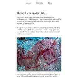
Let’s talk about icons now. They’re an essential part of many user interfaces. The thing is: more often than not, they break clarity. Pictograms have been in use since the early days of mankind. They are often seen as the first expressions of a written language. Design user research explained for everyone with animated gifs. The most relevant source of inspiration and considerations when designing things are people. This inspiration can be deeper than understanding what people do, why they do it and what they say they need; it is ultimately about understanding what they truly value. Building empathy with the users can be inspirational and help define the overall experience. Have a conversation, don’t interview There are numerous books and articles out there explaining how to do interviews, observations, surveys and etc; the user research does not have to be that complicated.
Designers can simply go out, meet people in the real context and have a friendly chat with them. Uncover the values not the needs. The Future of Design in Technology — The Year of the Looking Glass. Design in the chameleon-colored world of technology is still young. The word interaction design only started getting thrown around in the 90s. When I started my first job, before the advent of the iPhone, I remember our team compiling a list of all the folks we could find who had ever designed an interactive application before. At the time, the list had less than 100 names. Today, at nearly every tech company, demand for design is through the roof. But we’re still operating a little like the Wild West — fast, loose, and with a lot of young guns.
It’s an exciting time to be a designer in technology (See also John Maeda’s recent report on this topic.) Look and Feel and Feel by Jason Fried of Basecamp. Designers often talk about the look and feel of a product, an app, an object, etc. These are good concepts to be talking about, but how the thing feels isn’t really the important feel. The important feel is how it makes you feel. That feeling isn’t usually covered by look and feel discussions.
This has recently come into focus for me. The trigger? The 22 Rules of UX — ThoughtWorks. The 22 Rules of UX By Valeria Spirovski Pixar’s 22 rules of storytelling adapted for UX — because both are about creating great experiences. In 2011 Emma Coats, a former storyboard artist at Pixar, tweeted the “22 rules of storytelling”. The post has become well known and was recently re-done as image macros. As I was reading each of the 22 rules, I felt drawn to the message Emma was trying to convey. Becoming a More Thoughtful User Experience Designer. A simple experience that opened my eyes to new possibilities took the form of a 170px smiley face. After a stressful day, I attempted to clear my inbox as a last-ditch effort to ease my mind. I had just downloaded the Gmail app and decided to use it instead of the standard Apple Mail app I had been using for years.
My Approach to UI Design. Why It’s Totally Okay to Use a Hamburger Icon. 13 UX Mistakes Explained in GIFs. One Magic Formula to Calculate User Experience? How To Become A UX Leader. Why You're Over-Thinking Your UI/UX with Rohan Puri. Startup Launch List. Why empty states deserve more design time. A Crash Course in UX Design Research — User Experience Design (UX) Skip the intro, don’t skip onboarding! UI/UX design Agency / Firm India. I am Prince Pal – UI/UX designer and Branding Expert at Think360. This presentation dedicated to whom who are UX designers / students or entrepreneurs. UI/UX design Agency / Firm India. RefreshBox. Animation Resources for User Interfaces.
Designing Moments — Facebook Design. A Deeper Dive Our team’s core principle for Moments was to make it really fast for friends to exchange photos in a way that works better than existing options. Building a simple way for groups of friends to share groups of photos became our team’s north star. One of the app’s main functions is grouping the photos in your phone’s camera roll based on when they were taken and who’s in them. This is done using the same facial recognition technology that powers tag suggestions on Facebook today. Early on, we discovered that this could be a tool for helping to suggest which photos you may want to share with specific friends.
Google's Guide To Designing With Empathy. The ultimate guide to launching your UX career. Material Design UI interaction concept. 9 UX Myths That You Thought Were True But Are Not. The Complexity of Easy Onboarding. Why Infield Top Aligned Form Labels are Quickest to Scan. Rise of the Product Managing Designer — Skillshare Writings. Designing a calendar app for millions - Sunrise. The Principles of UX Choreography — Experiência do Usuário.
Mobile-App-UX-Principles_Full-Report_Final.
7 Things Every Designer Needs to Know about Accessibility — Salesforce UX. 7 Things Every Designer Needs to Know about Accessibility — Salesforce UX. The watch on my phone: what time means to us. Designing Settings. Designing Settings. Look and Feel and Feel by Jason Fried of Basecamp. Thomas Byttebier - Blog. 10 of the Best UX Infographics. Users' Perception of Product Ratings (New Qualitative & Quantitative Findings) Tools. NeuBible. A Bible app designed for you. How to keep up to date on Front-End Technologies - The Recipe. Fonts. Web UI Best Practices: UI Design from the Experts. UI Animation Reviews: Web Navigation - All The Right Moves Screencast.
Xiaoyue (Jessica) Wang. All Design Lessons. The UX Newsletter.