

Universal Navigation: Connecting Subsites to Main Sites. Summary: On large sites with several standalone subsites, universal navigation provides quick access to the main site.
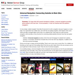
To be successful, it must not interfere with the subsite’s navigation. In menu design, “global navigation” describes the top level of a site’s navigation, because it appears on every page. If an organization has multiple sites, each with their own global navigation, what happens when users need to be able to navigate higher up the chain or to a different site? That’s when you need universal navigation, which provides a menu structure for connecting related websites that each have their own global navigation. Definition: Universal navigation provides a link to the main homepage of a website from subsites, sections, or microsites. Picture an exit sign in a large commercial building. In our building analogy, universal navigation is like a transporter that would take you from the groundskeepers’ shed directly to the main lobby. Accordions for Complex Website Content on Desktops.
Summary: Longer pages can benefit users.
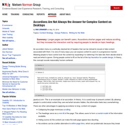
Accordions shorten pages and reduce scrolling, but they increase the interaction cost by requiring people to decide on topic headings. An accordion menu is a vertically stacked list of headers that can be clicked to reveal or hide content associated with them. It is one of many ways you can expose content to users in a progressive manner. Allowing people to have control over the content by expanding it or deferring it for later lets them decide what to read and what to ignore. Giving people control is #3 on the list of the top heuristics for usable design. Jqueryui.com: This is an example of an accordion. There are other advantages to applying accordions to long, content-rich pages: Collapsing the page minimizes scrolling. Major Usability Issues with Accordions While accordions sound ideal for presenting complex content, like with many other widgets and implementations, they are not a one-size-fits-all solution.
Criteria for Applying Accordions. The Difference Between Information Architecture (IA) and Navigation. Summary: IA is the information backbone of the site; navigation refers to those elements in the UI that allow users to reach specific information on the site.
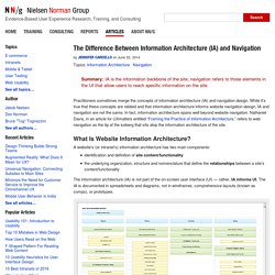
Practitioners sometimes merge the concepts of information architecture (IA) and navigation design. While it’s true that these concepts are related and that information architecture informs website navigation design, IA and navigation are not the same. In fact, information architecture spans well beyond website navigation. Nathaniel Davis, in an article for UXmatters entitled “Framing the Practice of Information Architecture,” refers to web navigation as the tip of the iceberg that sits atop the information architecture of the site. What Is Website Information Architecture?
A website’s (or intranet’s) information architecture has two main components: identification and definition of site content/functionality the underlying organization, structure and nomenclature that define the relationships between a site’s content/functionality. Barre de navigation web : pour naviguer sur un site web en toute liberté. La barre de navigation est un élément essentiel pour l'internaute.
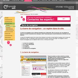
Elle lui procure une vue globale du site et lui montre l'ensemble des rubriques. Ainsi l'internaute peut circuler facilement en fonction de ses besoins. La barre de navigation permet de circuler d'une rubrique à une autre en toute liberté et quelque soit le niveau de profondeur du site. Si l'utilisateur utilise abusivement le bouton "reculer d'une page" du navigateur comme bouton de navigation pour se déplacer dans le site, ce n'est pas bon signe. 1.
Filters vs. Facets: Definitions. Naturalizer.ca. CLEARLY.CA. Utiliser la recherche par facettes pour gérer un catalogue e-commerce. La gestion de catalogue e-commerce est une activité qui génère des résultats, du risque, et qui est probablement la discipline la plus sous-estimée lorsqu’une entreprise décide de faire du commerce électronique.
Pourtant, le catalogue est au coeur du magasinage en ligne, et a des répercussions sur l’expérience-client, le référencement sur les moteurs de recherche, la mesure de performance et le marketing Web en général. Pour ceux qui explorent les besoins des clients, des campagnes et des autres sites, il y a plusieurs façons de maximiser l’impact des catalogues. Comment stimuler à la fois la recherche et la découverte?
Cet article, le premier d’une série sur la gestion de catalogue, vous présente l’outil qui semble quasi-incontournable depuis quelques années, la recherche par facettes…