

User Experience Professionals Association. User experience work is based on designing products and services with the people who will use the product or service in-mind (users).

This practice of focusing on the users is sometimes more specifically called user-centered design (UCD). In UCD work the focus is on the users through the planning, design and development of a product. An International Standard There is an international standard that is the basis for many UX/UCD methodologies. PP3. HDR S BUISINE. Fil d'Ariane (ergonomie) Un article de Wikipédia, l'encyclopédie libre.
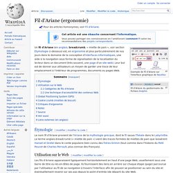
Les fils d’Ariane apparaissent typiquement horizontalement en haut d'une page Web, usuellement sous une barre de titre ou les en-têtes de page. Ils fournissent des liens en arrière sur chaque étape (page) parcourue par l'utilisateur au fil de sa navigation à travers l'interface afin de pouvoir se positionner au sein du site et éventuellement revenir sur ses pas depuis le point d'entrée (de départ) du site Web. Les fils d’Ariane sont souvent générés automatiquement. Guide du Débutant au Wireframing. WebForms LukeW. Formulaires. Formulaires. From all over the techniques and tools related to design process and User experience, only personas appears as a consistent common denominator, even in methods against the use of extensive “deliverables” as Lean UX.
Most of the point of view agree in that the secret of a great user experiences strategy lies on this tool, even so the building process varies significantly. Probably the most important reason to create personas is to set a common understand of the final user. So that a coherent strategy is defined that will result in a product/service that is user oriented and meet the user goals. This post and the further related ones, came from a personal work aimed to define a guideline for the creation of personas in daily work. Actually the state of art about personas is so extensive, so vast that this post don’t pretend to say anything is not already out there, but I think you may find this structure and easy starting point. One starting points: UXSketchnotes. The Guide to UX Design Process & Documentation (Part 2)
In this article, we explain the general product design process and relevant documents you might produce at the first three of seven stages.
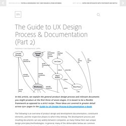
It is meant to be a flexible framework as opposed to a strict recipe. These ideas are covered in greater detail across 150+ pages in the Guide to UX Design Process & Documentation e-book. The following is an overview of product design and development documentation, constituent elements, and the respective phases to which they belong. The development process and resulting documents can vary widely between companies, as many follow their own unique design principles/methodologies. In general, many of the deliverables below are common within most organizations in some form—including UXPin. In Part 1, we covered the first three steps of the UX Design process. How They All Relate: The 7 Steps to the UX Design Process. The Guide To UX Design Process & Documentation - Part 1. In this article, we explain the general product design process and relevant documents you might produce at the first three of seven stages.
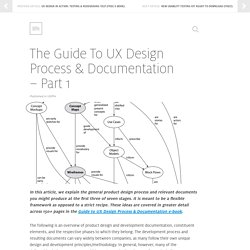
It is meant to be a flexible framework as opposed to a strict recipe. These ideas are covered in greater detail across 150+ pages in the Guide to UX Design Process & Documentation e-book. The following is an overview of product design and development documentation, constituent elements, and the respective phases to which they belong. The development process and resulting documents can vary widely between companies, as many follow their own unique design and development principles/methodology. In general, however, many of the deliverables below are common within most organizations in some form—including my wireframing and prototyping company, UXPin. How They All Relate 1. 2. 3. 4. 5. 6. 7. 1. Initial activities such as stakeholder’s kickoff meeting, brainstorming, and rudimentary product sketching lead to the creation of the following outputs: 2. 3. UX : observer et comprendre l’expérience utilisateur.
Designing Experience Layers. Yesterday afternoon, I posted a little jab at Vine.
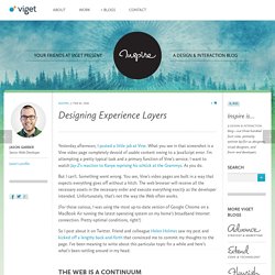
What you see in that screenshot is a Vine video page completely devoid of usable content owing to a JavaScript error. I’m attempting a pretty typical task and a primary function of Vine’s service: I want to watch Jay-Z’s reaction to Kanye reprising his schtick at the Grammys. As you do. But I can’t. Something went wrong. (For those curious, I was using the most up-to-date version of Google Chrome on a MacBook Air running the latest operating system on my home’s broadband Internet connection.
So I post about it on Twitter. 5 règles d'ergonomie, web design et e-merchansing internet, Le Carnet d'une aventurière du Web. Un constat fréquent est que les sites Internet sont conçus par des chefs de projet marketing surfers hardcore du web (qui aiment se faire plaisir, avouons le aussi) pour des utilisateurs « normaux ».
Les bonnes idées se révèlent souvent être de gros flops car technologiquement discriminantes/trop avancées ou non adaptées à la cible (ex : la redoute lance la cabine d’essayage virtuelle 3D en 2008, la fonctionnalité fait rapidement plouf et est retirée du site). Des contre-exemples ergonomiques illustrés.