

A Diamond in the stuff. It’s hard to believe, but my “little” girl is turning 10 next month.
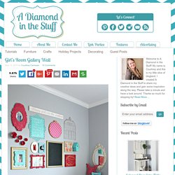
I can’t handle it so I’m going to quickly move on and not ACTUALLY think about that. It was pretty evident that she needed to have a little “big” girl sprucing up in her room. She has had the same theme in her room since she was born; a garden theme. Up until this point it was pink, green, and white. It was also very little girl. A girl and a glue gun. <a href="<a pearltreesdevid="PTD1278" rel="nofollow" href=" class="vglnk"><span pearltreesdevid="PTD1279">http</span><span pearltreesdevid="PTD1281">://</span><span pearltreesdevid="PTD1283">www</span><span pearltreesdevid="PTD1285">.
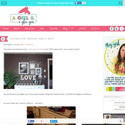
</span><span pearltreesdevid="PTD1287">wibiya</span><span pearltreesdevid="PTD1289">. </span><span pearltreesdevid="PTD1291">com</span><span pearltreesdevid="PTD1293">/</span></a>">Web Toolbar by Wibiya</a> Show AddThis What's Next Hide. Bigger Than the Three of Us. So, I told myself the living room wasn’t getting a gallery wall and it didn’t… for 2 years.

But then, I got so tired of looking at the large looming BLANK wall that I decided to just give in. I told Luke it was only temporarily going to be up there, because eventually I would find the perfect wall treatment for that wall. Well, now that I have it up and it’s been up for a month or so… I totally love it and couldn’t imagine anything else there. Are you laughing at me yet? LOL. Blue i style. Confessions of a serial diyer. Craft-O-Maniac. Craving some Creativity. Creations by Kara. Creations by Kara. Damask Love. I now interrupt your regularly scheduled National Letter Writing Month projects to bring you a little prettiness for your walls.
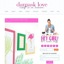
For years, I’ve actively avoided doing any “gallery wall” projects because they just seemed to fussy and way too expensive! All those pricey frames and all those prints. No thanks. Well – turns out that when you do gallery walls the Damask Love way, you end up with something like this or something like today’s project. Both projects can be done with cheap-o ingredients…and I love “cheap-o”!!! Today’s Cricut Explore gallery wall is created with craft supplies and cheap frames from Ikea. This Cricut Explore gallery wall is assembled with five new Design Space projects that I created using some of my favorite Cricut Access images. #boss Dimensional Wall Art It looks super official but it’s chipboard, glue and paint.
Get the #boss Wall Art Make It Now Project HERE The file is designed to cut into pieces like this. Last – you can paint your chipboard art . Diy n Crafts. Cookie barclose This website makes use of cookies to enhance browsing experience and provide additional functionality.
None of this data can or will be used to identify or contact you. This website makes use of third party cookies, see the details in the privacy policy. This website makes use of tracking cookies, see the details in the privacy policy. To learn more about how this website uses cookies or localStorage, please read our PRIVACY POLICY. By clicking Allow cookies you give your permission to this website to store small bits of data as on your device. Dwelling in Happiness. Hello!
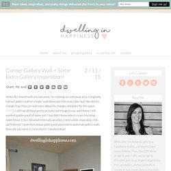
As I shared with you last week, I’m redoing our entryway area. I originally had our gallery wall on a larger wall above our entryway table, but I decided to change it up (You can read more about my changes and plans for this space HERE). I still had all these pretty pictures and things to use, and I knew I still wanted a gallery wall of some sort, I but didn’t know where in our tiny living room I’d put it. So, I did what I normally do when I need a little inspiration; I hit up Pinterest! Home happy home. Yesterday I posted some gallery walls that inspired me, and today I am sharing the gallery wall I put together in my living room!
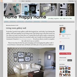
The living room is the first room you see when you enter our front door so I wanted the focal wall to make a statement! I looked and looked at ideas for stenciled walls, but I totally loved the painted wall treatment I found at Jonesdesigncompany . It took me about a week to complete the wall, but it was so worth it. Then it was time for the fun part arranging and rearranging the gallery wall. House and Home. Kai Ethier shares step-by-step instructions on how to make this mid-century modern-inspired display.
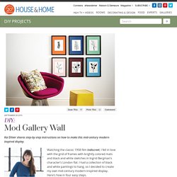
Watching the classic 1958 film Indiscreet, I fell in love with the grid of frames with brightly colored mats and black and white sketches in Ingrid Bergman’s character’s London flat. I had a collection of black and white paintings to hang, so I decided to create my own mid-century modern-inspired display. Here’s how in four easy steps. Materials. I heart naptime. Imperfect Homemaking. I organize my home because I believe that when we clear out the things that don't matter, we make room for the things that do.
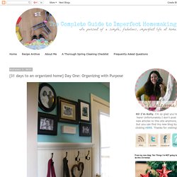
Because our hearts and minds can only take so much chaos. And life has enough chaos of its own. Because we need a daily refuge from the clutter and the noise and the blaring messages that wait on our doorstep. Because an uncluttered space creates an environment where we can learn and explore. Infarrantly Creative.
Infarrantly Creative. Its overflowing. Jenna Burger. Is it really Monday again?

Jenna Burger. Jenna Burger. Just a touch of gray. As I mentioned earlier this week hubs and I finally got our hands on the "elevator wall". You guys know I had been collecting things for a gallery wall - see post {here}. Well... Here's what we were working with... BEFORE - still a few more coats of mud needed Mudding finished - ready for paint! This is the view after coming in from the garage. Ta-dah! Not one indication of a door (well at least on this side)
Just Imagine. Kirsten Danielle. Kirsten Danielle. Kirsten Danielle. Lillian Hope Designs. This post contains affiliate links. All views and opinions are 100% my own. Hello Lovely Friends!! Originally this blog post was a giveaway for a local flea market. An image of my unfinished Gallery Wall Idea got pinned from the post, and it went viral! TONS of emails later I am listening to what you are wanting!
At the bottom of this post you will find the Gallery Wall Printable Downloads & The Shopping List of where you can purchase the items shown or similar ones. I constantly am asked what method I used to create this Gallery Wall Idea?!?!? -Start with your middle object (I started with the wooden Hello word), then work your way around that object. If you want a place for guest to hang their coats, put their shoes, and set their purses; then you can work that into your Entryway Gallery Wall design.
You can use standard table frames and remove the kick stand from the back. Lillian Hope Designs. Lolly Jane. Hi, friends! It’s Debby from Time to DIY here to share some tips and tricks for creating a gallery wall for a kids room. A couple of my New Year’s resolutions are to print more photos and get more walls decorated. Lovely Etc. Martys Musings. Not so deep thoughts. This story begins in the spring of 2010 when I decided to re-paint the entry way. Organize & Decorate everything. I made Emilee’s gallery wall using things I had in my craft room and a canvas print from the dollar area at Target.
I started by grabbing some thrifted and clearance frames and some embroidery hoops. I like to buy frames on clearance or from thrift stores then I always have them on hand when I need them. Then I arranged them in a way that appealed to me. I went through my scrapbook paper and fabric stash to find things to fill the frames. Emilee’s colors are green, yellow and black so we decided to paint all the frames black but I left the hoops natural. Organize & decorate everything. Paper Daisy Design. Pop Home Design. Refunk My Junk. Remade Simple. Rosenberry Rooms. Creating a gallery wall or frame collage with multiple frames in varied colors and shapes is becoming a very popular trend in nursery and kid’s room design.
With our newest collection of vintage inspired custom picture frames you can create this same look in your home without having to go to 10 different stores for 10 different frames! Sarah m Dorsey. Sassy Style Redesign. School of Decorating. Setting for Four. Somewhat Simple. Tatortots and jello. Tatortots and Jello. The Kim Six Fix. My family/play room is one of the places in my house that have been the most neglected. Mostly because it is always a hot mess of toys and shoes and clutter. It is also the room that houses the TV and the room we spend most of our time. I have updated the fireplace and built-ins, but that is about all that has been done. I have a bunch of cheap IKEA furniture (since I love the washable covers in bright colors), but it isn't really a cohesive design. It is definitely very kid-friendly with lots of toys and colorful artwork above the fireplace: Because the room is really intended to be the kids' playroom, I decided I wanted it to truly reflect them.
Top Dreamer. Sand and Sisal. Well, if you do, then you remember I had a special place in mind for them... Right here, in these thrifted frames. Our little "family tree," if you will. With one empty frame... (very) soon to be filled.