

5 Best Practices for Single-Page UX Design. Everybody loves single-page websites.
There is definitely some chemistry with this design trend. It has been around for quite a while, but it’s still on the rise and too many websites opt for it. SEE ALSO: Creative Single Page Website Designs, Examples. Avoid These 7 Usability Mistakes When Designing Websites. Website are easy tools for attracting customers towards a brand.

If you’re successful in building an appealing website, there are greater chances for gathering the attention of targeted audience. In addition to visual features, usability comes up as a key point of concern among individuals who’re looking ahead to render a great user experience via their website. If you’re a web designer, I’m sure you’d be well familiar with the importance of incorporating extensive usability within the website. Well, usable websites offer an amazing user experience and grow your chances of converting visitors into high-paying happy customers.
Smart web design decisions can actually take you towards the path of success. 2: All pages should be accessible in 3 clicks. Usability tests have long challenged the so called three-click rule.
Contrary to popular belief, people don’t leave your site if they’re unable to find the desired information in 3 clicks. Walt Disney: The World’s First UX Designer. I'm a huge fan of the Walt Disney park experience, and my family has traveled to Walt Disney World and Disneyland multiple times.
The service we’ve received has always been exceptional, and I return from every visit with at least one extra-special memory. The reason the Disney experience is so consistently good is a focus on quality, detail, and the customer. For the Walt Disney Company, that focus came from the man whose name is above the door. Walt Disney was an innovator, a creative force, and a brilliant businessman. Game ui. Nipple. 10 Casos de usabilidade fora das telas. Avaliando a usabilidade do meu website. Mobile Video: It’s a Small Screen for a Growing Marketplace. Watching video via smartphone is growing in popularity thanks to the large touchscreens and robust connectivity options these devices tout.
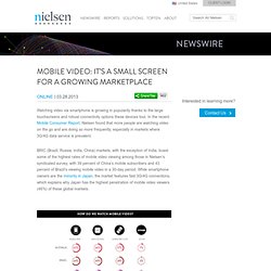
In the recent Mobile Consumer Report, Nielsen found that more people are watching video on the go and are doing so more frequently, especially in markets where 3G/4G data service is prevalent. BRIC (Brazil, Russia, India, China) markets, with the exception of India, boast some of the highest rates of mobile video viewing among those in Nielsen’s syndicated survey, with 39 percent of China’s mobile subscribers and 43 percent of Brazil’s viewing mobile video in a 30-day period. While smartphone owners are the minority in Japan, the market features fast 3G/4G connections, which explains why Japan has the highest penetration of mobile video viewers (46%) of these global markets.
For more information about how consumers around the globe are using mobile, download The Mobile Consumer: A Global Snapshot. GoodUI. Novo Padrão de Resolução de Tela e Navegador. UX Statistic. If spending on UX is a no-brainer, then why do so many sites send users careening off the road to conversion?
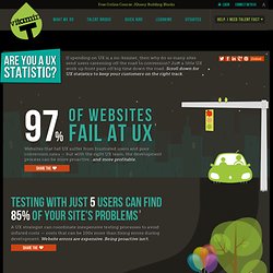
Just a little UX work up front pays off big time down the road. Scroll down for UX statistics to keep your customers on the right track. Websites that fail UX suffer from frustrated users and poor conversion rates — but with the right UX team, the development process can be more proactive...and more profitable. UX Design Defined. By Ritch Macefield Published: June 18, 2012 “In the field of user experience, people often confuse terms like information architecture, interaction design, visual design, usability engineering, and UX design.”
Pequenos detalhes na interface de usuário fazem a diferença - Design BlogDesign Blog. 5 Ways to Be Persuasive in Your UX Work. By Michael Hawley Published: November 1, 2011.

Customer Experience Design Talk Idris Mootee. Meaningful Play. Getting »Gamification« Right. You can do better: Lessons Learned from Government Meets Social Net... Don't Play Games With Me! Promises and Pitfalls of Gameful Design. There Be Dragons: Ten Potential Pitfalls of Gamification. Just add points? What UX can (and cannot) learn from games. O montar formulários quando você é o responsável pelo código e design. UI Design Guidelines for Responsive Design. Some UI guidelines and tips to consider when designing a website to make it cross-device friendly and responsive.
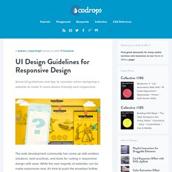
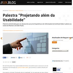
The web development community has come up with endless solutions, best practices, and tools for coding a responsive design with ease. While the vast majority of websites can be made responsive now, it’s time to push the envelope further. It’s easy to pay attention to great coding best practices, but sometimes the best design practices for various screen sizes get pushed aside. Many resources on responsive design cover the basics — make use of excess space on desktop, make things simpler on mobile. Escrevendo na Web. Trends in interactive design 2013. Palestra "Projetando além da Usabilidade" #Design Emocional #Imersão #Social Interface #User Experience No dia 30 de janeiro tive a oportunidade de ministrar uma palestra para os alunos do curso de Arquitetura de Informação do Instituto Faber Ludens, que aconteceu na sede do iMasters em São Paulo.
Stop Misusing Select Menus. By anthony on 01/22/13 at 8:34 am A form has many user interface elements. If you don’t know how to use them all properly, you could make filling out forms difficult for your users. One interface element that’s commonly misused is the select menu. When to Use a Select Menu Sometimes you’ll find a select menu with 2 options and sometimes with over 20 options. A select menu with over 15 options is just as bad as one with less than 5. Labeling Select Menus Like other form elements, a select menu should always have a label next to it. When to Use a Default Select Menu Option Most of the time, you should avoid giving users a default menu option. Grouping Select Menu Options If the options in your select menu have a hierarchy, you should split them into groups using the optgroup tag. Using Select Menus for Navigation Select menus are mainly used on forms, but sometimes they’re used for navigation.
Repensando o “acima da rolagem” O texto abaixo foi enviado pelo Marcus Perez e faz parte da série de colaborações que o Blog de AI está recebendo. The Pursuit of Tappiness. At the time of this writing, there are nearly 70 million tablet users in the U.S. alone, a figure that has doubled from the year before. This means that nearly 30% of the country’s Internet users are browsing on a tablet device. Tablet traffic to e-commerce sites grew by 348% from 2011 to 2012, overtaking smartphone traffic for the first time. With the tablet market as young as it is, its footprint is only going to expand.
This trend sends a strong message: if you haven’t already, now is the time to prioritize your website’s design considerations for tablet functionality. 6 Ways Ecosystems Have Changed Our Roles and the Way We Work. User Interface Design, Getting the Basics Right. If you build a house atop a solid foundation, it forgives – it allows you to try over and over again until you get the stories right. But a flawed foundation? You can hire the most brilliant architect and the poor fellow will ultimately fail. When it comes to our websites and applications, the user interface comprises the basics. How to create a cutting edge Smart City visitor experience.
A four step guide from the Milan Expo 2015: Step 1 Ask your main sponsors (in this case Cisco, Enel and Telecom Italia) to indicate the relevant “Smart City” technologies that they already have, are currently working on, or are generally trendy. In the Milan case these are push technology services, QR codes, smart phone apps, mapping services, RFID tags, biometric identification, security services, electronic walls, gestural interfaces, augmented reality (and eyewear), immersive virtual reality, 3D avatars, health tracking services, and foldable tablets.
What is this UX thing? Designing for Mobile, Part 1: Information Architecture. Around 1993, my dad brought home a large, brick-shaped mobile phone. Www.ucdgame.org/index.html. The State Of E-Commerce Checkout Design 2012. Advertisement A year ago we published an article on 11 fundamental guidelines for e-commerce checkout design here at Smashing Magazine. The guidelines presented were based on the 63 findings of a larger E-Commerce Checkout Usability research study we conducted in 2011 focusing strictly on the checkout user experience, from “cart” to “completed order”. This year we’ve taken a look at the state of e-commerce checkouts by documenting and benchmarking the checkout processes of the top 100 grossing e-commerce websites based on the findings from the original research study. O uso de smartphones para iniciar atividades online.
UX Trends & The Problem with Stealing Bad Ideas. Last week at State of the Startup, a monthly event in NY (which I co-hosted) focused on the latest trends in the startup world, Charming Robot and Hard Candy Shell cofounder Dan Maccarone gave a talk titled “User experience trends and you.”