

Lonely Planet Travel Guides and Travel Information. This is the primary and secondary colour palettes as described in the PSD styleguide and in colour_palette.sass Gray Palette Click to copy Copied!
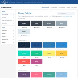
#2c3643 $darkgray #3b444f $titlegray #67747c $bodygray #99a9b3. Design better data tables. What are Fixed Assets - Asset Tracking. What are fixed assets?
Fixed assets are high value, non-consumable equipment used in your business. Common examples of, what are fixed assets, include laptops, cell phones assigned to employees, and tablets. More expensive fixed assets can include things such as company cars and so on. Dashed Illustrations — Al Power // Designer // Illustrator // Irish. SVG Filters. SVG Filters: The Crash Course — Sara Soueidan – Freelance-Front-End UI/UX Developer. I always try to customize in-house client workshops to my client’s needs.
That sometimes also means that if my client’s design and dev team is interested in learning something that is not covered in my workshop, I will tweak the content of the workshop to make sure they learn what they need to make their work better. One such example is when I ran my SVG Workshop for the design and engineering team at Netflix last year. Elijah told me he’d be interested in learning more about SVG Filters. I hadn’t dug into SVG filters before that, so I took his request as an opportunity to finally do it, so that I could customize the workshop for them. I learned all the basics of SVG filters in time for the workshop, and then spent the following two months learning more. If you know me, you know that my talks tend to be fast, packed with practical and technical goodies and tips. I had not shared the slides for the talk before today.
The Video Recording The Talk Slides You can find the slides online here. Form - Calltoidea. Android and iOS App Design – Web Efficient. Pleo - How it works. Finessing `feColorMatrix` Be more creative. Dashboard UI Kit. Designing an Account Switcher for Duolingo. My Process I ran a design sprint in two weeks where I prototyped and tested account-switching flows for the iOS tablet app.
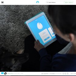
Below is my two week design process. Here’s How I Did It 1. Understand Needs Persona: Personas put people at the heart of the design process. Meet Ann Karn: Ann is a stay-at-home mom. User Personas for Mobile Design and Development. The user persona is one of the most valuable tools in UX work.
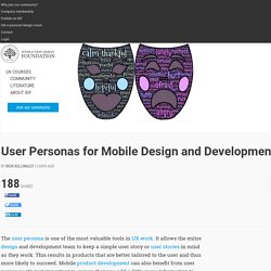
It allows the entire design and development team to keep a simple user story or user stories in mind as they work. This results in products that are better tailored to the user and thus more likely to succeed. Mobile product development can also benefit from user personas; it’s just important to ensure that you add a little more information to them to make them as effective as they can be There are several types of persona used in the customer and user focused business, which we hope is all businesses.
There are two types of persona that are particularly useful to user experience designers and they are the proto-persona and the user persona. The Proto-Persona – is a persona created when there’s no resource available to carry out research on users. Both types of persona tell a story of what people do, why they do it, and what they need/want from a product. Buy YI Home Camera 720P Night Vision Video Monitor IP/Wireless Network Surveillance Home Security Internation Version (US/EU) from Reliable yi home camera suppliers on yi - Store.
GENeco. 2.
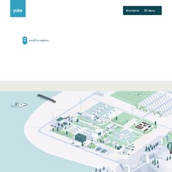
Developing a visual personality The second part of the discovery phase was to clearly define how GENeco wanted to be perceived externally. This took the form of a workshop focused on personifying GENeco the business with human personality traits in order to identify the organisational personality they wanted to communicate.We constantly referred back to the audience personas to make sure that our plans would resonate with their target audience. The workshops provided a forum for healthy discussion for the GENeco team, and ensured that consensus over the direction was achieved and that everyone was on board and had a say in the direction the ship was sailing. Following the workshops, we created a range of mood-boards which translated our findings into a visual language and explored tone of voice options that could be discussed and voted on.
A multi-channel helpdesk integrated with your back-office. Affordable Help Desk Pricing. Build moodboards collaboratively with your team or clients. Talebook. Stride Health. GiveForms - Beautifully Simple Giving. How Important is Simplicity in UX Design? Written by CareerFoundry graduate Caroline White.
Simplicity is often referred to as one of the fundamental principles of UX design. UX heavyweight, the Nielsen Norman Group include it in their definition of user experience saying: "The first requirement for an exemplary user experience is to meet the exact needs of the customer, without fuss or bother. Why product thinking is the next big thing in UX design. When you think about good user experience, what often comes to mind is a simple, beautiful, and easy-to-use feature set of a product that makes the user’s life easier.
But features are merely a small, fragile part of the product. They are only a few of many thinkable solutions for a user’s problem. Product thinking considers specific problems experienced by users, along with jobs to be done, goals, and revenues. The core user experience is not a set of features—it’s why people use the product. Uber’s core user experience is to get a taxi easily at any time. But Uber’s product works regardless of this feature.