

Gestalt principles in UI design. - Muzli - Design Inspiration. Here’re the Gestalt principles which can inform today’s UI design.
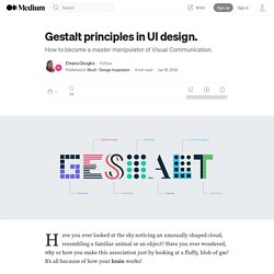
Elements arranged close to each other are perceived as more related than those placed further apart. This way different elements are viewed mainly as a group rather than as individual elements. How does the Proximity principle apply to UI design? We can use the Proximity principle in UI design for grouping similar information, organising content and decluttering layouts. Its correct use will have a positive impact on visual communication and user experience. As the principle states, items that are related should stay close to each other, while the unrelated items should stay further apart. We can apply the Proximity principle pretty much everywhere from navigation, cards, galleries and banners to lists, body text and pagination. Similarly to the Proximity principle, elements placed within the same region are perceived as grouped.
40+ esempi di utilizzo dello spazio negativo in pubblicità. Spazio negativo: che cos’é?
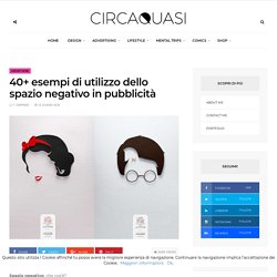
Partendo dalla consapevolezza che per spazio positivo intendiamo lo spazio occupato dal soggetto principale, per spazio negativo (chiamato a volte spazio bianco) intendiamo l’area che circonda il soggetto principale, quello spazio dunque che definisce ed enfatizza tutto ciò che risiede nello spazio positivo. Una corretta alternanza di spazio positivo e negativo permette all’occhio di respirare, ecco perché è bene progettare immagini che non siano troppo piene ma che vedano la presenza bilanciata di questi due elementi. Non solo equilibrio si nasconde però dietro l’utilizzo dello spazio bianco: la creatività è infatti dietro l’angolo, soprattutto quando questo tipo di spazio è utilizzato per nascondere una seconda immagine e dare più forza al messaggio veicolato, permettendo una doppia lettura dell’immagine.
Fonte: Digital Synopsis. The designer's guide to Gestalt Theory. In the 1920s, a group of psychologists in Germany developed a series of theories of visual perception known as the Gestalt Principles, or Gestalt Theory.
Along with systems such as grid theory, the Golden Ratio and colour theory, the Gestalt Principles form the basis of many design rules we follow today. Get Adobe Creative Cloud It's important for graphic and web designers to learn these principles. If you understand what they tell us about how we perceive visual objects and their arrangements, you'll be able to create a more coherent design that will better connect with your audience. Creativebloq. Le principali Leggi della Gestalt. Lo spazio bianco nella grafica - Retorica Comunicazione. In principio era il foglio bianco, la paura di ogni creativo.
Chi non è mai stato in soggezione davanti ad un foglio bianco? Penso allo scrittore in cerca della parola più adatta per iniziare il suo romanzo, oppure al pittore che con poca ispirazione fatica ad infrangere con la prima pennellata la tela bianca, oppure a chi? Al matematico alla ricerca della formula perfetta. 20+ creative and inspiring negative space logo designs - Credesk Technologies. Vitorials – How to Create Negative Space Letter Logo With Golden Ratio. Behance. A2 Visual Composition with Gestalt Principles. Order The first square composition I made centered around the emotion/feeling of order.
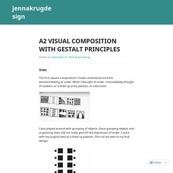
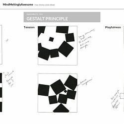
When I thought of order, I immediately thought of soldiers, or a lined up army platoon, or classroom. I also played around with grouping of objects. Since grouping objects and organizing them did not really give off the impression of order, I stuck with my original idea of a lined up platoon. This can be seen in my final design. Tension Tension was the hardest conceptually for me to create. I like the idea of stuff barely touching or things not fitting into holes, so I ended up thinking of the idea of a prefectly still sheet of ice and a body coming in and upsetting the balance. Comfort When I think of the word comfort, I think of things fitting perfectly together. I ended up going with a ’tiled’ (as the critique put it) composition. Ultimately, I kept this design because its composition reminds the viewer of a peaceful flower and its geometry is very set and each square perfectly fits in its place. GESTALT PRINCIPLE – MindMeltinglyAwesome. Image : hello friends!
Of course as usual on each post we will be learning something new and on today’s post we will be learning GESTALT PRINCIPLE. Sounds very different and exciting isn’t it? Let’s jump right into it! Gestalt is a psychology term which means “unified whole”. It refers to theories of visual perception developed by German psychologists in the 1920s. The example above appears as as single unit because all of the shapes have similarity.
Unity occurs because the triangular shapes look similar with each other.Difference is they have different shapes. image : continuation Continuation occurs when the eye is compelled to move through one object and continue to another object. Continuation occurs in the example above, because the viewer’s eye will naturally follow a line or curve. Image : closure Closure occurs when an object is incomplete or a space is not completely enclosed. Although the triangle above is not complete, enough is present for the eye to complete the shape. Like this: Gestalt principles and the psychology of design. The word “gestalt” gets thrown around a lot in design.
Taken from the German word for “form” or “shape,” it often refers to the overall look of something that is greater than the sum of its parts. In psychology, gestalt refers to the basic principles that allow us to visually perceive order. These principles are fundamental building blocks for creating visual meaning – and often seen in logo design.