

Brochure design: 10 top creative tips. We've given you a selection of great brochure templates elsewhere on the site.
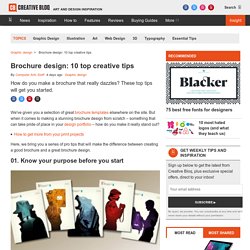
But when it comes to making a stunning brochure design from scratch – something that can take pride of place in your design portfolio – how do you make it really stand out? How to get more from your print projects Here, we bring you a series of pro tips that will make the difference between creating a good brochure and a great brochure design. 01. Know your purpose before you start When you're thinking about how to design a brochure, start by asking clients why they think that they need a brochure. 02. You don't need many fonts when you're thinking of how to design a brochure – just a heading, subheading and body copy font. 03.
Talk about paper stock before you put pen to notepad. 04. 2 Page Spread Editorial Design (Min. two variations) - East Digital Arts & Media. 2 page spread variations: You are responsible for designing 2 variations of your article.
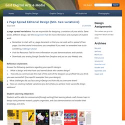
Same words, different design. See the Assignment Tab for more information and examples of student work.Remember to start with a 3 page document so that you can work with a spread of two pages. Use the tutorial instructions you completed if you need to remember how to do something. InDesign tutorialVisit the Resources Tab for more information on past demonstrations and tutorialsDownload your analog Google Doodle from Dropbox and put on your Weebly site.Reflection statement:Answer the following questions regarding your specific designs: 1.
Two Page Spreads - Matthew Wolosz. Circle Type on Behance. 20+ Modern Style Brochure / Catalogue / Template Design Ideas for Inspiration. When a new company opens up, it tries to attain the confidence of the people by introducing the top notch products or projects that can win the hearts of the people.
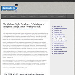
For this, they try to keep the quality in good check and balance & they don’t compromise on their excellence. Before getting into the business, the logo design of a company is to be made, later on comes the brochures, flyers, business cards all this and all that to come close to the understanding and awareness of the people. Graphic designers are wanted everywhere in the business fields. They are being hired on bigger salaries because too much have to be given onto their work table therefore designers are being paid much so they can give vent to the originality and do not get tired of their monotonous designing routine. Well ideas come handy to them because their job’s first requirement is to produce and to compose the unconventional, innovative and unique to touch the hearts and to connect the minds. 1.
The Creative Way To Maximize Design Ideas With Type. Layout creativi e impaginazione: 5 idee da provare ad aprile. Home » Magazine » GRAFICA » Layout creativi e impaginazione: 5 idee da provare ad aprile Se la grafica è la tua passione (e magari anche il tuo lavoro) ecco che potresti aver esaurito le idee e potresti aver bisogno di trovare layout creativi dai quali trarre ispirazione.
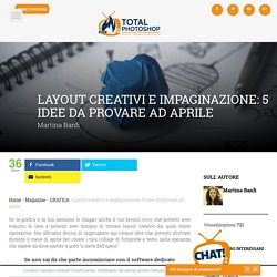
Noi abbiamo deciso di raggruppare qui cinque idee che potresti sfruttare durante il mese di aprile per creare i tuoi collage di fotografie e testo, nella speranza che sapere da dove partire ti porti “a metà dell’opera”. Se non sai da che parte incominciare con il software dedicato all’impaginazione ecco dove andare: Le texture possono essere un ottimo modo per rendere un layout dinamico ed accattivante ma anche per gestire al meglio la gerarchia visiva. Si tratta, inoltre, di elementi abbastanza facili da reperire e da utilizzare ma, soprattitto, che non richiedono un dispendio di tempo esagerato per essere personalizzate ed adattate ad ogni contesto.
Grid Paper PDFs. Downloadable and very printable, I find these PDFs extremely useful.
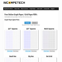
Graph Paper Quick Picks Now set to: 8 1/2 x 11 Paper. Ruled in Inches. Now set to: A4 Paper, Ruled in Millimeters. Custom Graph Papers Need more specific stuff? Tip number one! Though I do return the correct header for a PDF, sometimes Explorer gets confused when downloading... L’utilizzo delle griglie in Graphic e Web Design. Le griglie d’impaginazione, così come le conosciamo, vennero teorizzate a partire dagli anni ’50.
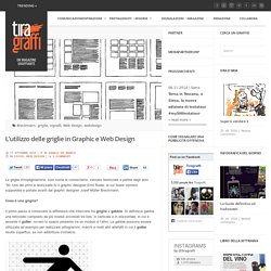
Uno dei primi a teorizzarle fu il graphic designer Emil Ruder, le cui teorie vennero supportate e portate avanti dal graphic designer Josef Müller Brockmann. Cosa è una griglia? Il primo passo è conoscere la differenza che intercorre tra griglie e gabbie. Si definisce gabbia una reticolato composto da più moduli accostati tra loro, in verticale e in orizzontale, in cui è assente il gutter, ovvero lo spazio presente tra un modulo e l’altro.
La gabbie possono essere utilizzate ad esempio per realizzare pittogrammi, marchi e molti altri artefatti in cui il gutter risulta superfluo, se non addirittura d’intralcio. Nell’immagine sopra, costruzione di un pittogramma con l’utilizzo di una gabbia, realizzato dal graphic designer Otl Aicher per le Olimpiadi di Monaco del 1972. Adobe InDesign Magazine Template from AlfianBrand. The team of AlfianBrand specializes in high quality print resources and diverse graphic templates for professional use.
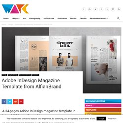
This well designed magazine template for Adobe InDesign consists of 34 unique pages. Available in A4 and US Letter, this document will help you to create super stylish brochures and magazines in no time. Whether fashion, art or lifestyle, the modern layout is well suited for a variety of topics. Feel free to get more details below the image or click on the following link. The template is available for purchase on Creative Market.
These are the main features. Included as A4 and US Letter documents, the files require Adobe InDesign CS4 or later.