

12 Logo Design Mistakes To Avoid. Posted on 24'10 Aug Posted on August 24, 2010 along with 84 JUST™ Creative Comments This was an article I originally wrote for the Sep / Oct 2010 edition of Layers Magazine, it has been republished here with permission.
You can see pictures of the article in print at the bottom of this article or you can view the PDF here. The article is targeted towards designers, rather than business owners. Logo clichés (overused & overdone) Hello, I know I might be opening a can of worms here.

But, this has been bothering me for a while and this morning the subject was brought up in another thread. I believe it is the 5th time the subject is brought up in the fora. *** Could we all stop making logos featuring the one-legged pointy man, please? *** 10 biggest logo design clichés of all time. The sad thing about trends, in any field, is that as they become overused they eventually turn into a cliché.
A visual cliché in a logo is something that you should avoid at all costs, as one of the main characteristics of a good effective logo is that it should be unique. So if the world and his wife are utilising your same idea then it can effect not only your competitive advantage but also the way in which your brand is perceived. If a direct competitor is also using the same cliche then this can obviously become very dangerous indeed, with the possibility of brand recognition becoming impossible.
5 Cliché Logo Design Trends to Avoid. Logos are one of the trickiest areas in the graphic design world.
It takes almost zero talent to make a logo, virtually anyone can do it. However, making a good logo requires a lot of insight, artistic skill and patience. Too often we see designers falling into the trap of rushing into a logo design project and coming up with ideas that are so overused that they’re downright cringe-worthy. Today we’re going to take a look at five logo trends that fit this description. Read on to see if any of your go-to techniques are on the list. Who Cares About Being Unique? How to avoid overdone and overused logo designs. Can you have too much of a good thing?
Eat too much cake and you might get sick. Exercise too much and you might hurt yourself. Listen to the same hit song over and over – you’ll never want to hear it again. The same goes for graphic design. In this article, we’ll illustrate what not to do. 1. If overdone design were a brand, its poster child would be the “V-Man.” Health, social media and other service oriented businesses are ripe for the V-man trap. Here are a few examples of designs that represent similar ideas in a different way: 2. Globes (both the 2D and 3D versions) are also dangerous territory. These travel company logos avoid those pitfalls and show that the global theme can be implemented uniquely: 3. Generic and overused logos - Avoid it! In the world of creative communities a customer launches their project (for logos, corporate identities, banners, websites, etc.) and designers respond with their proposals.

The customer, here, has the possibility to get amazing designs from creatives from all over the world and the creatives have the possibility to show his best works to all the community, creating contacts with international clients. But, in the jungle of logo design, there is a tricky trap: the spreading of the generic logos. 10 Mistakes Logo Designers Should Avoid. All logo designers know and value the importance of a professional logo to any business, large or small.
It represents the company, it tells their story and symbolises their brand to the world. Viewed daily by their clients and potential customers, it could jeopardise, even ruin the success of the company it acts for if poorly designed. No matter how great your products or services are, if your logo sucks, you’re going to have a hard time attracting customers to your business. 10 Common Mistakes In Logo Design. With the power of the Web, and more eyes watching than ever, it’s important for a business to communicate its unique message clearly.
The easiest way to recognize a company and distinguish it from others is by its logo. Below, we go through 10 common logo design mistakes that you should avoid if you want to create a successful and professional logo. 1. Designed By An Amateur Avoid websites that promote ridiculously cheap logo packages. A professional business should look professional. Here are the most common reasons why many logos look amateurish:
Logo Design - How NOT To Design A Logo. Logo design: 60 pro tips. Great logo design requires a complex mixture of design skills, creative theory and skilful application.
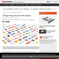
Any designer worth their salt can create a fit-for-purpose logo, but truly mastering all aspects of the craft takes time. Exclusive offer: Save 15% on Adobe Creative Cloud now. 10 Tips for Designing Logos That Don’t Suck. Please Note: This article was originally published in August, 2012.
Occasionally we re-publish articles that we feel are still relevant, and interesting for our readers. 1. What makes a good logo? Vital Tips For Effective Logo Design. There have been numerous creative logo design showcases1, logo design resources2 and logo design tutorials3 posted across the Web. While these help you to create a powerful toolbox for your logo designs, first you need to gain a solid understanding of what makes a logo design good and what you need to consider before starting using this toobox. In this article, we’ll get down to the nitty gritty of what makes an effective logo design and we’ll also guide you through the principles and best practices of how to create an iconic brand identity.
You may be interested in the following related posts: